Reflection on Images-based VR by Kenneth

When I first opened the TED talk video, I was complaining about the quality of the video. I had not paid attention to the time of the talk and didn’t realize that 2d-making-3d technology has already existed since 2007.  The insight into the challenge that images-based VR takes years to its development is that I think in 2007, the technology or the basic theory of 3d visualization of 2d images were mature. As we can see, there was good work in 2007. But the challenge at that time, as I think, should be the image collection. Firstly, the 4G network was not available in 2007, which result in the fact that it would take a long time to collect 2d images of one object on the Internet. Besides, the source of image may be untrustworthy. For example, as the video shows, one of the images the system of Photosynth chooses is a poster image but not an image of the real thing. That increases the difficulty of computation.

After checking the works of the team members of Photosynth, I find out that most members still keep exploring the image-related industry.  Following through the releasing time of papers, I realize that their focuses have already shifted from theory in the past to application nowadays. The reason why I think they are still sticking out to the image-based industry is that the fundamental logic of the image-based industry has not changed. With the development of high-speed network and computing hardware, the difficulties of development are not as huge as they used to be. Also, the tech of machine learning can be a great help to analyze the image data so as to guarantee a good quality of materials.

The reason why some people quit, as I think, is that they cannot follow the trend and refreshment of media and industry. In 2007, as the video shows, Photosynth is based on computers. In recent years, after checking the topics that same group of people is working on recently, the image-based industry has already evolved to be more diverse: VR, smartphones, the Internet are new filed. People who quit might fail to follow the trend.

Week4: Summary of watching Oculus developers conference and Human-free pictures by Kenneth

Summary of Oculus developers conference

After watching the 12 minutes summary of the Oculus developers conference, I decided to choose the video posts of “Spark AR for Places and Things” and “From WebVR to WebXR: The Next Generation of VR Experiences on the Web” to explore more about the advanced tiers of VR&AR industry. For “Spark AR for Places and Things”. In this video post, the speaker introduces the new development tool for AR to the public–Spark AR. On this platform build AR experiences that are connected to real-world locations, environments, or objects. I think this platform is necessary for the development of the AR industry and I strongly agree with the speaker that the future of AR is quite bright and the development tool for AR is vital because the development tools or platforms like Spark AR as the whole industry is similar to the IDE as the development of programming language. 

For “From WebVR to WebXR: The Next Generation of VR Experiences on the Web”, I agree that the web is important not only just for the previous media of computers or smartphones but for the future potential new media. As the data are shown by the speaker, two-thirds of the users of Oculus will use the web browser in Oculus to check Facebook and Youtube. The new standard of the web–web XR plays a key role in future immersive experiences of Web on the VR platform. From WebVR to WebXR, I think it is the shift from old time to new era–old Web experience turns to be flat and 2D on screen compared to the new Web experience under WebXR. By using 6DOF space tracking and VR controllers, WebXR will create a revolutionary interactive way, which will bring users a new sense of immersion. In the future, I think the experience of the Web will be spatial, touchable and multi-dimensional. But for the example of Hub, I think it is not the best application or case for WebXR. I think the way to build a room as a Website is not as practical as to how people think. The idea of sharing a VR room in an URL to other users and people can enter the room and get information by exploration is innovative and kind of sci-fi but I think the way that people browse the Web is read or heard in the room, which is a way of same with what we are doing now on computer and smartphone. The room design as I see is just decoration for the future web. There is must be a way to make innovation for the future Web. We still have a long way to go.

Human-free pIctures

This picture is the original version 

I use photoshop to erase the building and only keep the cloud and sky. Also, there is a bird in the sky(a little bit tiny but it is actually there)
Besides, I also take a photo of pure sky, which is obviously human-free.
For the other, I shoot the flowers, boskage, water, and leaf without human invention. I will print them out and bring them to class because the size of images is beyond the maximum size the website can hold.


Week3: Review on 3 VR titles

 Review on Spacewalk

In general, Spacewalk is a good VR project. Firstly, it is “3dof” project. As an astronaut in the project, users only have a 180-degree view. For images aspect, it is a 3D project and it works successfully to fool my eyes because it uses many images to create a verisimilar environment of space–without gravity. The pictures in front of me are dynamic and the highlights like floating items in spaceship provide me such an excellent sense of immersion. 

For the audio aspect, it is normal because it seems that the creator of this project has not used spatial sound or multiphonic techs to build a sound immersion. The only sound in this project is the sound of the phone, which is non-spatial and non-stereo. 

But generally, I like this project because it excellently shows me a great space world and successfully immerses me into it. What I dislike is that it is a “3dof” project. If it were a “6dof” project, it will help people to experience how is the feeling of being an astronaut.

Review on Scaring movie project on Youtube

This is the worst VR titles I experienced. The sacring movie project on Youtube is a video project. It is a “6dof” project and it is a panorama display with 2D images–that is the thing that makes this project unsuccessful for me: 2D images cannot make a big shock for audience, especially in the area of the scaring movies. The opening of the movie project is a 3d intro of the video of walking alongside a corridor. Accompanied by sacring background music, I began to be scared and wanted to stop it. What disappointed me is that the main body of this project didn’t perform as well as its opening. Low-quality 2D panorama images could not immerse me into the environment. What is worse is that I could not move around but could only watch and listen. Audion performance was not good as well. It is not spatial and not stereo–it is just the simple audio sound like what we will hear in normal form of movies. In conclusion, I like the opening part because the 3D-dynamic walking scene with scaring movie provides me a great atmosphere of scaring movie and speed up my heartbeat. What I dislike is that both the audio and visual performance of this project could be better by using 3D tech and stereophonic display.

Review on the Cowboy shooting game

That is the only game I experienced in class. It is an ordinary project both in audio and in visual. For visual, it is 3D cartoon-style but “3dof”. Users can only rotate their head in 180 degrees and see the things in front of them. Besides, users cannot move around. Audio is not spatial but good in quality. Therefore, I get the conclusion that it is an ordinary VR project and I keep a neutralizing attitude towards this project.

Assignment1: Replies to the 16 Lessons assignment & VR experiences by Haoquan Wang(Kenneth)

Replies to the 16 Lessons assignment:

Most agree: No.3 Network speeds and cloud computing capacity will be the key utility of the future.

Like web and cellphone, being the mainstream devices of digital life means that VR&AR devices will be widely used and there will be a social community of users. Therefore, stable connection and high-speed data transportation are the key utility to guaranteeing the stable online processing of VR/AR devices.

Most disagree: No.7 VR can erase race and gender inequality gaps.

VR creates a visual world for users but it does not mean that users can completely get rid of the real world. Using avatar in the VR world will not erase race and gender inequality–it can only temporarily help users forget the real-world limitations.

VR Experience:

I experience three VR projects, BBC Spacewalk, Scaring VR video, and Cowboy shooting game.

BBC Spacewalk

BBC Spacewalk is the most excellent VR project I have ever experienced. It is a project about space movement and astronauts mission. In the space, users need to use controllers, which are two hands of astronauts to grab spaceship to move around, repair the spaceship, etc. The graphics are in high quality and I really enjoy diving into this visual space. What shocks me is that I even feel dizzy of weightlessness. That is amazing.

Scaring VR video

This project set me inside a blocked room and it is pretty scaring. But what a pity is that I can only stand and watch–there is no interaction design in this project. I think VR is suitable for Scaring game and movie because it can provide a sense of realness and shock which video and video games cannot provide for users.

Cowboy shooting game

This is the only game that I experience in this class. The gamer needs to hold the controller to shoot and change the clip by shaking the controller like a cowboy. I love the design of changing clips because it makes me feel like a cowboy. The graphics quality is good but not as excellent as the Spacewalk one.

In conclusion, I think that VR can be used for games and interactive visual project. 

 Review of the Kevin Kelly AR article

AR, as the third platform after the first and the second platforms of Web and phones, will digitalize the rest of the world. But We still have a long way to go.

Escape Room Game: Break Free – Haoquan Wang(Kenneth) – Young

CONCEPTION AND DESIGN:

Concept of my project–Depressing emotion:

I got my inspiration from my own experience. In this semester I have encountered many difficulties and depression. When I was depressed, I really hope that there is someone who can care for me.  So I think I can do something for the people who are depressed–maybe I cannot help them solve the depression, I can do a project which appeals people to care for their friends around them. Secondly, because I want to do something “artistic”, the idea of making an escaping room game came to my mind–I can use a locked room to imply one’s closing mind and the breaking room to imply going back to normal. Hence, I decided to do an escape game.

Design of interaction:

1. Basic design:

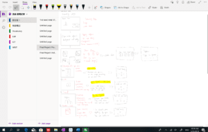
To make an escape room game, the first thing that I did is to design each room. I hope that users can explore each room through clicking mouse. They can also go back and forth among all the rooms. That is the basic interaction way of our project, which users can navigate through this way. Then we design each room. I divided my project into four main topics: Love, academic, family and self. In our story, the character encounters much displeasure–she fails in the exam; she breaks up with her boyfriend. The result is that she forgets who she is; she forgets her family and friends. So basically we supposed to have four rooms and four keys. In four topics, users need to explore to get information and guess the key. 
2. The way of getting key:

I design many interactive ways to collect keys. They are a potentiometer, direction keys, and camera. The first thing is the potentiometer.
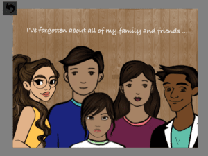
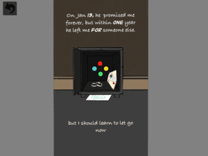
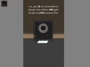
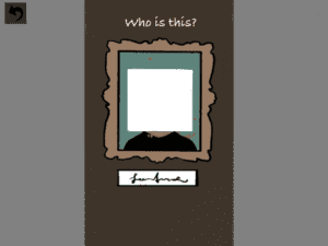
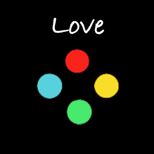
The first picture is the family page. I design that the picture is unclear(upload pixels and change the size of the rectangle to a big number), meaning that the character forgets her family and friends. Users can use the potentiometer to change the size of the rectangle to make the image clear, which means that the character gets the memory. The second and third pictures are love page. The character hides her love and memory in a locker. The users are supposed to help her open her mind to embrace the new life. My partner design a riddle that there is a number hid in it. Users need to guess the number and turn the value from the Arduino to a number bigger than the riddle number. At first, we want to let the users turn the value to the value we assigned, but the value from the Arduino is floating, is not stable. So in order to solve it, I code it like “if(valueFromArduino > 1314);”(1314 is the designed value).

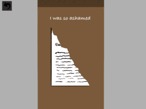
 

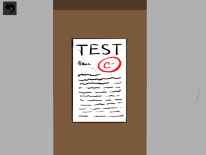
For the academic topic, I mainly use the interaction of direction keys. In this topic, the character experiences the failure of the exam, which is pretty common in students’ life. The character tears up her exam paper. The users need to use the direction keys to move the paper pieces together so as to help the character correctly face the exam. 
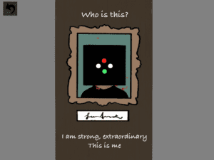
3. The way of entering keys

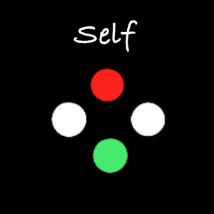
In self page, I use camera interaction. In this part, the character forgets who she is. So I design that users need to use a camera to take a selfie, meaning that “know yourself”. At first, we want to use the library of face detection, but it will increase the difficulty of using–the users may not know this is a self-taking selfie. So we abandon this design.
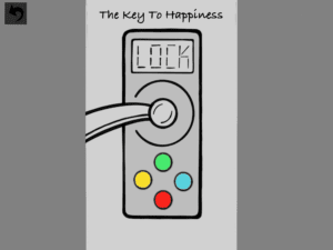
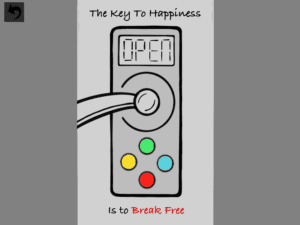
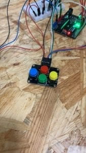
For entering keys to go out, we design our keys in forms of the figure, like the picture. In the lock page, the users need to press the button according to the key image. For multiple button key, the user needs to press all the key at the same time. We decided to design the key part in the way that users don’t need to enter the key in a specific sequence. At first we want to do that way, but actually, we realize that it is too difficult and inconvenience for the users to remember the sequence and go back to each page to check each key. So I think do not use this design is smart and necessary.

FABRICATION AND PRODUCTION:

For fabrication, we only use the laser cutter to make a box to hide our Arduino board and breadboard. We dig several holes for the potentiometer and button. Also, we leave four small holes for LEDs on the top of the box. The LEDs can help users check the key they enter.
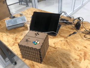
We try to use the serial communication to show the key through LEDs–the led will shine and fade to show each key right after the users successfully get the key. But we don’t have this design until user testing, so we don’t have enough time to achieve this design. We failed it. The most successful thing in our production is that we do all the work at the same time. I was coding while my partner was drawing. For the components, big potentiometer and direction buttons, we bought it from Taobao.

In user testing, we got much feedback. The first thing is that we need more instruction. Fellow Nick says “He didn’t know what he should do when he first open my project”. Besides, he also mentions that he didn’t know whether he should use only the box use computer. It is confusing. To solve this issue, we firstly add instruction through typewriter effect in Processing, we type many hint and instruction on the canvas of our project. The second thing we did is to add more background information page to tell the users the whole story. Also, considering the feedback from Nick that we should do all the interaction in a physical box or just on the computer, we want to add a cursor on a computer operated by a button, but we failed.
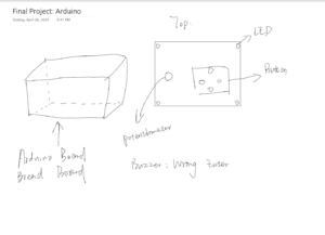
Generally speaking, all the adaption and changes are pretty effective.

CONCLUSIONS:

In general, my project achieves our goal–to appeal to people to care for the people who are depressed. In IMA show, our users highly praise our aim of the project. In my research paper, I wrote that interaction should be a flexible, self-created reciprocal process. The output can also be the input, the input can also be output. In my project, the screen, Processing part, is the input, people can touch the screen or click the mouse to explore and take a selfie; it is also output, users can get information and keys from the screen. For the physical part, Arduino part, people can input key through the button and interact with the output from the computer–it is input part; also, it is output because people can check the LEDs.

During the IMA Show, my users pretty enjoy my project. They easily know how to interact with my project. Even kids can get familiar with this flexible, highly connected interaction way.
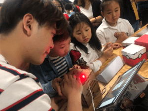
 

If I have more time, I will fix several things. The first thing is that I will make the self page part easier. From the feedback from the users, they think that they need to move two pieces of paper together very accurately. The second thing is the camera interaction. Because my camera is broken, so for the part of camera interaction, we just guarantee that it is working but people cannot interact with our project in that way. The third thing is to achieve the serial communication design that I mentioned above. 

The lesson that I take away from this final project is that I need to have the ability to simplify things. When we cannot achieve one design, how can we have a similar one through another alternative designing way? This ability that I gain really helps me a lot this time. Because our project is supposed to be very hard and almost impossible to achieve within two weeks.

The wrap-up:

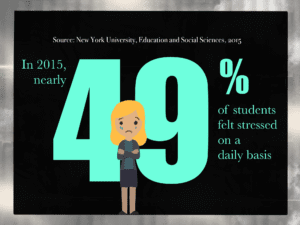
Going back to the purpose of my project, many universities suffer from pressure and burden of love, friendship, academic mission, and family conflict.  
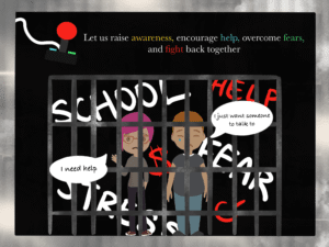
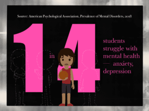
These pictures were going to be used at the end of my project, but we decided to put in in final blog post. These are the research we had made. There is a necessity for us to pay attention to the mental health of students in modern universities system. Even though our project may not really help those who are depressed to feel better, our project is aiming to raise the awareness of these serious issues.