Photo Zine:
Hope and Hanna – Sustainable Fashion pdf
Video:
https://drive.google.com/open?id=1pOqtK4VBa0JMHz4OoaAmXcHlhOs05PbR
Interactive Media Arts @ NYUSH
Photo Zine:
Hope and Hanna – Sustainable Fashion pdf
Video:
https://drive.google.com/open?id=1pOqtK4VBa0JMHz4OoaAmXcHlhOs05PbR
Inspiration:

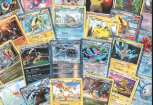
Our inspiration for our comic came from the recent announcement of a new Pokemon game. With Pokemon being so popular, we decided to adapt it into an interactive comic.
Comic Overview:
Start by choosing a starter Pokeball. Once you make this choice, you will have the option to name your Pokemon. Once the name is assigned you will engage in a Poke battle. You will be able to navigate through the battle with interactive choices which will affect the outcome of the battle. The Pokemon you are battling with will respond accordingly. Depending on your choices throughout the comic, you will either win or loose the battle.
-The java script we will likely be using to create interactivity will include buttons which will take you to different pages, etc and pop-up widows with text notifications. We would use CSS to have an arcade-themed font, and could use Java Script to change the text style/size, etc.
Link: http://imanas.shanghai.nyu.edu/~hrm305/Week_3/
Concept: The concept for my portfolio home page was to have a section with picture previews of the different projects displayed on the site, as well as a navigation bar on the left-hand side of the page. I used basic HTML to create my content, and then an external style sheet to style the site. I also added the same background image to this page as is on my homepage.
Process:
-For my homepage, I created my basic content using html, including flexboxes and other <div> classes, such as a “navigation” class, a “content-box” class, etc. In my external CSS style sheet, I styled my content by altering the margins and padding, width/height, color, font-weight, flex properties, adding borders and float properties.
-I wanted to have the links in my nav bar actually link to other pages, so I started by linking my “about” page to my facebook account. For the interactive comics, audio, and video pages, I did not have my own content, so I linked these to some random example pages.
-For my “Websites” page, I linked another website that I created in the past for another class.
-For my “Photos” page, I created new html and css docs and used <div> tags and “polaroid” classes with 9 different photos from my trip over winter break. In the css page, I added borders to the photos and used basic margin, padding, height, and width properties to style a basic photo layout.
New Concepts:
-I employed the use of flexbox to create a broader “content” class, as well as individual “content-box” classes which contained the images on the homepage. In the css page styling of the content class, I used flex-wrap: wrap, and align-content: flex-start to correctly set up my flex boxes.
-In order to make my images more interesting, I used box-shadow to give the content-boxes an off-white shadow. The code I used is: ![]() . This gave my content-boxes more depth, which I thought looked better than just the images alone.
. This gave my content-boxes more depth, which I thought looked better than just the images alone.
-Instead of having a plain color background, I decided to insert a background image as my site’s background.
Struggles:
-I initially struggled with inserting a background image, because I was having issues inserting the image using external CSS. I eventually solved this problem by putting it in the <body> section of the <style> tag on the html page.
Conclusion: Overall, I found this assignment to be fun and a good way to put the html and css skills I have learned into practice. If I had more time to work on this site, I would like to add some more separate pages that I code myself for the links in the nav bar. I would also add some stylised icons with links to my social media, and perhaps a generic contact form.
In her text, Sarah Scaturro argues for the concept of eco-tech. “Balancing the dismay regarding the role current technologies play in the fast fashion system is an alternate belief that the right technologies, when selectively developed and applied, can play an integral role in the growth of sustainable fashion. This concept is best called eco-tech fashion, and is an idea that insists upon the emergence of a sustainable fashion system through an innovative technological framework containing thoughtful manufacturing processes and consumption patterns.” The concept of eco-tech seems like a good approach to unsustainable practices, because even though many such practices cause environmental problems, we cannot deny that we live in a technological age. Therefore, a combination of advancing technology and changing individuals’ awareness about sustainable fashion could be an effective strategy for fashion sustainability.
When discussing the sustainability of biologically-derived fibers, Scatturo argues, “These biologically derived fibers could play a significant role in the creation of a truly sustainable fashion system, but technology must be precisely applied to limit pollution and energy expenditures, while the manufacturing processes must become open source and accessible rather than remain proprietary.” The author argues that while we need to move away from highly toxic and polluting synthetic fibers, many of the natural fibers created toady use an exorbitant amount of energy, and so are not as sustainable as one might think. I found this discussion relevant to my own life, because I have made purchasing decisions in the past, such as the purchasing of bamboo toothbrushes, with the thought that the material I was buying was more sustainable. Through Scatturo’s article, it is clear that while biologically-derived fibers and products should be the future of sustainability, the energy and material sustainability in the making of these products also needs to be addressed.