Week 3: Basic HTML/CSS Website – Hannah Kasak

Here it is 🙂

Making this website, like almost everything with coding, was fun but involved a lot of trouble shooting. There were a few cases where I made a seemingly small change in value (like the sizing of an element) that ended up having a major impact on the layout.  For example, I wanted to change the margins for the photos on my about page, but this ended up exceeding the height of the container. I resolved this by reducing the height of the footer and increasing the height of the navigator and content. 

I was also torn between adding containers to the style.css file and making a new file for different webpages, since I thought this would make it less cluttered. I decided to just add more to the existing style.css file so that I could styles from elements on other pages. This ended up being a good move, I think, because it would have become tedious to repeat many of the style features (like color, outline thickness, etc) that I wanted to keep consistent throughout the site. 

I also tried to figure out ways to do something without looking online first. One of my failed attempts  was make the link text change color when hovered over with the mouse by adding 

.profile-box:hover{
background-color: steelblue

a{
color: seashell;
font-family:sans-serif;

}

to the CSS file, but it seems that text related values cannot be added within a container. This is something I would like to keep looking into though, and also how to make an image a link in itself.  Even though I know relatively little about coding, I like trying to do it without initially looking for online sources because I find it is a good way to think about how the code is being read, and makes me retain better what does and does not work. 

Above are the photos on my about page with the links leading to external sites. I ended up using “.profile-box:hover” to make the background of the link change color rather than the link itself. 

I was also pleasantly surprised by how well our previous exercise in CSS prepared us to make a variety of layouts, because the shapes and sizes of elements can be so easily manipulated. I initially spent a lot of time trying to figure out why my aboutpage images were aligning in a column rather than a row, despite using flex-direction: row. It was especially puzzling because I wasn’t having that problem with items on the portfolio page, even though I was using the same properties (below). It turned out to be that I needed to add “float:right” although I’m still not sure why I was only having the problem with one page and not the other. 
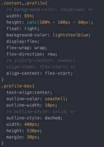
In the end I was able to resolve the issues I ran into and create a simple but (I think) nice looking site. I’m excited to apply this in the future as well!
Week 2: CSS Exercise – Hannah Kasak

http://imanas.shanghai.nyu.edu/~hkg245/week02_CSS/index.html

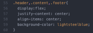
This project was a great exercise in familiarizing ourselves with useful properties and experimenting with different values. A few times I would make mistakes like selecting “align-content” instead of “text-align” and not getting the results I expected, but this is fairly easy to realize and resolve. Especially fun was picking out colors for the font, boxes, and borders. CSS Color Codes was very helpful for this. I was surprised by how much the visual appeal of the site could be improved with a few simple properties and values, especially the wide selection of colors.  I found it easiest to experiment by adding properties where I thought they might work and then commenting them out if they didn’t, so that I could go back to them if I changed my mind. Also simple is better, both in design and in coding. Adding the color in the format below, for example, makes it much easier to go back and change than adding it individually to each component.

Week 2- Response to “Understanding Comics” – Hannah Kasak

In his analysis of comics– in the form of comics– McCloud challenges the conventions of message and media. Rather than the medium being the message, McCloud asks us to search for the message without discriminating against the medium. We normally take for-granted our assumptions about the role of the media in the formality or importance of the message. For an academic argument we expect to see a specifically formatted article with citations in APA or MLA depending on the disciplines, perhaps a book with dense single spaced paragraphs, or a power point in the most casual circumstance. However, we would never expect to find an academic argument to take the form of a comic. One could argue that our formatting convention exist for good reason– it makes it easier to find the information one needs when one knows exactly where in the article to look. But one could also argue that we are stuck in the old fashioned notion of complex diction and syntax being a sign of complex thought. McCloud defends the art and the sophistication of comics by using them as a way to make a nuanced and complex argument accessible (more accessible than an academic article) but still vigorous and informative. He proves that one can change the medium and preserve the academic value. In fact, why not make an argument more accessible when it can be done without compromising the message? McCloud also traces the use of comics throughout history to demonstrate their currently-unappreciated importance in literacy and narrative-making. Though I have been to many museums and seen many of what I now know are comics, I had never learned to read them– for example zigzag or bottom to top. There is a notable deficit in the academic appreciation for comics, and the potential it holds for understanding sequential pictorial images from today and from ancient times.

Week 2:Photoshop Project – Hannah Kasak

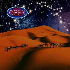
Open Sky

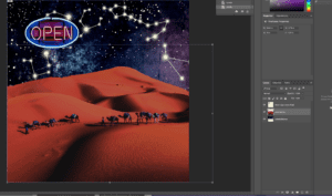
project_1_final
Project 1 Final Image

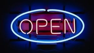
In this project a bit of my home sickness for Abu Dhabi came through. I started with the neon “open” sign and thought of it floating in an exaggerated night sky because of its brightness and blue-pink colors. I chose a sand dune as the foreground because in the desert, without any buildings or trees to fill the space, the sky makes an overwhelming impression. 

Below are the original images I used for the project. 

project1_original_dunes
Original Dune
project1_original_sign
Original Neon Sign
project1_original_sky
Original Sky Image
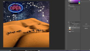
project1_step1
Combining Images

I combined the 3 images by layering them with the sky in the back, the dunes in the middle, and the open sign in front and used the magic wand tool to erase the open sign background and the blue sky of the dunes image. I also removed some of the desert background and

project1_step2

cropped the image to make the peak of the dune more dramatic. 

I used the smudge tool to smooth the edge of the dune and make it fit better into the sky, as well as to erase some of irregularities in the sand.

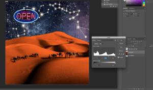
project1_step3
Editing Background Colors

I then edited the colors of the foreground to look more like a night time image. I originally planned to make the sand blueish purple, but ended up liking the contrast of the reddish sand. The sky I made darker with brighter nebula colors to better match the neon sign. 

Looking at the final project, I wonder if the dunes are too reddish, or whether the shadows are too dark, but while editing I liked the intensity of it. I’m interested in learning more about theory and principles of design so that I can develop a better eye for combining shapes and color.

Week 2: “The Medium is the Message” – Hannah Kasak

Marshal McLuhan makes the bold claim that, rather than the content of the media being the only message, the nature of the medium itself is inherent to the meaning. I must admit I had a hard time making sense of his argument at first, but it became clearer to me when he framed it as the following: “A message, it seemed, was the content as people used to ask what a painting is about. Yet they never thought to ask what a melody was about, or a house or a dress.” This illustrated to me that we assume an intention in every item we encounter. A dress or house we assume the intention of functionality and to some extent aesthetics, however we don’t normally look for life advice or political discourse in these items. In some media, however, we assume the medium itself to be only a vessel of a deeper message– one where we do look for life advice or political discourse — and we disregard the active role that the medium plays in shaping our life individually and that of society. That being said, McLuhan goes on to argue that the medium cannot be excused from the havoc it wreaks. Contrary to Sarnoff’s statement (and a widely shared sentiment) it does not suffice to call a medium “neither good nor bad” because the medium does influence and enable the way in which it is used. This part of McLuhan’s argument is less persuasive to me because I fail to see any advantage in condemning every item that could theoretically be used for bad purposes. There are some items that are necessarily labeled as dangerous and therefore controlled, however the majority of things must be allowed and we must trust the users’ intentions or we would be left with nothing.