http://imanas.shanghai.nyu.edu/~hkg245/week01/Final%20Project/
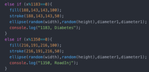
Design: As someone passionate about public health, I felt that internet art would lend itself in exciting ways to make global health issues better understood. Our attention to a disease is often not proportional to the danger it actually poses. In response to this I represented the loss of life by specific illnesses by the appearance of differently colored polka dots. Each ailment will be represented as a different color, and the dots appear at the rate the disease claims lives. For example, every 3.35 seconds (or 201 frames) someone dies of ischemic heart disease, so every 3.34 seconds a new dot appears. The dots accumulate to illustrate the scale of each illness’s impact.
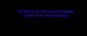
My project is partially inspired by Yayoi Kusama’s use of polka dots in many of her works, as each dot is both aesthetically and symbolically significant. In the context of my project, each dot will represent a data point, which is also a human life. I hope that by visualizing the quantity of dots (lives) over time, the users will be influenced to think more deeply about the global health issues we face.
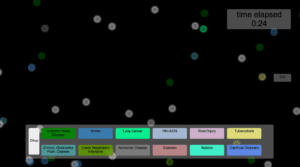
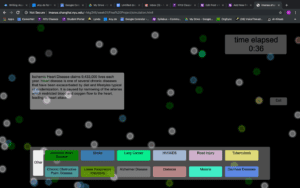
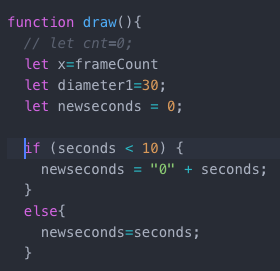
To provide the user with more information, my project includes a key at the bottom of the window that classifies which colored dots correspond to which disease. When the user hovers over the key elements, they can read more about the specific condition. A clock in the top right of the page also allows the user to related the number of dots they see on the screen to the amount of time elapsed.
Process: My biggest concern in making my project was making the timing accurate to represent the data. While I was initially unsure where to start, this aspect turned out to be quite simple once I procured the data and calculated the correct frame rate at which to make each point appear.
I ended up spending the most time adjusting the visual aspect of my project. I found there to be tensions between aesthetics and readability. I wanted the meaning and information of my project to be clear so that the educational aspect would be effective, however I also didn’t want to the interface to look so casual that the subject matter would be take lightly. I spent a surprising amount of time changing the colors of the data points so that the interface would not look too cheerful, however this in retrospect made the colors difficult to identify. I also realized that the fastest appearing dot is the white “other” dot. Even though I included data from the top 12 causes of death, the sum of deaths by all other causes is still larger than any of the individual top 12. To the user however, the project is less meaningful when the largest quantity of dots have only general information available. Though it would be beyond the scope of this project and the data that was readily available to me, it would exciting to map the top 100 causes of death to provide more detail for the user.
In creating the pop-ups to provide information for the diseases in the key, I also found it hard to decide which information to include. Depending on the disease I would describe risk factors, reasons it is particularly dangerous, and comments about who it effects most, if relevant. I think in the future I would do deeper research into each particular disease and add a link to an entire page about the disease rather than just the pop-up.
Future: Admittedly, my project was somewhat limited by my amateur-ness at coding. Right now the project provides insight and comparisons between diseases, but not between world regions or income levels. While I feel I accomplished my initial goal, I think the project requires itself to be expanded upon in the future so as to encompass more data and better represent the inequality that lies behind the distribution of burden of disease. I would like to add a sequence of pages in which the data of low income, lower middle income, higher middle income, and high income countries are represented. This way the user would also see a large disparity in the types of disease and the death rates across income level. I would also take into account the stylistic and conceptual recommendations I was given. To improve the view-ability, my classmates suggested that I make the key appear as a side panel and ensure that data points are contained to particular coordinates. The colors I chose, because I intended to preserve a more solemn appearance with muted tones, were difficult to distinguish from one another, making the data more difficult to interpret. As Professor Moon also pointed out, the polka dots are a missed opportunity for a more creative expression of life and death. Designs that fall and then rise as stars, for example, would create a deeper narrative while still illustrating the data.