Recitation 8. Serial Communication by Frances (Fan Yuan)

Instructor: Marcela

Exercise 1: Making a Processing Etch A Sketch

Steps:

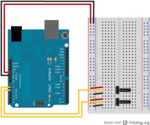
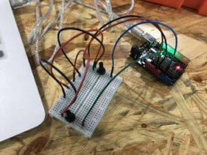
  1. Build a circuit with two potentiometers and Arduino
  2. Use Arduino to read the values from potentiometers and send them serially
  3. Use Processing to draw an ellipse whose x and y values are based on the input from Arduino.

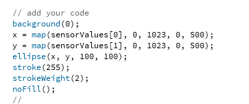
We were already experienced in building circuits and drawing ellipses, so working separately on Arduino and Processing was not hard. The more difficult part was to connect them together. We were provided example codes to start with. First, I modified the number of sensors and values to let it match the circuit I built. Then I followed the instructions in the code and changed the PORT_INDEX into the port index of my laptop. Then, after uploading the code to Arduino, I can now see the number that is sent to Processing. The numbers were stored in an array called sensorValues, so I put the corresponding values at the positions of x and y in ellipse function and it worked.

However, the ellipse sometimes disappeared from the canvas, because the range of the values sent from Arduino was 0 ~ 1023, but the canvas size was 500. To solve that problem, I used map function to change its range to 0 ~ 500.

Exercise 2: Make a musical instrument with Arduino

Steps:

  1. Use Processing to send values to Arduino based on mouse’s x and y positions and other keyboard/mouse interactions
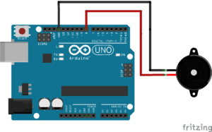
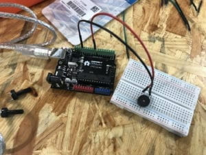
  2. Build a circuit with Arduino and a buzzer
  3. Use Arduino to read the serial values from Processing and translate them into frequency and duration for a tone, which will be sounded by the buzzer 

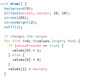
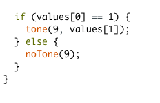
For this exercise, I decided to set the frequency based on the x position of the mouse. I first changed the code in Processing to send the value of mouseX to Arduino and connect the circuit with buzzer and set the tone function’s second parameter to the value read from Processing. When testing, the buzzer did make sound accordingly, but it won’t stop, only if I disconnect it from the power. So I set the buzzer to turn on and off by clicking the mouse. I send value 1 to Arduino if mousePressed is true and 0 if it is false, and turn the buzzer on and off according to that value. I also tried to use the keyboard to control the buzzer, but I found moving the mouse and clicking it a better combination. To optimize user experiences, I also added an ellipse to make the position of the mouse more straightforward.

Processing:

Arduino:

Preparatory Research and Analysis by Frances (Fan Yuan)

During the group project, I defined interaction as “a cyclic process in which two purposeful actors alternately receive, process and respond to actions or information”.In addition, I emphasized on the significance of processing, as people naturally perceive reception and respond as essential parts of interaction, while processing is more often overlooked. In the past few weeks, we’ve gained a deeper understanding of interaction through classes and practice, and my definition of interaction has evolved as well. I still agree with my initial definition mostly but learned from the experience developing my midterm project, as well as other people’s work, I now think interaction not only happens between two actors but also among three or more. When more roles are involved, interactions happen simultaneously and affect each other. Moreover, during an interaction, actors respond accordingly based on the commands and the ways they process. For example, pushing different buttons or for different times will lead to different results, and I think it is also a feature of interaction.

Project that aligns:

This project consists of a cube of mirrors that spans and redirect light and sound based on the movement and positions of the people surrounding it. The project aligns with my definition because it senses the surrounding people, processes all the information and spans the mirrors to reflect light and sounds accordingly. It also well presents the changes I made to my definition. The whole cube interacts with multiple people at the same time by including all positions into calculations to decide how to span the mirrors. As a result, each individual’s movement will affect others’ perceptions of the light and sound as well.

Volume – Interactive cube of responsive mirrors that redirects light and sound

Project that does not align:

This project contains three objects that were designed to encourage people to reduce the unnecessary time they spent on phones, and I’m particularly interested in the third one. It is designed for restaurants. Customers can put phones on the device and charge them, but they cannot use their phones at the same time. The device will record the time and customers can print out the percentage of time spent on the phone during the meal. I think the project does not align with my definition of interaction. It does interact to some extent, but the degree of interaction is relatively low. Its only responses are turning lights on when the phone is plugged in and showing the record time. It only has one single input, so the process part is not emphasized much.

Connected Tools – Devices that mediate smartphone consumption


Derived from research and my own experience developing interactive projects, my definition for interaction is: a cyclic process in which two or more purposeful actors alternately or simultaneously receive, process and respond accordingly to different actions or information. And based on the statement Crawford put forward in his article “The Art of Interactive Design” that interactivity has degrees. I think it is important for interaction to respond differently according to the inputs and the way it is designed to process the inputs so that it’s not merely, for example, turning on and off the lights. And it has to be in a cyclic process, each part alternately receives and gives out information or interacts with multiple actors at the same time, and the response could be diverse and always in change.  

Recitation 7. Processing Animation by Frances (Fan Yuan)

Recitation Exercise

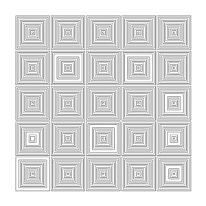
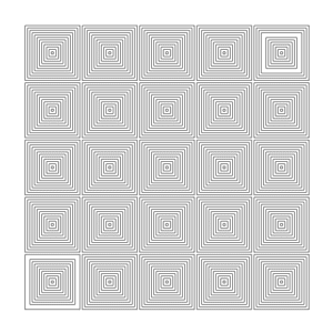
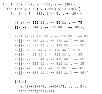
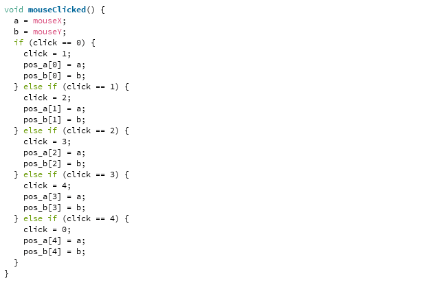
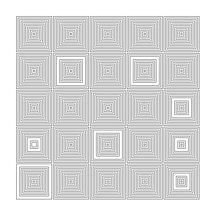
Last week I created these two images based on VERA MOLNÁR’s work, and for this week, I decided to develop my project from my previous one. The way I created these images last week was to first generate all the squares including the missing ones, and then take out the missing squares by calculating and adding all the corresponding positions into the code. When I was doing it last week, I already felt that typing in the positions one by one was not the best way to do this. During the creation process, artists have to transform their ideas into coordinate numbers, which is extremely inconvenient and not intuitive. So I decided to use our new interactive animation knowledge to improve that.

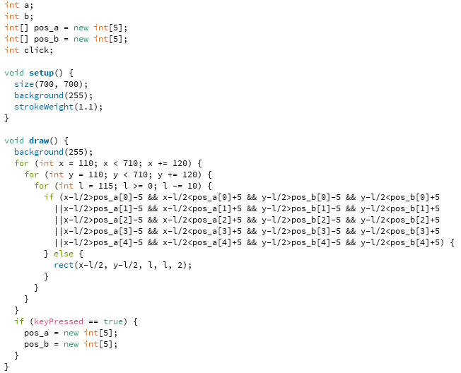
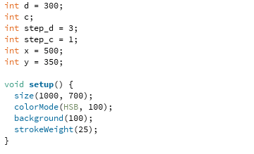
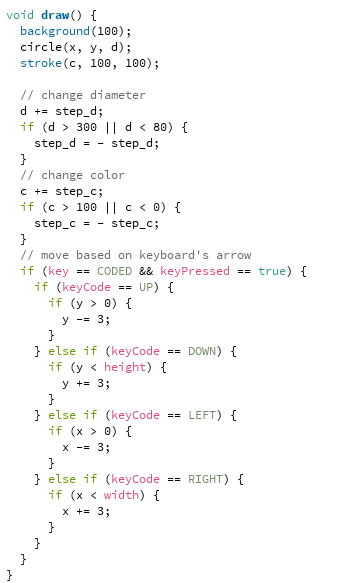
My final work interacts with users through keyboard and mouse. Simply by clicking on the top left angle of the squares, users can remove the squares they don’t want and create their own artwork. And by pressing any key on the keyboard, they can start over. 

The limitation is that users can at most remove five squares. When they click on the sixth one, the first one will show up again. If someone wants more squares to be removed, we can change the code to achieve that, but the numbers can only be set to a certain amount. What can be improved is to make the number unlimited, but I haven’t figured out the right way this time. 

Additional Recitation Homework

Recitation 6. Processing Basics by Frances (Fan Yuan)

Instructor: Marcela


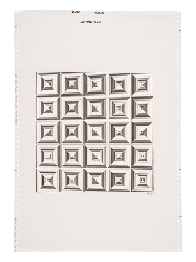
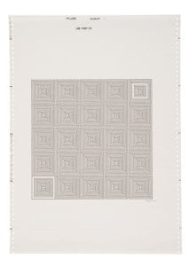
VERA MOLNÁR     |    Untitled, 1974
 

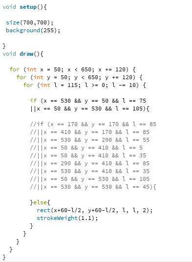
Here is the image I created with Processing and my code.


I also created another similar image from the same series by changing the if condition. Moreover,  with this method, more images like these could be generated easily.

Schrödinger’s Cat – Fan Yuan (Frances) – Marcela

Partner: Theresa Lin

CONTEXT AND SIGNIFICANCE

The inspiration for our project comes from me and my partners’ own experiences. Both of us are indecisive, and we always spend much time deciding what to eat for lunch, or whether to order bubble tea. Many of our friends share the same problem as well, so we decided to create a decision maker, that could help us make small everyday decisions and save us time and effort. The output of our decision maker only contains yes/no answer, because we want the operation of our decision maker to be simple and fast, which aligns with the purpose of our project. Users don’t need to change the settings like the number of choices. All they need to do is to press the button and they will get a yes/no answer.

During our research, we found a project that integrated the idea of the famous thought experiment Schrödinger’s Cat with the decision maker. https://www.youtube.com/watch?v=B7sKqlM4LZg&t=1s  In simple terms, the experiment is to put a cat in a sealed box with poisons and a radioactive source. When inside the box, the cat is in a superposition of both alive and dead. While our observation of the experiment forces the nature to “collapse” to one option, alive or dead. More information could be found in this short video. https://www.youtube.com/watch?v=OkVpMAbNOAo  We found this combination really fascinating, as the uncertainty and mystery of Schrödinger’s Cat add more fun to the decision-making process and is more engaging. We re-created the project and the major improvement we made is to let it finish shuffling the cat’s states before the door opens, which is more aligned with the original experiment.

CONCEPTION AND DESIGN
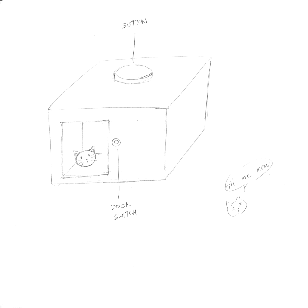
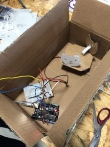
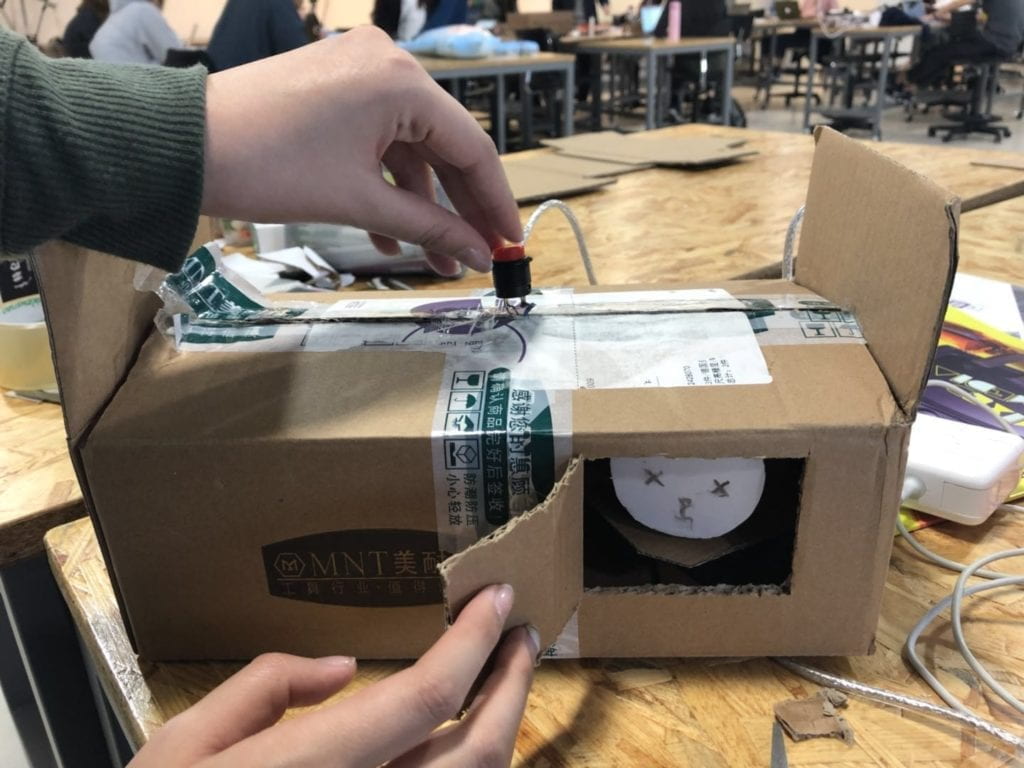
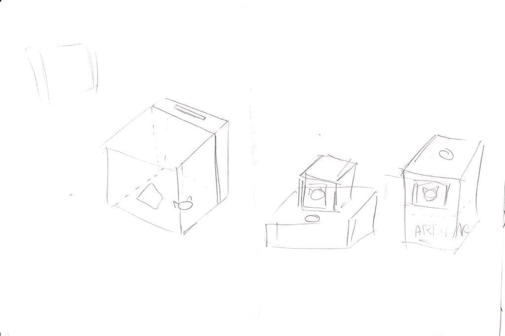
In order to achieve our goal, we used a button to trigger the shuffle and door opening, so that the shuffle could be done first. We made two cats and placed them on a surface that is spanned by a servo to randomize their positions so that users can see different states of cats in the same position. And we placed a red button on the top of the box to attract users’ attention to press it. So users will first press the button to shuffle the cat, and then open the door to see if it’s an alive cat or a dead one, which implies a yes or no decision.
FABRICATION AND PRODUCTION

While during the user testing session, some problems of our original design showed up. First, without clear instructions, users don’t know when to ask questions, when to press the button and when to open or close the door. These steps need to be performed in a specific order to fulfill the project’s goal, while users tend to get confused about what to do next. To solve this problem, we decided to change the manually opened door into an electric one and make it automatically open after cats’ positions are shuffled.

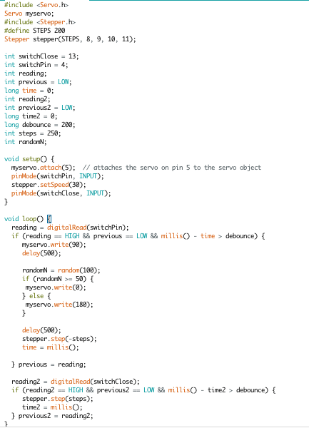
To achieve this, our code is below.
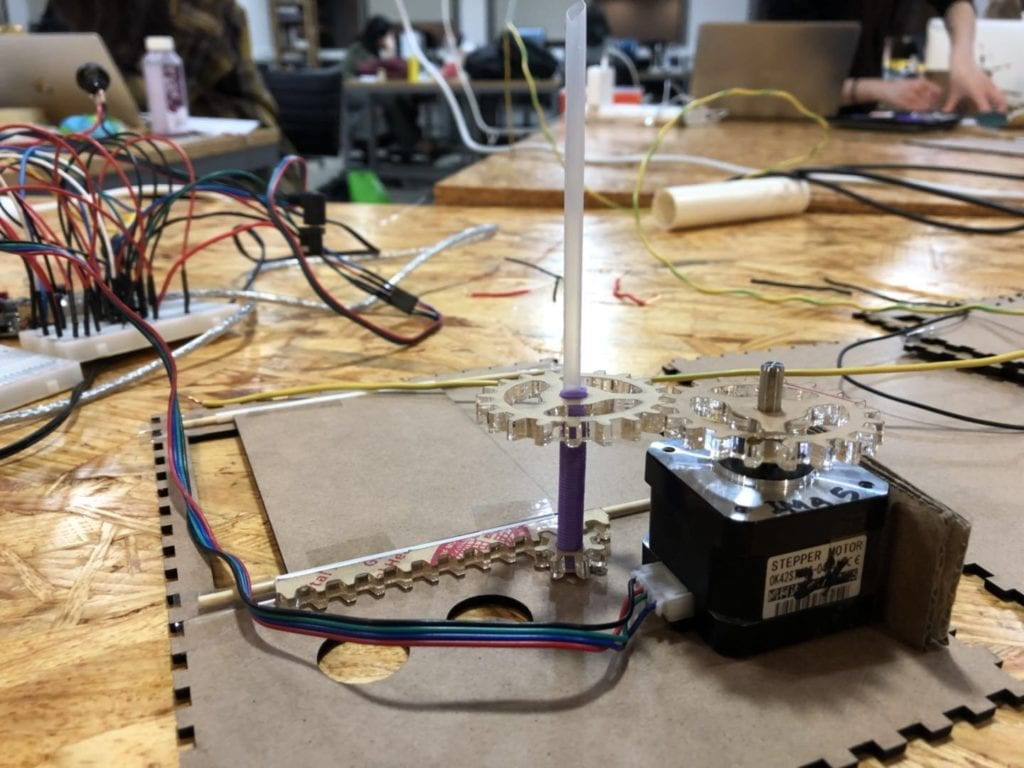
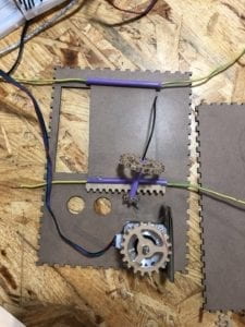
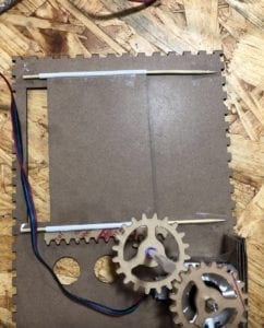
Building the electronic door was the most difficult and time-consuming process in our whole project. I first find a YouTube video tutorial on how to make an electronic window using motor, gears, and rack. https://youtu.be/8ci4ssVTRz0  Then I tried to look on Taobao to buy the components, but it was hard to get the right size. So I use illustrator to change the size and shape of the gears and rack and laser cut them myself. And instead of using the motor showed in the video, we used the stepper motor because it’s easier to control it to stop after certain steps.

One problem we met was that we first used wires to hold the straws and gears, but because the gears‘ teeth have to be engaged with each other, the wires are too soft and thin that they can’t hold everything in place. After trying combinations of different materials and different sizes, we found the straws and bamboo sticks from family mart a perfect match.
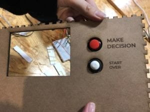
Apart from using a red button to control the shuffle and the door’s opening, we added a white one beside it to close the door. The intention behind this design was to make sure users don’t forget to close the door so that the next user’s experience won’t be influenced. We also thought about using only one button and there could be two possible methods to fulfill it. First is to set a time range and the door will close itself automatically, but during user testing, we found that the time different users looked at the cat varies greatly, so it might be user-unfriendly to set a fixed time. Another method is to set it as the first time someone presses it the door opens, the next time the door closes, but we also abandoned that method because users are likely to leave the door open.  
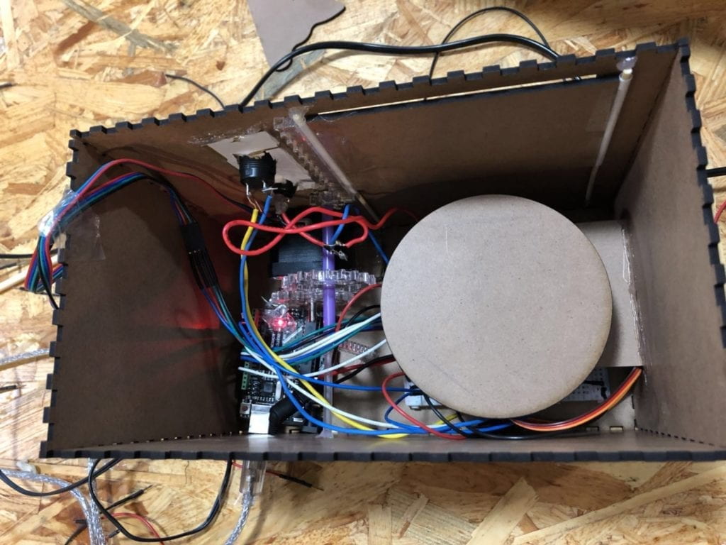
Moreover, sometimes users don’t know where to look at after they press the button. Originally, our button was installed on the top of the box, while the door was on the side face. And we hid Arduino, wires and other components all beside the door, so the box was short and wide. Users have to bend down to look inside the door. Installing an electronic door definitely solved this problem to a great extent, as it attracts users’ attention. In addition, we also redesigned the box to be taller. We moved the door higher and hid other components all at the bottom.
We also add yes and no beside the cat to make it easier to understand, even for users who don’t know the experiment well.

CONCLUSIONS

The final result of our project is actually satisfying. Because of the implementation of the electronic door, the sound of the stepper motor running covers the servo’s sound. So users only see the door opens and the state of the cat has changed “secretly”, which is in accordance with the idea of Schrödinger’s Cat. The user experience is also more friendly. We had classmates and friends to try our project, and most of them know clearly how to use it without our explanation. And the questions they ask are not just limited to decisions, but also questions like “will I pass my midterm?”, which I think would be an interesting function to add to our project: fortune teller.

As for improvement, we were planning to add some LED lights somewhere around the cat, and they could light up the cats so that the result will be clearer and more straightforward. Limited time was one reason we didn’t do that. The other more important problem was that our box was small, and we had too many wires already. What we should do next time is to plan everything better, especially to take more consideration on the wires as they actually take up a lot of space and could influence the overall appearance greatly.
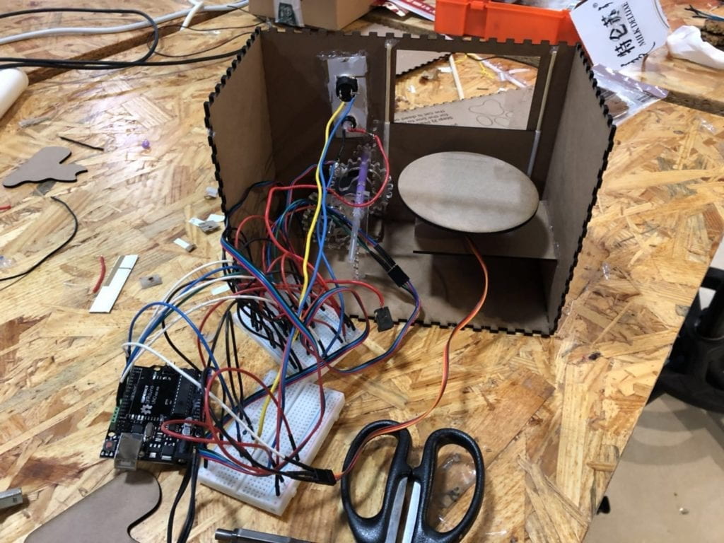
 

Here is a video of one of our friends user testing 🙂