AI ARTS- Final – Modified Turing Test- Eszter Vigh

AI
Robots are taking over!!!!! Or are they really?

Inspiration

After going to the museum field trip and experiencing the “fake smart house” piece, I knew I wanted to do something engaging.  I met with Aven to discuss a project using a modified “fake” AI Chatbot. 

Motivations

There is something to be said about social cues and the intricacies of human conversation. There is a growing gap between individuals who trust and do not trust technology. This was an idea first introduced to me in my Information Technology in Business and Society course last year, most notably with the: Will Robots Take My Job exploration. There was a project by Google, an AI essentially took the job of being an assistant and made appointments on behalf of the boss.

There is a new face scanning system to get into the building, there is a certain level of distrust with that program too, as many outside of IMA and CS don’t understand the safety mechanisms regarding the program. It is very interesting to see that sort of divide. 

Turing test
Turing Test

Modifications

For an actual Turing test, I would need social science experiment approval. We did not have the time to get that paperwork processed, so as I result I modeled  the setting as an IMA user-test with questions one would normally ask after a user test.

Aven Meeting
Professor Meeting!

So a summary is:

  • Test of a machine’s ability to exhibit intelligent behaviour equivalent to, or indistinguishable from, that of a human (wikipedia)
    • In this case, I will create a Chat-room occupied by myself (masked by the username: AI) and an unsuspecting user tester
  • Data not collected for privacy issues.
  • My “chat bot” was coded in node.js

There was a five question, paper survey. The questions were as follows:

After Use Survey

(type in a greeting to begin chatting)

Date:

  1. How human is it? (0 being not remotely human, 5 being very human) Circle one.

0                1                2                3                4                         5

  1. What was most human about it?
  1. How un-human is it? (0 being it’s not remotely un-human, 5 being very un-human) Circle one.

0                1                2                3                4                         5

  1. What was most unhuman about it?
  1. Would you feel comfortable using this project again? Why or why not?

Method

I used node to create a very simple interface that was easily local hosted. We learned about node in Moon’s Machine Learning Class, so I took the skills I learned in that class a couple days later to actually build this project. It was my first time using node, so I consulted a number of blogs for a guide. The source I linked just before was my favorite!

Next-Steps

I wanted to run the experiment live at the IMA show, but due to three other projects I couldn’t. As it is, I straight up abandoned my project in Leon’s class and didn’t get to talk about it at all. It’s very sad. 

Aven and I talked about showing this in a very different setting. Should the opportunity come to show this, I would be more than happy to. 

If I were to do this again, I would start the approval process for a social science experiment so I can conduct more Turning test-y environment tests. 

Survey- Comments

Answers to question 2:

Humanness
Human-ness

This was exciting!

Answers to question 4:

yikes
Un-human-ness

Apparently, I’m not a good listener 

Answers to question 5:

“Very comfortable”

“It comforts me! :)”

“Definitely!”

“No”

“Yes”

“Yes!”

“Ok, it’s slow”

“Yes, but later”

Overall, users would like to talk to the bot/me again. That was really exciting. I scored an average score of 3.5625 in terms of my human-ness, and a 1.3125 in terms of my inhuman-ness out of 5.

It was interesting because many of the users, knew me… quite well! So it was shocking that they didn’t pick up on my mannerisms, but of course that being said a couple of them questioned whether or not I was just typing out the answers. 

PowerPoint (Final Presentation)

I presented my final project as a powerpoint, where I explained what I had done. My live server wasn’t working, but in theory you can run this project modified with your server information. I have added the code to the end of this.

Modified PowerPoint (As I am not present to explain it)

Code

benignity- Machine Learning New Interfaces- Final- Eszter Vigh

NO
No SnapChat Filters

Inspiration:

Still working off of my midterm “cancer project” I wanted to take the idea in a new and very different direction. I was HAUNTED by the suggestion that the project was a snapchat filter. I wanted to do serious work and I realized that if I wanted to covey serious topics I had to frame and present the work in a way that conveyed my intentions. 

Instead of focusing on beauty and growth I wanted to reframe the project as a visualization of the dehumanization of cancer patients. I wanted to have a very delicate floral design on top of the user, covering them up completely. Somehow I wanted to show how their life was still separate from the cancer and treatments. 

The main question was… how. (I wan’t even sure when I proposed this project… so the journey to the final result was long.)

Starting with the Fun Part: p5!

The only salvageable part of my midterm was the idea of a p5 overlay of graphics. The question was, if not Henna style flowers, then how was I going to make something super delicate looking. I very randomly went to a workshop for I think another class entirely led by Konrad. It was there that we worked on intricate sin/cos drawing creation that was far more advanced than my dotted style. 

This was going to be the graphic I spring-boarded from, it would ultimately be re-colored and pixelated… but that is a later step I’ll get to a little later.

KNN- The Struggle is Real

KNN
KNN Struggles

KNN and I… we don’t get along. I think that is the simplest way to put it. I had previously done a homework based on Southern Chinese Sign Language. It didn’t “suck”, but basically I realized how limited KNN and PoseNet was. It doesn’t really detect your fingers. In my case, I realized this was once again going to be the issue if I wanted to do ALL of the cancers. There was clearly overlap if you are just taking wrist position into account. An example is colon and stomach. None the less, I selected about half of the cancer from the sample list I had in my proposal. 

I will say, just because I am so painfully awkward, I found myself saying well I have… ____ cancer, I have _______ cancer, more like trying to show that I was training a set trained on a given cancer form… not that I actually have cancer. (No seriously, I am totally fine, I just couldn’t English for a little bit… sleep deprivation is at fault I promise.)

KNN in my case was a modification of the “rock,paper,scissors” example like last time. I added about 200-ish data points for the version I presented at the IMA show, which was modified to work when the user was sitting down. (I didn’t save that particular version… I mean I did but it was on IMA Computer 20, and I didn’t think to save it until I began writing this post). I added an empty example set as well just to help in the accuracy, but once again that is something that was for the show specific version.

Pixel Manipulation – Moon is a Literal Wizard

Peter Parker
Inspiration

Now, I had this idea in my head that I wanted the user’s final image to Peter Parker out of existence. (I am including a GIF of that because that scene from Infinity War is just that good.) Just because they, the user, don’t have cancer so they don’t have to live with the consequences of having cancer. 

I had never done anything close. Basically we applied things I had learned with BodyPix, like grid size to help splice and separate the image into pixel squares. 

Then it was a matter of understanding logarithmic functions to make them move. This took… one and a half office hours to understand on my part.

What the Flower Means – Deep Thoughts 

Test 1
Tests!
Neck
Testing!
test
TEST
Testing
Tests
liver
Testing!
Kidney
Test!

The dotted white line, represents the treatment cancer patients have to go through… so doctors appointments, checkups, hospital stays, etc. The flower is colored based on the “diagnosed cancer” and represents the life of the patient. The patient is lured out as, they as a person cease to exist as all anyone wants to talk about is the cancer. 

Bringing it All Together – Intervals and Frame Countmlnimlni

Using the FrameCount method from the midterm, I was able to effectively stop the flower from drawing more than I wanted it to. Then by adding an arbitrary number (like 250) in my case, I was able to stop the pixel manipulation sequence from going on forever. Using intervals, I was able to give a secondary threshold to the KNN, so in the case of the final it was 200 frames of a pose to cause the floral image to draw. In the case of the “normal demo” copy, it is 60 (that’s mainly because my personal laptop is just WAY slower than an IMA laptop, sorry). 

Saving the Results- Space Bar for Flower, Ending of the sequence for entire Image

I implemented two saving mechanisms. These saving mechanisms are meant to be able to allow for printing of the user’s experience so they have a lasting impression after. It’s a last touch added after the presentation on Wednesday. 

Cancer Ribbons
Cancer List

Conclusions-Next Steps

I like my project, if I had another month to just add data points to the KNN I would. Ideally the project is presented standing up, but sitting works as well just do long as the data set is modified. It would be cool if I could use the same dataset for both sitting and standing sequences.

Ideally, I want this work to be published or shown in a big setting, once I have more of the bugs worked out. The message is important. It is something that resonates with millions of families round the world. 

Special Thanks:

Professor Moon for your help, your presence in the lab during the finals crunch is much appreciated.

LA Jessica, for teaching me abut empty examples. 

My roommate Sarah, who served as the “user” during the IMA show to make the entry display always active so people had something to explore and talk about the second they entered the room.

The Code

AI ARTS- Week 12- Final Proposal- Eszter Vigh

AI
How Users Think of AI

I went back to the drawing board with this idea SO many times. It took visiting McaM to really get an idea solidified. I’ve been working towards that idea since that field trip last Saturday. 

So what’s the big idea? 

It’s an AI Chat Bot. But what I want to do with it… is kind of cool. I want to ask users afterwards to provide feedback on it. So, the core of my project is to have a chat bot that is as human as I can make it (using a Google API).

NOW… here is my big issue. I don’t want to collect the chat history or any data really from the users. Rather, I just want user-tester feedback. The google API unfortunately, “By default, bots can only read the basic identity of users that invoke them. This information includes the user’s display name, user ID, email address, and avatar image.” I don’t even want that. 

So, I may end up using a slightly different API. I found this tutorial, and I think it will honestly be better.

This tutorial requires my own data. I’m going to do some experimentation and research on what other AI conversation bots use as their training data and then maybe include some of my own Eszter-isms. What I still really need to narrow down based on this blog post I found, is what the purpose of my AI chat bot is. Do I just want to make it an all-around bot and have users find out what doesn’t work? Like… try to see the limit of knowledge the bot has? 

Survey
This is a potential hypothesis

That would be cool. (At least, I think it would be). For the User Test survey I want to ask the following questions:

  1. How human is this Chat Bot ? (Scale 0-5, Five = Practically Human, Zero= Obviously Coded Computer)
  2. What did you find most human about the chat bot?
  3. How un-human is this Chat Bot ? (Scale 0-5, Five = Undeniably a Computer, Zero= Human)
  4. What did you find most un-human about the chat bot?
  5. Would you feel comfortable using this Chat Bot again? Why or why not?

I want to set up a computer in the IMA lab with my experiment with a little survey collection box. I plan on shredding all of the survey results after to maintain privacy of the users. The goal is make this fully anonymous and voluntary. 

My hypothesis for this project is that most users will feel uncomfortable using the chat bot because of the same logic they use to reason through not signing up for the face-scanner to get into the building. I think they will view this user testing session will reveal some conflicts between human and machine. 

The design of the chatbot will be super simple, very basic chat room-esque is what I am going for. 

AI ARTS Week 11- Deep Dream Experiments – Eszter Vigh

Jennifer Lawrence
My starting Image

Aven’s Deep Dream example with his face was scary. I was wondering if maybe it was just that specific filter he has chosen to use for the example that yielded such a terrifying output.

Deep Dream
Deep Dream Attempt 1

So the first thing I learned with the example is YOU MUST USE CHROME. I am a safari user, and I couldn’t get my own image uploaded into the sample. I restarted my computer several times before giving in and switching browsers. This was my first attempt using Aven’s presets to see if I could get a result (as the in-class example videos just would not work for me, despite Aven’s continued efforts to help me).

another experiment
Slightly Different Filter (3A vs 4A)

I picked the most aesthetically pleasing option, in this case option 3A over 4A. I liked it slightly better, so I thought maybe the output wouldn’t gross me out as much as the previous example. (I was wrong, but I didn’t know that yet).

3A
Continued 3A filter Experimentation

So I worked through the example, changing all of the subsequent parts of the process to reflect my 3A filter preference. I felt like the 3A filter gave the whole image this more “comic-like” design, at least from a distance. 

Iterations
Further 3A Iteration

Then I decided to do the zoom example, and this is where I stopped liking 3A and Deep Dream altogether. It starts looking as if my favorite actress has horrible scarring from a distance.

3a zoom
Zoom Attempt

Zoom 1 didn’t help. I am happy that this isn’t the “eye” example that Aven did because that was creepy, these squares were nicer, but this zoom still showed her mouth, and it made the now striped patten look odd. 

Zoom zoom
Further Zooming

The zoom feature worked well! Further zooming yielded actual results. It’s a relief that at least SOMETHING works in terms of examples. I still haven’t been able to get Style Transfer stuff downloaded, but at least this worked. 

Not cute
This isn’t cute

UPDATE! Hi! I got the video to work with my old LinkedIn photo! Enjoy! 

It is a total of eighty frames. The actual information on how I inputed the variables is here:

ai inputs
Inputs!

MLNI- Final Project Proposal- Eszter Vigh

I went to a workshop held by Konrad. At first, I really wasn’t sure what I wanted to do for my final. It’s one thing to say, “Oh, I’ll just continue to work on my midterm”, but in practice it doesn’t always work like that.

I was disappointed with my midterm, it wasn’t nearly as polished as I wanted it to be when it came to presenting it. I think after that project, quite honestly I am in a creative slump with little motivation to do anything. When it comes to this class… I couldn’t think of anything I really felt connected to, or motivated even to explore for a final. 

I knew what I wanted to do for CDV and AI ARTS almost instantly… and this final for whatever reason is just not coming to me. The closest I have come to inspiration is this new form of floral art. 

It felt more delicate, more me. I think I just need to rework my midterm completely. Maybe these floral creations are on joint points, accessible through PoseNet… I like the idea of a completely white background and maybe sound input changes the hue of the florals. I feel like I need to use KNN to get top marks, but it doesn’t make sense to use it unless I am changing the florals’ hue based on pose. 

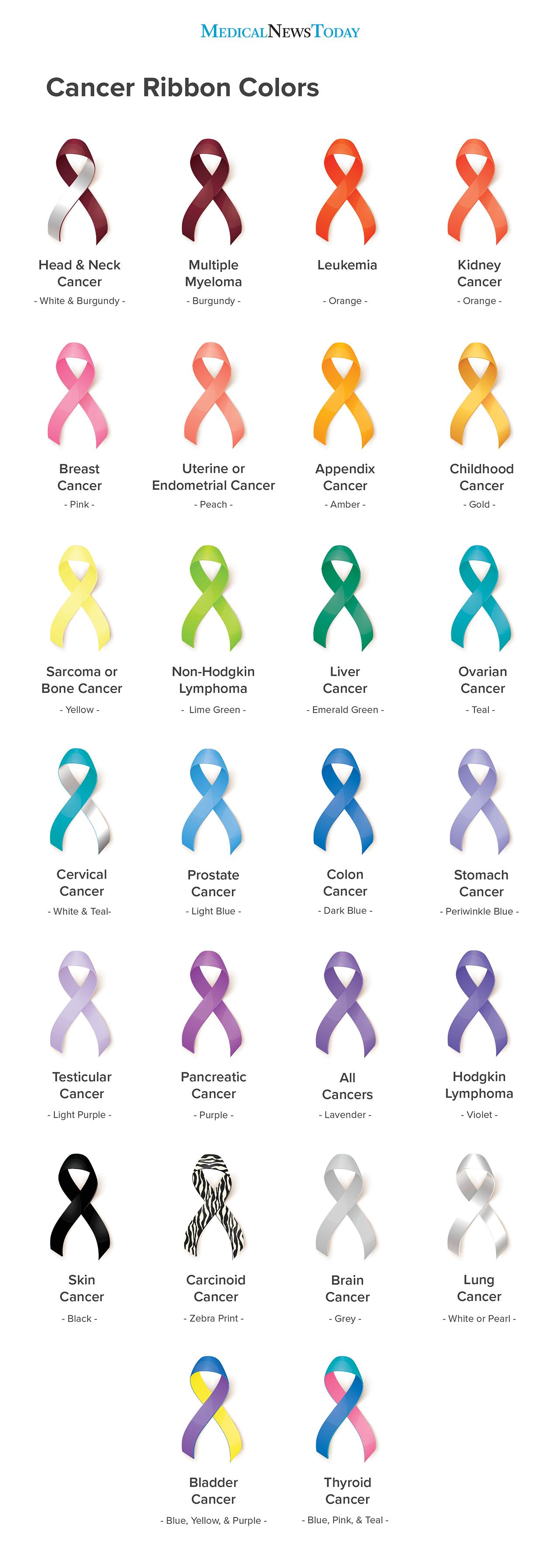
The poses could correlate to something…  secret. I had done my KNN homework, semi-successfully on Southern Chinese Sign Language. What if certain poses… correlated to cancer ribbons. (Way to go Eszter, another morbid topic!). It’s subtle. As you can see, the design I have right now has the vibe of water color flowers. 

Ribbons
Cancer Ribbons

You practically have the entire rainbow here. The project can just be a case of practicing anatomy and training a rather complex KNN. It’s just a delicate education tool. I could print little cards with this same information, I know the school prints business cards, why not print the ribbons on it too, just as a small reminder. 

At the end of the day, I want to create something really beautiful and delicate, still based off my midterm, but more polished. The last thing I want is for anyone to think of this as just another snapchat filter.  I don’t want to target my  work at children, I really want to target this project for users that are older, looking for a more refined way to educate. 

(What you see above, is my entire thought process trying to develop this idea. I literally had no idea what I wanted to do when I sat down to write this post. Amazing how looking through my p5 library and thinking through my past assignments changed that).