Recitation 7. Processing Animation by Eva

In this Recitation I will be using Processing to animate an image, as well adding an interactive element from the user’s input. 

Demo Video:

Seizure warning. This template is intended to provide a warning of content which is more likely to trigger seizures due to flashing lights or other causes. 

autofocus

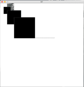
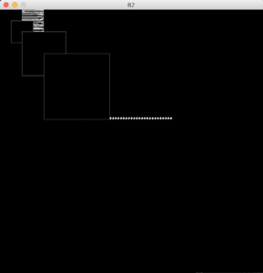
Stagnate images of the animation:

Unlike the previous Recitation, this time I wanted to explore the polar opposites of the colour spectrum: black and white balance.  I should rather say- their relationship. 

The dark and light values bleed into each other with such force and power, I felt my blood starting to pump also. I created a piece that would allow the user to alter the intensity of the values of the focal point with the mouseMoved() function. This element plays a role in my overall journey of The War of Colours, that I’m currently exploring. The overlapping randomised lines, as well as the stagnant line of dots are additional elements in my overall minimalistic style creation. The mousePressed() function gives a higher rate of satisfaction when utilised from the perspective of the users, due to its instantaneous trigger to change the value from white to black and vice versa. I am very happy I was able to overlap these two functions without distorting one another.  Additionally since I am working on a mac, and my computer mouse is black with a white outline, I also found it very pleasing to see how this figure was interacting with my design.

I am beginning to feel out the Canvas much better, and be able to statically place the elements rather than depend of liking whatever the computer generates.  I was able to explore the area of the Canvas, as well as user triggered input through this process and am excited to learn to incorporate hardware as a triggering input.

Code:

PFont font;

int value = 0;

void setup() {
size(600, 600);
background(255);
font = loadFont(“Trattatello-48.vlw”);

}

void draw() {

textFont(font, 24);
fill(0);
text(“…………………………………”, 160, 250);

for (int i = 0; i < 100; i++) {
float r = random(50);
stroke(r*5);
line(50, i, 50+r, i);
}

fill(value);
filter(INVERT);
rect(25, 25, 50, 50);
rect(50, 50, 100, 100);
rect(100, 100, 150, 150);
}

void mouseClicked() {
if (value == 0) {
value = 255;
} else {
value = 0;
}

}

void mouseMoved() {
value = value + 5;
if (value > 255) {
value = 0;
}
}

Additional Exercise:

I began by created a Processing Sketch for the initial stagnate ellipse in a 600×600 canvas. 
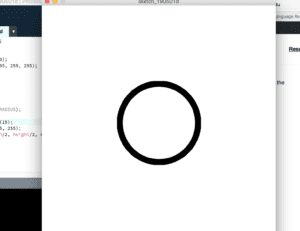
int size = 100;

void setup() {
size(600, 600);
background(255, 255, 255);

}

void draw() {
ellipseMode(RADIUS);
stroke(0);
strokeWeight(15);
fill(255, 255, 255);
ellipse(width/2, height/2, size, size);

}

The Blog has attached my demo video in a separate directory, but I have imbedded the link bellow:
DemoCircle

Recitation 6. Processing Basics by Eva

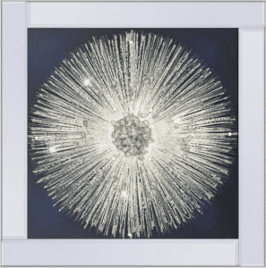
For this Recitation I will be using Processing to create a 2D digital static image based on an inspiration photo I sourced from a Design Gallery (linked bellow).

Source: https://www.pagazzi.com/wish-liquid-art-blue.html

Description: “This picture is part of the Wish range from Pagazzi Lighting” and to me represents the abstract visual representation of the smallest particle – the atom. It further morphs into the everlasting sun, and then even further reaching is the assimilation with my interpretation of The Big Bang. The shape of a focal centre beaming out strays of light/ lines is very inspiring, and something I want to attempt in recreating by utilising my skills of coding. 

Using this lose strain of inspiration, I used the general idea of the motion I had envisioned when I discovered the image and based the initial steps of my sketch on it.

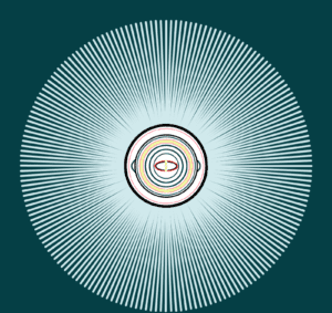
I created an ellipse in the middle by centralising its x and y coordinates and adjusted the stroke() and the strokeWeight(). Instead of rushing to create the radiants from the focal point towards the borders, I was curious in exploring what I can turn my focal piece into and thus began my first altering attempt. 

It it truly encouraging to generate art with code, especially when you hold no strict guidelines in what you are trying to produce as a final product. Each alteration to the code has (in my beginner eyes) unpredictable outcomes, and although I am excited to be able to recognise and manoeuvre through the program with more control soon, – I am currently enjoying the process of exploration.

By incorporating the pushMatrix() function I began creating the radiant placement around my focal point. The overall feeling of the image began to tie in, and I started to explore colours as the next step in designing my mandala- like design. 

The final piece reminds me of hypnotic imagery. The dense alignment of the shapes, as well as the subtle variations in strokeWeight() allows for a stagnate image to come alive if you stare at one point for a while. This came as a by product fo my code exploration, but I am very curious how I will be able to animate imagery as such in later Processing production.

Image:

Code:

void setup() {
size(800, 800);
background(5, 63, 69);
}

void draw(){
background(5, 63, 69);

translate(width/2, height/2);
for(int a=0; a<360; a+=2){
pushMatrix();
rotate(radians(a));
strokeWeight(5);
stroke(208, 233, 236);
line(100, 0, 350, 0);
popMatrix();

strokeWeight(6);
stroke(1, 1, 1);
ellipse(0, 0, 195, 195);

strokeWeight(1);
stroke(245, 39, 86);
ellipse(0, 0, 180, 180);

strokeWeight(3);
stroke(0, 44, 49);
ellipse(0, 0, 165, 65);

strokeWeight(1);
stroke(0, 44, 49);
ellipse(0, 0, 135, 135);

strokeWeight(1);
stroke(0, 44, 49);
ellipse(0, 0, 126, 126);

strokeWeight(3);
stroke(1, 1, 1);
ellipse(0, 0, 150, 150);

strokeWeight(2);
stroke(0, 44, 49);
ellipse(0, 0, 140, 140);

strokeWeight(1);
stroke(245, 44, 49);
ellipse(0, 0, 128, 128);

strokeWeight(5);
stroke(236, 251, 149);
ellipse(0, 0, 120, 120);

strokeWeight(1);
stroke(245, 44, 49);
ellipse(0, 0, 112, 112);

strokeWeight(3);
stroke(0, 44, 49);
ellipse(0, 0, 100, 100);

strokeWeight(3);
stroke(0, 44, 49);
ellipse(0, 0, 80, 80);

strokeWeight(2);
stroke(0, 44, 49);
ellipse(0, 0, 60, 60);

strokeWeight(2);
stroke(245, 0, 0);
ellipse(0, 0, 54, 24);

strokeWeight(2);
stroke(1, 1, 1);
ellipse(0, 0, 50, 20);

strokeWeight(2);
stroke(236, 251, 149);
ellipse(0, 0, 5, 10);

strokeWeight(2);
circle(0, 10, 6);

strokeWeight(2);
circle(-0, -10, 6);

}
}

Final Project Essay by Eva

My current focus is the exploration of digital art projects with the added element of interactivity, and how this additional aspect influences the art experience for the audience. I further explored the effect of seeing user’s own face reflected in the project, by exploring digital artists whom used Style Transfer mirrors. Wondering how a person would feel if they had some control over the sequence of events of them observing the art project, as well their reaction to seeing their own reflection – became my two focal points in the development of this project.

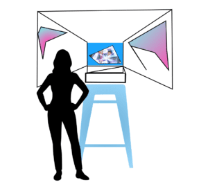
I am building a display (Fg. 1)  that will be centred around a screen, with mirrors positioned to reflect the screen towards one another, a “control panel” in reach of the users’ hand, and potentially a headset (depending if audio elements will be incorporated).

Figure 1.

In the most simple terms: I want to create a(n audio-)visual experience that will activate the camera feature and showcase the users face in the finale of their experience of navigating through visual sketches. Human behavioural patterns tend to indicate a stronger sense of awareness of one-self when a reflection of their physical appearance is in sight. This particular phenomenon made me consider when are the times we lose touch with ourselves? A routine, a mundane rotation of the dynamic lifestyle can detach  the individual from their true self. By provoking my audience to look at themselves, I am intending for them to capture a few moments out of their busy schedule to think about themselves, and what  sort of emotion is triggered when you are just faced with yourself.

The more I dive into the ever-so developing aim of the project, the more I change the physical layout for the purpose of fulfilling the maxim extent of my vision. The display with a curtain, similar to a photo-booth opening and closing, would create a very intimate experience for the user, as there would be absolutely no distractions, just the visual aid of the screen and the mirrors, and themselves.  I do truly believe the addition of audio aid would be beneficial, but I need to see the extent of my ability on this part and/or the ability to use other artists’ music. There will be no souvenir to keep from this experience, but rather a quick flashback of the emotion you felt when you saw your-self in a dark display in the IMA lab. 

More technically: I will be creating visual animations with Processing, that will be at parts interactive with a joystick that the user will be able to play with. My plan right now is to create the visual experience, currently considering the time frame from 1-6 minutes; build a small prototype of the display checking the angles for the mirrors; having the first prototype fo the display in a week time. 

W10: Preparatory Research and Analysis by Eva Solo

As I further dive into the exploration of creating, I have realised I used to experience interactivity similarly to the way I would enjoy going to the cinema; sit back, relax, and experience.  As this semester progressed I felt as if I had gained the access to the screening room at the top of the theatre, and was seeing more operations that develop that experience. As I approach the final project I am ready to take the role of the writer & director of the movie and be able to produce an experience for my audience. 

With this analogy, I am representing the role of the ability to collect tools/ (or skills) to create something I was not able to fathom before. The deeper understanding into the way hardware interacts with the digital equipment has suddenly opened a whole new corridor of doors. By no means do I feel comfortable enough navigating through these halls, but the sheer inspirations of the ability is inspiring for the long-term approach to creation.

“Cubist Mirror” (https://vimeo.com/167910860), an interactive art project by Gene Kogan – whom I’ve mentioned in my initial exploration of interactivity, is a style-transfer mirror that provokes the users to interact with themselves. This to me represents a high-level of interactivity, and let me explain why I think so: from the initial viewing, the project is just a reflection of the user with a fancy filter on it, but from the way I see it it evokes existentialist questions with no answers to be told. As a human being, I have not been told or given a purpose for being, thus as an individual I am constantly having to make decisions, which at their core could not satisfy the definition of free-will, that ultimately create a unique path that only I have experienced. The idea of an art piece incorporating the image of oneself is not the most comfortable setting, if the self is not comfortable with itself. In the video some of the users express an emotion, and it is not for me to define it, but I have noticed it – which in my opinion is a successful project.

“That Was Is The First” (http://marcinignac.com/projects/that-what-is-the-first/) is a beautiful memorial project that contains a picture of a woman, the user distance to the frame will determine the are of the subject. Although, I think this is a wonderful project, in terms of interactivity I do feel as it is very though provoking. The predetermined subject in the photo swiftly takes the attention of the personal identity and immerses in a new world of foreign visual aid. Once again I reiterate, I acknowledge the inspiration for the incentive, I am currently on a different path of perspective relating to interactive art. What would be astonishing is the ability to unite these two projects together: The frame reflects the user’s image and as you approach it further it youth-enizes the facial features, while as you move further way it adds wrinkles. This type of project would be very very emotionally provoking if immersed in it fully (and definitely something I am going to keep exploring for the future)

The concept of a “perspective” is currently on my mind. I am exploring the way a “change of perspective alters scenarios. Some of my current drawing projects are based on quantifying the infinity, in a sense of it being unobtainable to fathom. For my project, I have been initialising the idea of taking my users on a journey. A sort of interactive, make- choose, pathway that would incorporate digital illustrations and their development through user input on hardware. As evident on the choices of others’ interactive projects, I really want to see if I would be able to have the addition of incorporating the reflection of my users. Something about the visual reflection of one-self that continuously produces the largest array of emotional responses, at least in my experience with previous creations. I am also interested in seeing how I could incorporate mirrors and lights into the overall design. My current stance is to finalise the concept of how the human and my creation will interact, which will depend on the question I raise that will in some way provoke emotion. I am very curious where this project is going as I am feeling a lot of inspiration from my current stance!

Mood Mind Match – Eva Solo – Marcela

Continuing the exploration of of interactivity, Kyle and I discussed our experiences during the Group Project.  We began by exploring the way the users were meant to interact with the 2119 inventions (our separate projects, as well as the ones we saw) and narrowing down the concepts that were affective in our opinion. Simplicity is key – by having a clear idea of how the user is interacting with a prototype and what is being outputted was our main focus. What we gathered is that by taking a preexisting concept and adding our own functions to it would be a great way in exploring our newly found interest in hardware prototyping. Since we had practiced coding sensor related functions, we wanted to base our project on a particular sensor and how it interacts with a user. 

The concept of a mood ring, that based on your body temperature defines your mood, is a simple  and very inaccurate measure of feelings – this was inspiring to us! We had discussed upon the idea of human compatibility and how easily people are swayed to believe their horoscopes or any other belief has an effect on their connection. These two components set us off in making the MOOD MIND MATCH.

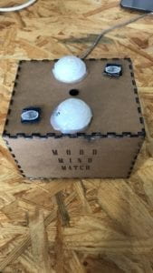
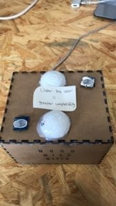
The MOOD MIND MATCH is a device that scans your finger print and produced a colour output, by using it with a partner you may compare the colour compatibility – thus obviously determining your personal compatibility. The concept for their prototype is clearly paying on the idea of irony and in a cynical way mocks all outlets that are supposedly predicting your future. We had fun in developing the underlining purpose, but now for the production of this masterpiece. 

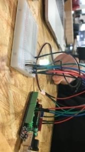
Just like the mood ring, our MMM takes a users temperature through a temperature sensor. The range of temperatures were then converted into a colour gradient as an output through a RGB led. Initially this gradient produced colours very similar in tone, but we did not want to convince our users of their true love that easily. The next step was converting the decimal values to produce very far apart colours for very close range temperatures – meaning only the ‘to the decimal matching temperatures’ would be compatible. We actually noticed a lot of complains of ‘it not working’ due to the lack of ‘pure matches’ (same colour outputs), but in my opinion I thought it was wonderful so many people expected compatibility considering the global scale of population on this earth. User testing did allow us to make changes in our representation to better appeal to our targeted audience. 

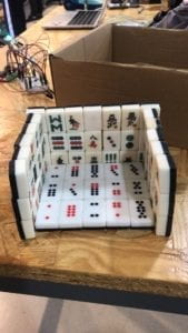
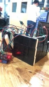
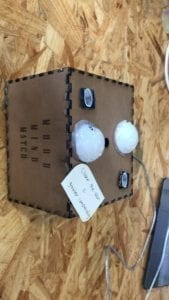
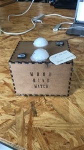
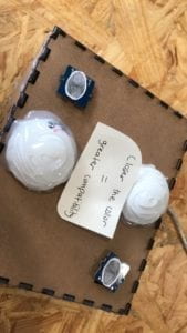
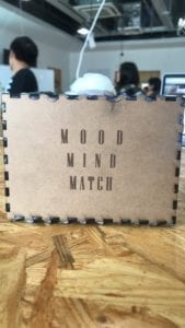
As we were satisfied with our satirical concept as well as the functioning input output circuit, we moved on to the design display – which was much more challenging to tackle. Some on the challenges had to do with the malfunctioning of the digital fabrication machinery, and thus we had to improvise by attempting to build a prototype out of a Chinese board game. Lucky for us, the laser printer was working once again and we were able to use Illustrator to design a slick-looking box with the project name on the front. This was a huge turn around that encouraged me in the last stages of production. We were able to fit our circuit inside, as well as accompany it with ping-pong ball sphere cut outs covered in hot glue for aesthetic appeal. The final step we were not able to achieve was the 3D printed heart design that would have contained a simple line of instructions – we added this with a paper instruction at the top. 

The goal of the project was to create a fun, two-user prototype that would ultimately decide their faith based on a finger scan. We created what we set out to do, even with some minor set-backs, although there is always place for further development. Now speculating on the improvements, I think the installation of a reset button would be very affective in allowing the users to interact with our device without our interfered. Another great suggestion we hear during our presentation, was for the lights to be slowly fading in and out till the output colour to signify ‘loading’ – which I think would further contribute to the experience without our contributions. The greatest concept I am taking away from this experience is how the user responds to a particular type of interaction. I do not think we emphasised (or wanted to emphasise) our initial inspiration for this project, thus allowing our testers to take it partially serious – this to me showed the impact of representation and the extent of interpretation that an audience convolutes. I can now confidently say I have a much greater understanding of what ‘interactivity’ means not only form the side of the user but a creator as well.