Final Project Proposals by Eleanor Wade

Proposal 1:

One potential project that both interests me and combines all the necessary requirements for this assignment would be based off synesthesia as it pertains to art and designs.  More about synesthesia can be found on this wikipedia page:https://en.wikipedia.org/wiki/Synesthesia   In my understanding and experience of synesthesia this is a concept that can be used to translate colors into letters or numbers.  For some reason I very definitely associate particular colors with numbers and letters (I view ‘A’ as red, ‘B’ as blue, ‘C’ as green, etc) and would be interested in creating an interactive art experience that allows users to type, for example their names, and then see which colors illuminate.  In practically thinking about this project, I would program each letter or number with an LED  (or possibly an LED underneath colored films) that would light up when pressed.  I would place the lights in an interesting pattern on a board so that each word or letter would illuminate a completely different design.  The space bar could act as a clear that would turn all the lights off again. What inspires me about synesthesia are the ways in which it brings words or letters into a visually colorful field.  I think this demonstrates interactivity in that it allows for viewers to have unique experiences each time they encounter the piece and provides something new.  I also like that there is an element of my own perspective, in that it is my understanding of letters and the colors that I associate with them.  

Proposal 2:

Another possibility would be to create an interactive way to draw with your body.  Using movement sensors that translated your action into strokes on a processing background, I would engage audiences with the ability to create new and unique, abstract designs that are directly following their movement.  I think this would be a compelling project because it would not only be interesting motivation to move, encouraging physical activity, while also providing them with interactive art.  

Proposal 2:

I am exceptionally passionate about understanding the implications that our dietary choices have on not only our health and wellbeing, but also the environment and vulnerable global populations.  I am increasingly interested in spreading awareness for the importance of our food choices, specifically when it comes to consuming animal products.  As your dietary choices have an even greater impact on green house gas emissions than your transportation choices, this is a problem that has extreme relevance and correlation to our influence on the environment and global warming.  In trying to shed light on the impacts that our every food decision has, I would like to create a project that presented audiences with different snack options.  Possibly featuring bacon, mac n cheese, and falafel (or other variations on a meat dish, vegetarian dish, and a vegan dish) that then when selected, it triggered a response on the screen that informed the consumers of the larger impact of this choice.  What I think would be especially interesting would be to not tell consumers of the purpose of this free snack before they make their choice, then tell them of the relevance that this choice has on the world, and record reactions.  This is interactive in that it would definitely involve sensors that responded when different foods are taken (like a little vending machine, when a button is pressed their snack is dispensed, the facts are delivered) and then their eating of the food.  I would be interested to know of their experience of eating each snack after learning more about what it means.  And in attempts to not be too obnoxious in my vegan beliefs, I would like to try and keep the conversations about eating animals far less aggressive and accusatory than they can be.  Rather, this project seeks to educate and inform without telling people what to do or what they should eat.  snack facts??
Recitation 7: Functions and Arrays by Eleanor Wade

Creating an interesting design with processing is not necessarily something new, so this was not too difficult for me.  Although I still found this to be very time consuming, even though I have become somewhat more familiar with coding and creating designs that do not include animated elements.  Looking back, I think I spent way too much time trying to come up with a design and making it fit into the right place on the background, considering how long it took me to figure out the much more complicated steps in this processing exercise.  I should have read through everything first and made this initial step more efficiently.  

In creating a for loop () I definitely encountered a few problems, because the variable i is in the for loop, the setup has to take from these previous points.  So it knows that I have the variable i in the for loop, but I was struggling with creating the 100 instances.  

int instances = 100;

float [] x = new float [instances];
float [] y = new float [instances];
float [] speedX = new float [instances];
float [] speedY = new float [instances];
color c;

//float [] xPositions = new float [instances];

void setup() {
  size(600, 600);
  background(255);
  for (int i= 0; i < instances; i++) { 
    x [i] = random(width);
    y [i] = random(height);
    speedX [i] = random(5, -5);
    speedY [i] = random(5, -5);
  }
}
void draw() {
  for (int i= 0; i < instances; i++) {
    thing(x [i], y [i], 150, color(150));
    x [i]= x[i] +speedX[i];
    y [i]= y[i] +speedY[i];

    if (x [i] > width || x [i]< 0) {
      speedX[i] = -speedX[i];
    }

    if (y [i] > height || y [i] < 0) {
      speedY[i] = -speedY[i];
    }
  }
}
void thing(float u, float v, float size, color c) {
  // display ball
  strokeWeight(.06);
  fill(c);
  triangle(u, v, size, size, 100, 200 );
  fill(255, 100, 89);
  rect(u-size*0.3, v-size*0.1, 0.05*size, 0.05*size);
  fill(20, 230, 140);
  ellipse(u+size*0.3, v-size*0.1, 0.05*size, 0.05*size);
}

Question 1:

In your own words, please explain the difference between having your for loop from Step 2 in setup() as opposed to in draw().

The key differences between having the for loop in  setup() as opposed to draw () is that when it is in setup it will only run once, while in draw it will continue to do the same thing over and over again. 

Question 2:

What is the benefit of using arrays?  How might you use arrays in a potential project?

Using arrays is beneficial in coding as it is a way to store many data for the set and create infinite of number of repetitive animation without having to recode each design.  This could be used in a project in that you could animate many different different designs that repeat.  Although I have found arrays fairly difficult to use as I am not totally sure where the different variables should be, I definitely plan to use these function in future projects as it is especially useful to save both time and energy in the coding process.  

Final Project Preparatory Research and Analysis by Eleanor Wade


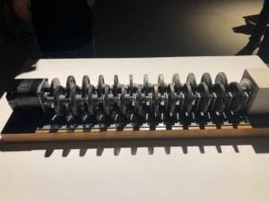
After having visited the Cronus Art Center and exploring the exhibition there I am feeling particularly inspired by all of the creative and innovative ways to integrate technology into art and design.  Not only were there many fascinating pieces to observe here, but also I find it interesting to think about the ways in which technology can add an extra element or layer to more traditional art works.  This can be exceptionally relevant when the artists are trying to make a statement that might not be familiar to some viewers.  One work that stood out to me as demonstrating a compelling use of technology was the “Beholding the Big Bang” piece made of motors, gears, and a concrete block.  While only a few of the gears in this sculpture appeared to be moving, this work is making a mind boggling statement about the passage of time.  What I find relevant about this integration of technology, movement, and motors into art is the message this is sending about the relative brevity of the things we create and their capacity to withstand the test of time.  Because it will take the final gear 13.82 billion years to ever turn, it is clear that it will in fact never happen.  However, the premise of this design and concept sheds further light on the purpose of art itself, and how we are able to appreciate such a complex machine even if we can never experience the final turn.  Rather we are left forced to come to terms with the nature of time and instead appreciate the beauty in visualizing this interesting (although frustrating) idea.  

Much of the art that I have had the pleasure of experiencing in the past, although being incredible, did not necessarily incorporate technology or interactivity into the overall concept.  After having seen this exhibit I am very excited about the idea of learning to bring together these elements to send an even more relevant and interesting message to my audiences.  Even when the objective of the piece is not 100% clear to viewers, it is evident that art that makes use of technology is capable of creating new perspectives on topics we thought we already understood.  

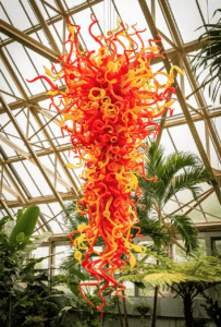
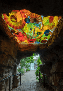
One interactive artistic experience I have had in the past and that inspires me for this project was at the Franklin Park Conservatory in Columbus, Ohio.  The artist, Dale Chihuly has created gigantic, colorful, and magnificent glass sculptures that are integrated into a botanical garden.  After both visiting this site and further researching the artist and the conservatory, it is evident that not only are the art works stunning in their size and their integration into nature and their surroundings, but also it allows visitors to fully put themselves into this atmosphere of both the natural and the artistic world.  What stands out to me as particularly interactive about this exhibit are the active  and living elements of the experience.  

https://www.chihuly.com/exhibitions/franklin-park-conservatory-and-botanical-gardens/chihuly-celebrating-nature

Although this art exhibit does not necessarily make use of technology in its design structure, it certainly demonstrates an interesting level of interaction, as it is filled with live, energetic butterflies.  This combination of striking, colorful glass structures, an abundance of natural plants, and countless fluttering butterflies create an experience unlike any other for visitors.  By adding these beautiful animals to the garden, the artists and designers have created an exhibit where much of the fun comes from the ability to interact with playful butterflies and watch as they fly around the space and then land someplace interesting.  To me this is a very successful way to make use of interaction in that it draws attention to moving ourselves throughout the exhibit and following the butterflies to watch their response.  Even though this is not something I could recreate, as I do not plan to involve butterflies into my project, I think there are many inspiring aspects to this exhibit.  I am also interested to think of the ways in which technology could be used to mimic the movements of these animals and still create an interactive experience for visitors.  Another concern is regarding the safety of the butterflies, as allowing for the public to enter these spaces is also potentially putting them at risk for people harming them in some way.  On balance, however, I feel this form of art and interaction is very successful in creating a beautiful, active, and unique experience.     

Next I researched for various other specifically interactive art exhibits that make use of technology and found this very interesting museum for children and the “Painting with Light” exhibit.  This incorporation of science and art into something really fun and beautiful for children to use inspiring to me because it is both intuitive but also brand new in its conception and execution.  I also really like this idea because it allows for the audiences to create something themselves, which I find to always be worthwhile, as it presents unlimited potential outcomes and products.  

https://creativemachines.com/portfolio/painting-with-light

I feel that this artistic site demonstrates a compelling relationship to interaction because it is giving its users (specifically children) a new tool to be able to express their individual ideas and the desire to be creative.  Because I really enjoy working with kids, I find this approach to making something that is both interactive and artistic to be really fascinating because it presents an opportunity to work with really young people that are frequently far more eager to jump right into trying something new and experimenting with creative elements.  For this reason and the inspired goal of using light to make paintings, I see this piece as being quite successful as well.  

As my own definition of interaction has developed over the course of the semester, I feel that in order for an interactive experience to be successful it must first consist of intrigue.  Intrigue (in any form– possibly cuteness, interesting design, complexity in appearance) is necessary as something must initially draw the viewers into the piece for any interaction to take place.  After this first catch, interaction must consist of the translating of communication from either the audience to the device or vice versa.  This communication in-between the various parties is critical in that it interprets the input to then generate a new response.  In my opinion, this new response is finally what is critical in order to have successful interaction in that a new result, experience, or creative output is truly the goal of an level of interaction.  As evidenced by the Chihuly exhibit with the butterflies, this experience was definitely successful interaction because incorporating butterflies into the art is an incredibly fun way to get people involved with each other and their surroundings.  I found it impossible not to follow the colorful wings from one sculpture to another and then try and hold as still as possible when one landed on my face.  Then when the butterfly was comfortable enough to interact with me on this level, I had to take pictures to share the experience.  This interaction with animals and art could not have been more exciting and dynamic.  As  my working definition of interaction applies to the second exhibit I researched, it is clear that this is successful in that it presents kids with a very new and different opportunity to create something for themselves.  In this way, audiences get to interact with the artwork in that they are putting themselves in the position of artist and are interacting with this technology to make new designs.  Ultimately, interaction allows audiences to have experiences with art forms that they may have never previously encountered and to consider the importance of movement, action, and thought when it comes to art and design.  


Recitation 6: Processing Animation by Eleanor Wade

Animating something new:

Using Processing I created this little interactive  animation.  I am still finding coding in this way to be somewhat challenging, so I mostly used elements we have previously discussed in class to make this.   It demonstrates an element of interactivity because it involves using the arrow keys to move the ball around, as seen in this video.  

Code:

int x;
int y;
int speed;

void setup() {  // setup() runs once
  size(600, 600);
  frameRate(30);
  x = width/2;
  y = height/2;
  speed = 10;
}
 
void draw() {  // draw() loops forever, until stopped
  background(random(255), random(255), random(255));
 
  noStroke();
  ellipse(x, y, 100, 100);
}


void keyPressed() {
  if (keyCode == UP) {
   y = y-speed; 
  }
  if (keyCode == DOWN) {
    y = y+speed;
  }
  if (keyCode == RIGHT) {
    x = x+speed;
  }
  if (keyCode == LEFT) {
    x = x-speed;
  }
  
}

Recitation Homework: the expanding and contracting rainbow ring

Step 1

The initial set up of this code did not present any real challenges or difficulties.  I was easily able to create a black ring on a white background as it was very similar to processing codes I have written in the past and in class.  

Step 2

To get the ring to expand and contract, however, was somewhat more challenging for me to figure out.  I used the boolean ellipseIsShrinking to control this and also played around with the sizes because in the beginning the ring would just continuously expand beyond the edges of the frame and then never back down.  I also had (z == 0 || z == 600) for a while, so that the ring would go all the way to the edges and then back to nothing, rather than the sample video which showed it stopping before reaching these points.  

Step 3

I found it exceptionally frustrating to work with colorMode and the HSB color ranges to get the colors of the ring to smoothly change.  I spent a long time with trial and error and looking at the links provided to finally be able to do so, but it was definitely difficult for me.  I was mostly confused by where to put the colorMode (HSB, 360, 100, 100); and kept accidentally adding this in the wrong parts of the code so that nothing was changing.  

Step 4

This aspect was not too tricky for me to code, as it is very similar to something we had done in class and something that was also practiced in the recitation in my previous animation.  I very easily copied just this part of the code and added it to the end of this new code to be able to control the placement of the expanding and contracting ring by using the arrow keys.  I am quite please to be able to know how to do this particularly because I feel as if it adds and interesting element of interactivity to this entertaining animation.  

Code:

int x=300;
int y=500;
int z;
int speed;
int d=200;

boolean ellipseIsShrinking = false;


void setup() {  // setup() runs once
  size(600, 600);
  colorMode(HSB, 360, 100, 100);
  frameRate(50);
  x = width/2;
  y = height/2;
  z = 100;
  speed = 200;
  colorMode(HSB);
}

void draw() {  // draw() loops forever, until stopped
  background(360);

  stroke(z, 200,200);
  ellipse(x, y, z, z);
  if (ellipseIsShrinking) z--;
  else z++;

  if (z == 50 || z == 200) ellipseIsShrinking = !ellipseIsShrinking;
}


void keyPressed() {
  if (keyCode == UP) {
    y = y-speed;
  }
  if (keyCode == DOWN) {
    y = y+speed;
  }
  if (keyCode == RIGHT) {
    x = x+speed;
  }
  if (keyCode == LEFT) {
    x = x-speed;
  }
}

Some functions I used to make these animations are:

Size

Setup

Void Draw () {

Background

Stroke / noStroke

Random

Fill (color)

Ellipse (x, y, size x, size y)

Recitation 5: Processing Basics by Eleanor Wade

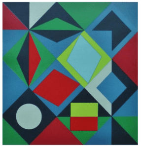
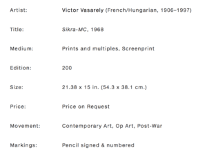
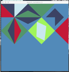
This image by Victor Vasarely is one I find particularly intriguing.  Both the colors and the complexity of the design seemed very interesting to me, as I was approaching this assignment.  I especially enjoy the contrast in the greens and reds, combined with the various shades of blues.  

In beginning of working with processing, I felt very intimidated and confused.  Eventually, however, the coding became easier and more intuitive in how I am able to translate shapes and colors into letters and numbers.  In thinking about this assignment on a plane of x and y, I was able to better understand the process and code the correct placement of various shapes.  Using processing to achieve the goal of recreating this image proved to be somewhat tedious, so I decided to replicate only the top half of the image.  It was definitely a challenge for me to conceptualize the image in terms of coordinates on a grid, so I did make a few notes on paper to aid in the process.  After learning how to code triangles, I found it to be quite straightforward to put the entire work into code via various triangles.  

One difference that stands out to me when comparing the top halves of each image are the slight differences in the colors.  I found it to be a tiny bit frustrating to try and recreate the beauty of the muted tones by using the color selector tool on my computer.  If I were using acrylic paints, it would seem natural to me to be able to mix a small amount of red  into the greens to dull the color slightly, but it was much less intuitive for me to be able to  find the shades I was looking for by using this tool.  I am sure that as I become more familiar with both processing and the color selector tool this is something that would become easier, however, currently when comparing the colors I used with the ones in the original I am off-put by the starkness of my new image.  

But for many elements, specifically the precision of the lines and crispness of the angles, I found myself pleasantly surprised at how satisfying it is to use processing as an artistic tool.  In this regard, I can fully see how using software such as processing can give artists far more options to create highly specific images.  In taking advantage of the software’s ability to produce exceptionally accurate, straight lines, clear angles, perfect shapes, literally every color (even though I struggled to find them) I can now see how beneficial it is to be able to use this as an artistic medium.  It is very inspiring to me to think about what I can create using this tool when I fully understand how to use all that it has to offer.  

Additionally, I decided to take the artistic liberty to make the canvas size 500 by 500 pixels.  Although the assignment instructed to go above 600 by 600 I felt that the original image can so perfectly be divided into 5 distinct sections, that it made much more sense for me to be able to graph everything by 100 pixel increments.  This also made it slightly more straightforward to graph the various points that did not fall on the 100 pixel splits.  

The code:

size(500, 500);

background(82, 138, 185);

noStroke();

fill(196, 24, 55);

triangle(0, 0, 100, 100, 0, 100);

fill(60, 67, 100);

triangle(0, 0, 100, 0, 100, 100);

fill(201, 231, 240);

triangle(100, 0, 200, 0, 100, 100);

fill(60, 67, 100);

triangle(100, 100, 200, 0, 200, 50);

fill(83, 149, 106);

triangle(100, 100, 200, 50, 200, 100);

fill(60, 67, 100);

triangle(200, 0, 200, 50, 300, 100);

fill(83, 149, 106);

triangle(200, 0, 300, 100, 400, 0);

fill(83, 149, 106);

triangle(200, 50, 200, 100, 300, 100);

fill(60, 67, 100);

triangle(333, 100, 400, 33, 466, 100);

fill(82, 138, 185);

triangle(0, 100, 100, 100, 0, 200);

fill(83, 149, 106);

triangle(100, 100, 0, 200, 50, 200);

fill(60, 67, 100);

triangle(100, 100, 50, 200, 100, 300);

fill(196, 24, 55);

triangle(100, 100, 100, 300, 150, 200);

fill(83, 149, 106);

triangle(0, 200, 50, 200, 100, 300);

fill(83, 149, 106);

triangle(100, 100, 150, 200, 200, 200);

fill(83, 149, 106);

triangle(150, 200, 200, 200, 100, 300);

fill(60, 67, 100);

triangle(100, 100, 200, 150, 300, 100);

fill(160, 245, 91);

triangle(200, 200, 300, 100, 400, 200);

fill(160, 245, 91);

triangle(200, 200, 300, 300, 400, 200);

fill(60, 67, 100);

triangle(400, 100, 466, 100, 400, 166);

fill(196, 24, 55);

triangle(400, 200, 500, 100, 500, 300);

fill(201, 231, 240);

triangle(266, 133, 336, 166, 263, 243);

fill(201, 231, 240);

triangle(263, 243, 336, 166, 323, 273);