Interactive Comic- Grace and Evan

Comic Link: http://imanas.shanghai.nyu.edu/~gmc439/ComicProject/fortyone.html 

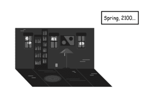
The comic titled “The Other Side” highlights a nameless boy that the user follows throughout the story. The user must click in order to follow each new page and see where the boy goes. After hearing a strange knocking in his house, he realizes that there is something odd behind his living room door. In order to see what the noise is, the user must click continuously to go through the door and end up in a different world. As well, we also included background music and sound effects to make the comic more interesting and engaging. 

My partner and I both split the work pretty equally as we both each did half of the coding and half of the illustrations. As I felt more comfortable with visuals and she felt more comfortable with code, we each helped each other to understand the areas we were less confident in. As a result, the final piece came out great and we were able to make the comic fun, interactive and visually pleasing.  

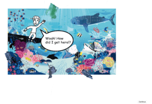
Throughout our process for making the comic, we decided to focus on color as a huge theme for the message behind the comic. We decided to use illustrator and hand drawings to make the visuals and used a black and white theme for most of the comic. Our original idea was to create a comic in which a person (represented by the user) goes through a normal day but then encounters a strange door in their house that leads them into a different world. We intended to use a black and white color scheme for the entire comic until the very end once the user clicks to enter the mysterious door. From this point, the user teleports into the different world (an underwater scene) in which they see how much humans have polluted the environment. The user is then told to click to get rid of trash in the ocean. At this point, the comic focuses on an environmental message that includes color in order to represent awareness of pollution. 
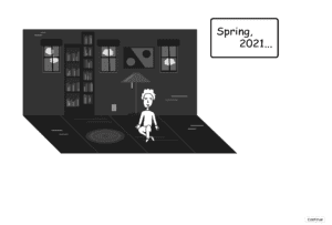
Overall, the project met our goals. However, the most difficult aspect was time and underestimating illustration/code time. As we both worked on code and illustrations, we did not think that these elements would take as long as they did. We were finally able to complete everything but we did not think that putting everything together would take as much time as it did. 
Interactive Comic: Current Progress- Evan and Grace

So far, we have come up with a solid idea and plans for how our comic will be completed. We are focusing on an ordinary door in a normal room leading to a different dimension(s).

As well, we are also incorporating environmental aspects into our comic such as climate change. For instance, we will have one panel show someone picking up trash from the ocean. So far, we have a combination of images and drawn out ideas from illustrator. We still need to finish the artwork and incorporate code but are currently working on that aspect now. 


Week 4: Javascript Recitation Example- Evan Xie

http://imanas.shanghai.nyu.edu/~emx200/Ex2_ScrollFun/indexstory.html 

The example in class was pretty straight forward to learn. However, the biggest problem I encountered was making sure all my words in HTML and Javascript were spelled or typed properly. Besides this issue, I was able to understand the scroll function and get the site to work properly. 

Week 3: Cat Javascript- Evan Xie

http://imanas.shanghai.nyu.edu/~emx200/catjavascript/javaindex.html

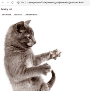
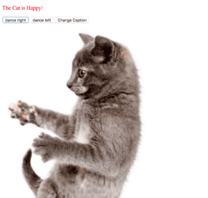
I was able to figure out the javascript for the dancing cat overall but struggled to make the buttons work to their proper functions. I understand the logic behind the code/javascript but just encountered minor technical errors. However, overall, I was still able to make the dancing cat function work. 

Week 3 Interactive Comic Idea-Evan and Grace

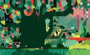
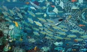
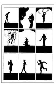
Our idea for our interactive comic came from a focus on the impact on color in comic art. We thought of a different approach to the assignment by focusing on a black and white perspective that uses silhouettes of people instead of extremely detailed features. This focus would allow us to express different emotions and elements in a deeper sense while still being intriguing/creative.  The original inspiration came from searching up random images similar to our black and white idea. However, our idea also incorporates contrasting elements such as reversing black colors and white colors for silhouettes. For example, one frame might be a black silhouette of a person with a white background, but in another frame, a white silhouette with a black background. While we are still thinking of a storyline and characters, we think this idea would be very fun to put into action.  

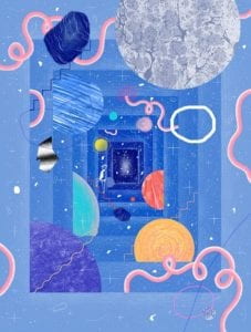
Original inspiration: 

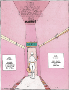
Idea 2:

Source: Google images