Final Project Net Art Documentation: Evan Xie

link: http://imanas.shanghai.nyu.edu/~emx200/CitiesXCommLab%205%3A13%20/homepage.html 

Description:

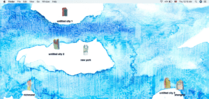
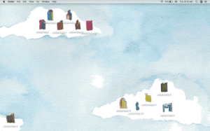
For our final project, my partner and I decided to create a web based concept that mimics a Mac desktop. We both created original art pieces, all hand drawn, and used them as a basis for our project. We wanted to design a theme based on cities we feel personal connections to. Therefore, we chose to use Manhatten (my hometown), Richmond VA (my partner’s hometown), and Shanghai since we both study/live here currently. We then drew each main city as icons for the desktop screen as well as two extra cities that are namable by the user. When clicked on, the main city icons (NYC, Richmond, Shanghai) each show a pop-up of different images as well as a soundtrack that I created from scratch, incorporating music/sounds from each respective city. We also added personal voice overs for each main city, showing our own thoughts on where we grew up as well as Shanghai.

Our project overall focuses on the idea of simple yet inttriguing artwork as shown through a desktop view. By being able to drag and click on each main city icon, our original artowork is shown to represent the beauty of each city and a personal view of some of its famous areas. 

Process: 

We started by hand-drawing all artowork and images used in the project, except for the top Mac-replica icon bar at the top of the screen. Next, after all artwork was drawn and scanned, we used photoshop to make the images into icons for the computer screen. After this, we each recorded our own voice overs for each city, and I created 3 soundtracks using Ableton Live and sampled sounds from each city using prerecorded noises since I am not currently in NYC or Richmond.  From here, my partner created the base of the code with draggable icons and then I added my own elements to the code with different images and clickable voice over functions. We then both worked on the code separately to organize and format css and js click functions. After we both finished our code, we brought it all together and finalized our project. By incorporating all images, sounds, and functions effectively, our final piece came out great. 
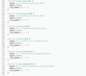
Sample code from voice overs- 
Challenges:

Overall, we were able to effeiciently and effectively make all elements of our project. However, the most challenging componants were formatting css properly with our js functions as well as making sure our code worked propery. It was slightly tricky for us to make all click functions work smoothly, but we did the best we could. 

Post-Mortem: 

Our project process and final result came out very well and met our expectations. I felt that we both worked very well and were able to bring our ideas to life. I feel very happy with our final result and feel that both myself and my partner worked hard to make it all come together. After all coding elements we learned throughout the semester, I feel that my partner and I were able to use these skills coherently for our final project. At this point, I feel that this project, as well as all other projects this semester, have helped me greatly in learning code and being able to apply it to my ideas.
Week 13: Final Project Proposal- Evan and Kai

How Do We Fall in Love with a City?

Concept:

As somewhat cosmopolitan city dwellers, Evan and Kai wanted to address their adoration for cities through an artistic approach. Having lived in American cities like Richmond (Kai) and New York (Evan) while also being introduced to Shanghai, they chose these three cities to explore and detail how these cities captivated them overall.

The concept behind the code is that you arrive on the homepage, which looks like a desktop, and you’ll be able to navigate a few specific folders for example: Richmond, New York, and Shanghai. The audio part of the homepage will simply be an on-off switch for the background music. The folder icons of will be specialized, and when they are clicked, you’ll be linked to a new tab that focuses on that city.

Sources:

Kai-

Miriam Singer: http://www.miriamsinger.net/

Singer has worked in Philadelphia and her cityscapes are clustered, cluttered, and colorful. Her work can be murals or drawings, but they all have this childlike impossible-to-actualize fantasy that highlights the artist’s love for her city. Kai chose her as a source simply because she had been inspired by Singer for some time after browsing a zine library in Las Vegas, Nevada.   

Evan-

Derek McCrea: http://watercolorpaintingart.blogspot.com/2013/08/new-york-city-skyline.html

McCrea encapsulates the beauty of Manhattan through a very simplistic style of watercolor art. By focusing on a very imprecise and almost unclear style of blending colors and objects together, McCrea creates a distinct representation of different cities that are incredibly breathtaking.

Production:

Evan intends to create a city-inspired soundtrack that includes different elements of sound (not only music) that represent the noises and overall feeling of each of their chosen cities. He will include various sounds that are specific to each city and portray them to try and capture the feeling of physically being in that city. The project will also have some voice over storytelling of what Evan and Kai love about their respective cities. The voice overs will be somewhat casual in rhetoric, yet scripted with professional audio quality.

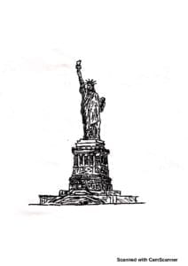
Many graphic design aspects from personal scans will be incorporated as opposed to digital art. The thought-process behind using real hand-drawings is to dedicate a more sentimental touch to the overall online platform. The execution of this project first involves us to draw new art and curiate some previous art, which will be their graphic design assets. Later, these will be process made into minimalistic .pngs using photoshop.

Finally, user-interaction will lead users to have a clearer understanding of the three cities Evan and Kai chose. The aim is to illustrate an artistic approach to city life through their own examples that can be expanded upon by others’ interpretations.

In creating this interactive scope of their 3 cities, Evan and Kai want the user to feel and experience what it is like to be present in these areas and what specific cultural aspects make these cities special/unique.

Week 11: Rachel Greene, Web Work: A History of Internet Art, Response by Evan Xie

After reading Rachel Greene’s “A History of Internet Art,” I found her writing very interesting as it shows a detailed analysis of how art and internet merge, in both positive and negative aspects. What stood as particularly fascinating to me was the depiction of internet art from the late 1990’s moving into later years. When seeing old systems of web browsers, I found the artwork created off of them captivating as it shows the value and limitations of art through old technology. 

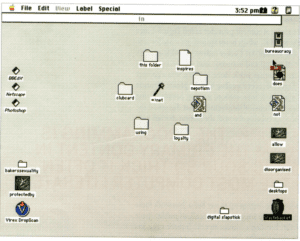
The above image specifically reminds me of instances such as film photography versus DSLR photography in today’s society. Although the internet art depicted is old, it is not necessarily bad or “ugly” as some people would put it. I consider art to be a depiction of the artist’s mind, or at least as close as it can get. Therefore, like film photography, I feel that this older style of internet art is not “ugly,” but instead unique in its own way. Considering these aspects, I feel that acknowledging old and new styles of web art is extremely valuable to an artist as it allows them to see two sides of a picture and create artwork that travels through time, capturing the essence of a specific moment in history. 

What also stood as very interesting to me was the explanation of how culture and society impacted internet art from the late 1990’s into later years. As internet in America has strict regulations for certain actions, I found the original net.art communities to likely have felt limited in their ability and freedom to create artwork online. Although these communities were originally granted freedom and certain privacies to work as they please, the role of corporate businesses such as CNN stood as important to recognize in harming smaller net.artists. The fear of mainstream companies and media overpowering net.art stood as fascinating and intriguing to read as it is and was an issue that is still very active today. As many artists are not granted proper freedom to their artwork and styles, it is important to be aware of how large companies can easily crush smaller artists. Therefore, I feel that it is important to have activists and artists unite such as the ones in the article, as they are able to create net.art that sends a powerful message to society in hopes of maintaining a sense of artistic freedom. While culture has a huge role in dictating the work of net.artists, I feel that as long as we do not conform to what society wants us to do, we will be able to preserve and continue net.art as a social, political, and moral output for displaying who we are and why we create the art we create. 

Week 10: Internet Art Blogpost- Evan Xie

Links to Michael Demers work:

http://archive.rhizome.org/

http://archive.rhizome.org/exhibition/html_color_codes/ 

http://michaeldemers.com/colorFieldPaintings_browser/where.htm 

Link to original artwork:

http://morrislouis.org/paintings/large/du287 

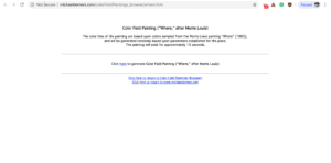
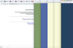
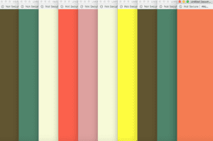
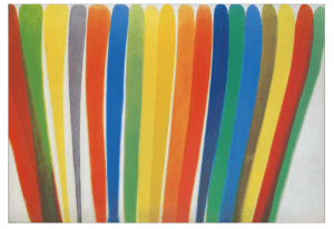
After looking through the rhizome archive or internet-based artwork, I stumbled upon Michael Demers’ website and web art. I found his artwork particularly interesting as it is very simple and visually pleasing. His aesthetic focuses on opening new browsers, each one after the other to create a series of colors that flow together and then disappear after 10 seconds time. I also really enjoyed his artwork as he based it off of Morris Louis’ “Where” painting but created a new style of showing the art. As Demers focused on showing the color schemes of the painting through HTML, CSS and Javascript, I found this very enjoyable and original in re-inventing the original work. The artwork itself inspired me to think of how this style of using HTML, CSS and Javascript can be used as a foreground for other, more in-depth works of web art to convey a deeper message or re-interpret another work of art using the internet. 

I really like Michael Demers’ art specifically as it is not too complicated and remains very simplistic. This style of art is almost like modern art in the sense that it can be interpreted in many different ways, despite mimicking Morris Louis’ original work. Although Demers’ work is noticeably similar to Louis’ original art, I thought the way he showed the art without any physical painting was very clever and original. I feel that this situation has inspired me to also think of how I can re-interpret paintings without the need for physical drawing. 

Michael Demers website and “Where” Interpretation:

Original Artwork by Morris Louis:

Week 10 Video Project: Evan Xie

Project Proposal: A comedic take on a young woman during a job interview in Shanghai- The video focuses on mimicking the theme of the show “The Office” as the young woman is interviewed by an extremely awkward boss who has no sense of awareness of others. The video includes a visual of a TV to show that the concept is focused around the idea of a TV show. The interactivity comes from splitting the video into 2 segments in which the user can choose to see the interview from the boss’ perspective or the woman’s perspective. The point of this option was to show that assumptions can be dangerous, especially with first impressions. Therefore, we shouldn’t judge a book by its cover. 

Process: First, my group and I worked on developing the code for the video to revolve around a TV screen with two options for the user to choose from in the path the video takes. Afterward, we filmed a series of different videos and edited them in Premiere to finalize the footage. From this point, we were able to incorporate the code interactivity with the videos by showing two perspectives on the interview being conducted. While we all filmed different parts of the video equally, I focused mainly on editing in Premiere and produced all musical elements from scratch to mimic “The Office” theme. While my other group members focused on coding and css, I also helped with designing our css to look like a TV and include two pictures of the main characters’ faces as buttons on the side. Besides this, I also used After Effects to create title animations throughout the video to make it more visually pleasing. Once my group and I combined all our elements, we were able to create a successful project. 

Issues: The main issues we faced were being able to properly format our videos to fit within our css style and TV theme. We tried multiple different methods to make the video fit, and finally found one that worked. Although the video may seem small inside the TV, it worked best to keep it this way rather than making the video look unnatural or stretched. 

Reflection: I feel that this project specifically was the most fun for me and most beneficial. I got to experience with new adobe elements such as Premiere and got to learn/strengthen my understanding of coding by working with my partners. As well, my partners were very helpful and enjoyed the process overall.