Mid project blog post
About my project
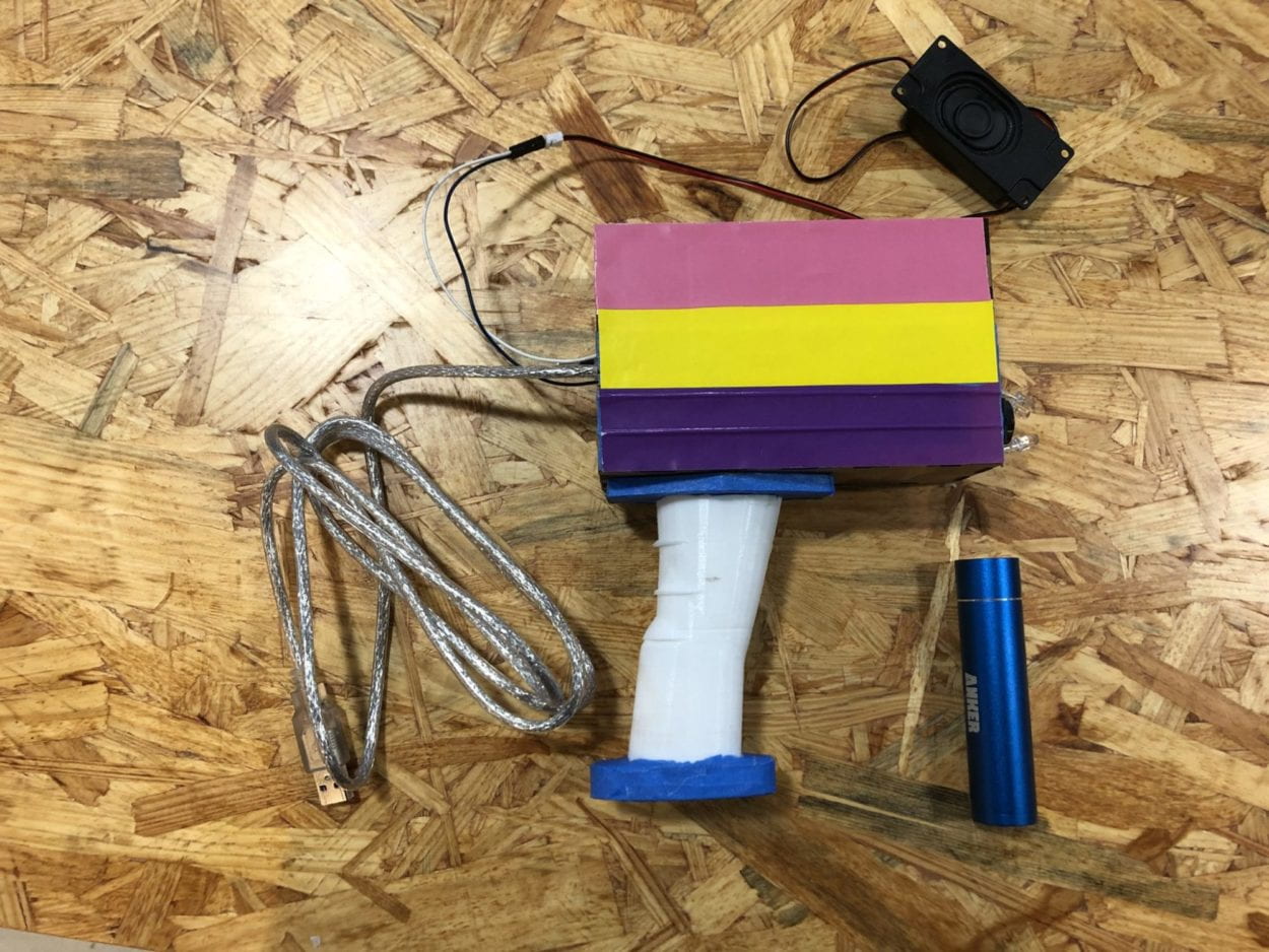
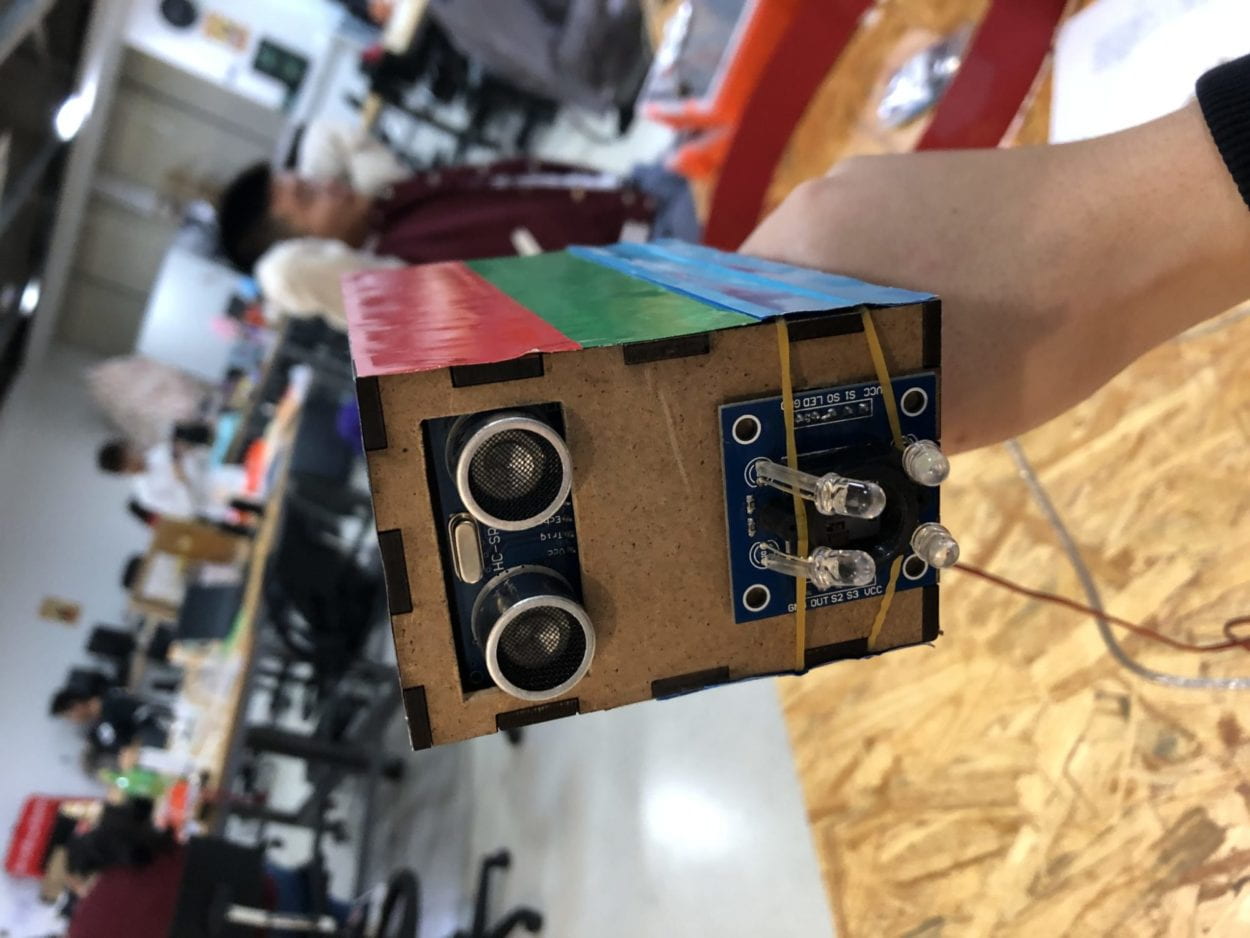
My project is called Hear the Colors. It consists of two sensors (color sensor and ultra-sonic distance sensor), an Arduino board, a box with handle, a set of head phone (or speakers), and a power bank. 


The function of this equipment is that it senses the color and the distance of a certain material placed in front of it and uses the two data as input, then it plays a piano note according to the input. As the color and the distance changes, the pitch and the volume of the note changes respectively.
In my group project 1 I came across two projects that triggered my thinking of the definition of interaction. I’m quoting myself on describing the two projects. ” The two projects that triggered my thinking are click canvas by KIMBABSTUDIO (https://www.creativeapplications.net/member-submissions/click-canvas/) and Vivienne La – 21st Century Ghost (https://www.creativeapplications.net/maxmsp/sfpc-spring-2019-student-showcase/). The former one aligns with my definition because the users, by clicking on the buttons of the canvas, can create certain picture(s) according to their will; and that, to me is user’s involvement being high and the creativity appearing. However in the second project, as high as the aesthetic value of the whole project, the interactive part or the supposedly “interactive” part of the project doesn’t align with my definition. in this project, when you put a certain number of sticks in a certain way in the vases, different images will be shown on the screen accordingly. This to me is simply like using a knife to cut a piece of wood. An input (force), an output (wood is cut), everybody knows how the output would be on a single movement like this if informed enough of the rules implanted.” As a result, my project aligns with my definition of interaction as it allows the user to experiment the relationship between the notes and the colors and create something out of it.
The target audience of my project is general public. Because it provides them a new way of looking at their senses. When this project connects colors and sounds it combines visual and auditory senses together and thus providing people a new experience of sensing everyday objects and provoking a new way for people to think about human senses and how they play a part in people’s daily life.
CONCEPTION AND DESIGN with FABRICATION AND PRODUCTION:
One big change during the earlier fabrication process was that we got rid of any excess cables and the two bread boards we were using in order to minimalize the size of the product.
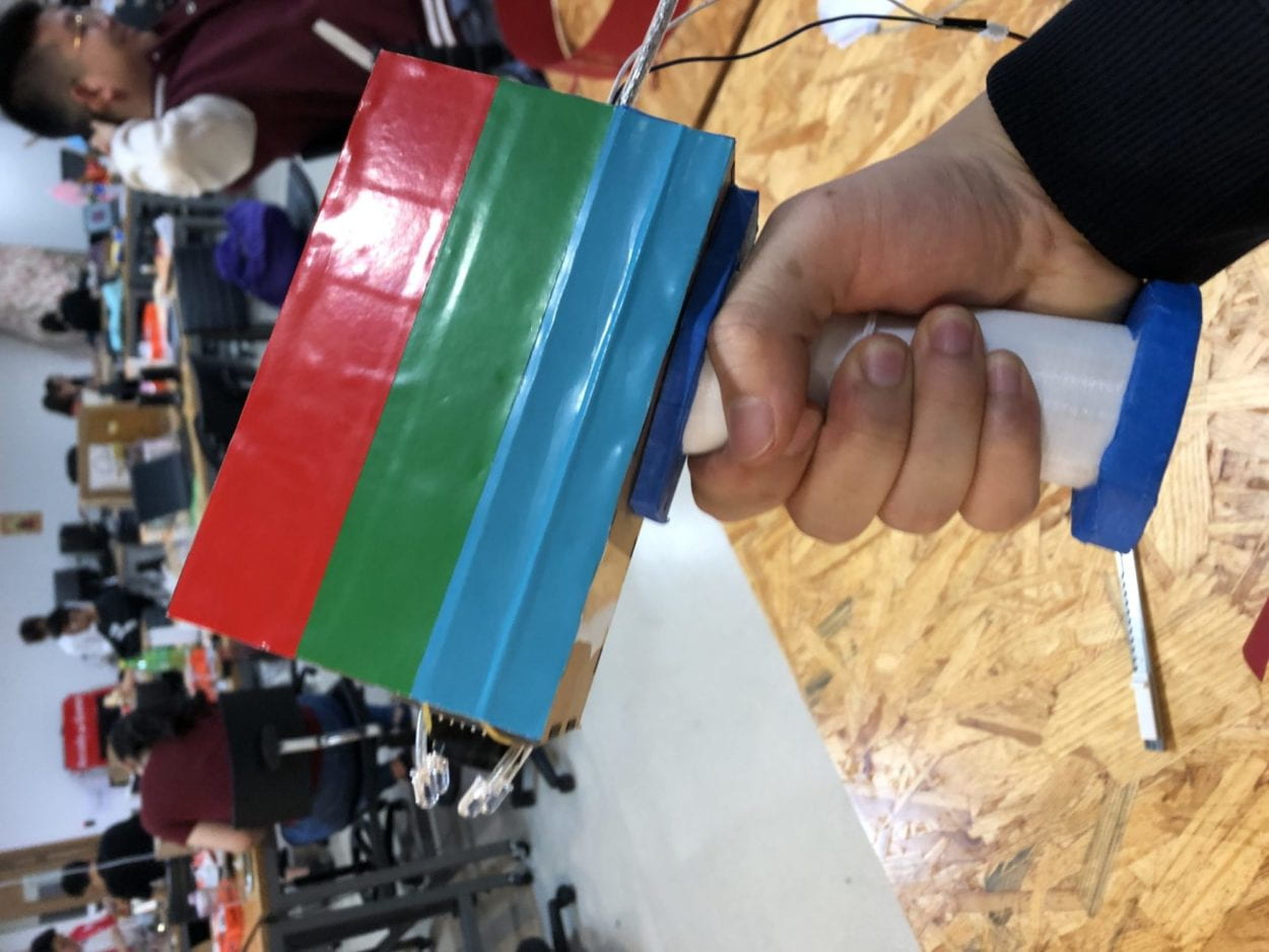
Our initial thought was merely users grabbing the device and immediately know where the sensors are and how to scan, so we put everything together on a box with the two sensors facing the same direction. However, during the user test session we received some feedbacks regarding how to let the user know how to use the device without actually telling people exactly what to do for it is not practical. So we re-designed the device box to have a pistol-like handle on which the user can grab and immediately know which direction to point to. We considered shapes like a torch or microphone could to the work too but in real life there are less such straight-shaped handle that are used to receive information, so the pistol-shaped handle could give people more straightforward instruction than the other shape.
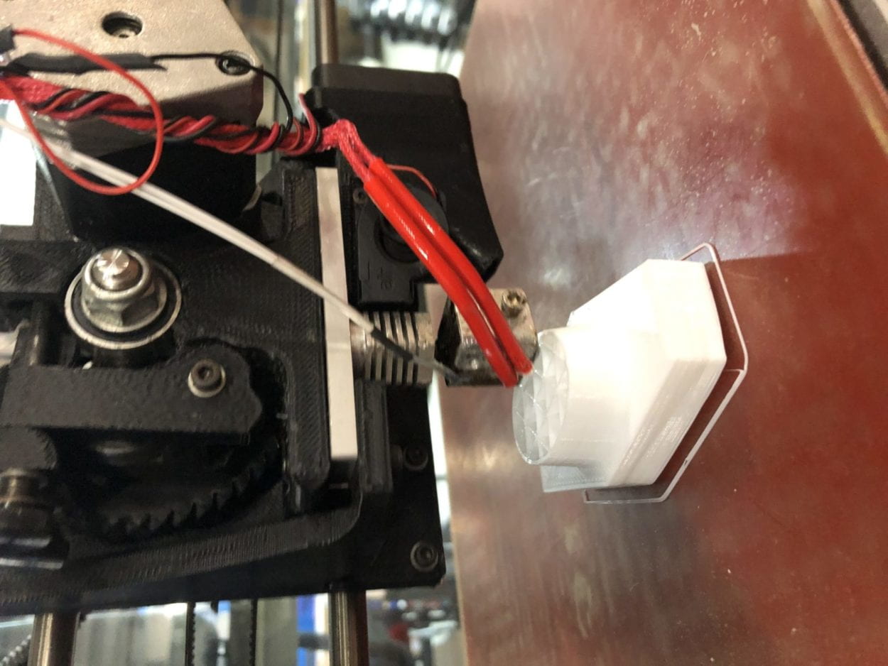
The reason why we used 3D printing to make the handle was that it is easier to make a handle that is easy and comfortable to grab onto.

Another useful feedback we got in the user test was that the response of the device seemed so long that it affects the user experience. In general, the users would want more active response from the devices and what we saw at the user test (that people almost always switch to another color before the speaker could even display the note) confirmed that. So we modified the music files and shortened the delay time to make the response more active.
CONCLUSIONS:
The goal of the product was to explore how human’s senses could be extended. And the product, through making a link between the visual and audial senses, achieves this goal. And through using our project and their own creativity, the users could create sound pieces to their liking. And that aligns with my definition of interaction perfectly.
If I had more time, there are definitely more things we could improve on. Firstly we would add a button or anything that could trigger the system working. And also it would be nice to be able to hide the power bank in the handle so the device looks less intimidating to use and less cyborg-ish. Last but not least the overall shape could be re-designed to look less like a gun and more like the qr code scanner. My biggest take away from this whole process is that there’s always another way to achieve a simple goal; its just the matter of if I could ask people and find out.
To look at it in a more critical way, overall the project did fulfill most of my goals and definitions, but due to the time limit and the lack of mature coding silks, the project reacts somewhat inactively to the users, that is to say, if we want to really extend our perceptions, we would expect quicker response, which the project lacks.
In conclusion, the ultimate goal for this project is to give people new experiences on sensing the world and get people to think about how their senses work.
