Final Project Essay: Celine Yu

Partner: Kenneth Wang

Title: Break Free (Working Title)

Project Statement of Purpose:

The main topic Kenneth and I have decided to focus on within our final project is that of self-empowerment and self-management. At first, Kenneth proposed the idea of recreating an Escape Room mechanism/game for our project as a means of invigorating fun and interaction, but since we wanted the final to harness a deeper meaning, we decided to run with the theme of mental illness as caused by stress and anxiety. Kenneth proposed the issue of mental illness to which I corroborated the proposition with the research I had conducted for another course earlier in the month.

NYU Shanghai is known for its academic excellence as substantiated by its expansive list of prestigious alumni, a factor that inevitably creates an atmosphere of rivalry and unease among students. To most individuals, this state of constant struggle creates never-ending drainage of energy from one’s body. According to a 2015 survey conducted by New York University, over 49 percent of its students reported struggling with creating a healthy balance between securing their mental health and fastening an education. A panel of private school experts, social workers, and guidance counselors interpreted that a major portion of the stress suffered by students at NYU was caused by parental pressure. Parents feel entitled to receive tangible results in return for the tuition they provide the university, results that directly reflect their children’s efforts in school. Thus, students are caught in a cycle of intensified demands and expectations as perpetuated by parents and the college system, one so long driven by societal standards that it can no longer be demolished. Students are forced to work as hard as adults and compete with peers to no end, leaving little to no time for relaxation or creativity.

This constant combining of demand and stress can cause various mental illnesses, various moments of self-doubt and a heart-wrenching collection of the silent screams for help. Our project will aim to help the students at NYU Shanghai — or all schools in general — fight against the demons known as stress and self-doubt. Hopefully, the escape room game that will incorporate problem-solving and nostalgic themes of self-love will allow the player to “break free” from their own cages, and break free of the restraints of stress.

Project Plan: 

Mental illness and stress do not understand cultures nor races, they impact all members of society in a homogenous manner. Regardless of the size of the impact, we want our final project to encompass the themes of self-love and self-empowerment over one’s doubts and stress so that the user can engage in a cathartic resource. We will create a virtual escape room that “locks” the user in, confining them in a space filled with self-doubt and melancholy. The user will then have to find a number of hints and clues —riddles, images, memories— that each requires a number of interactive practices through the usage of potentiometers, buttons, cameras and so on. As the user continues to collect hints and derive riddles of their answers, the user will input the finalized code through a 2×2 button pad. If correct, the user will be “set free” from the room, but if the input is incorrect, the user will have to continue his or her search into the room. We will be considering the aspect of a 2 player suggestion, as a way of portraying that sometimes, we all need a friend around to help us in times of pain and suffering to fend off our antagonists.

For the main part, Kenneth and I will be working hand in hand throughout the entire project. Kenneth will be in charge of the Arduino while I will be managing the Processing factor. Together, we will cover other aspects of the project, such as design, physical fabrication, schematics and much more. We are still working out the details but we intend to include various factors that remind of the user of self-love and of self-identity, things that are difficult to maintain when studying at NYU Shanghai, moreover, so far away from home. Until the presentations and final project production dates near the middle of May, Kenneth and I intend to make use of as much time as possible, as soon as possible. We will have hopefully, completed designs by the end of the week, and have the boxes and physical attributes of the project, designed and fabricated by next week in order to meet the deadline before the fab lab closes on May 13. I want to have all measurements completed and finalized so that I won’t be panicking when I still require the fab lab but no longer have access to it. Following the physical fabrication of the project, Kenneth and I will go straight into the coding, making sure to order all of our extra material off of the internet as soon as possible, most likely during the course of next week in order to refrain from having to stress over its arrival date. I wish and hope that we will have our coding done and completed in the 3rd week of May, leaving ourselves ample time for us to put everything together and user test before the final deadline. I wish to complete everything by May 11 so that I do not have to stress over it over the weekend before presentations.

Context and Significance:

The projects I personally researched prior to the final project did not have major impacts over the proposal itself but did in fact, assist me in my redefining of the term, interaction. Instead, it was the additional information and research I conducted on the origins and effects of stress in an academic environment that helped shape our proposal. Through my understanding of the “Click Canvas” and the “Rain Room,” I can now create my own definition of interaction despite its known ambiguous nature. Interactive art must incorporate the presence of dialogue and collaboration between the artwork and the user, and perhaps, users. There must be, according to Crawford, at least two or more actors that participate in a constant cycle of input, processing, and output, each whom’s input would stimulate the other. There must be a clear understanding that reaction is not interaction, that harness a purpose to immerse the user into the interactive piece in order to exercise the priority and desire to provide users a good experience, further encouraging them to continue implementing input, to enact in a process that we call a dynamic cycle.

Our project will perfectly align with my personal definition, for two or more actors are indeed working together to achieve a common goal. As the user implements its input, the project will provide hints, clues, and indications of correct and incorrect answers as a means of encouraging the user to continue interacting. Our project is significant for it takes into consideration the importance and dangers of stress and anxiety as perpetuated by a highly competitive environment in combination with escalating demands and distressing societal standards. It will teach users of the importance of self-empowerment and show them how with courage and reassurance, they can overcome their fears of failure and such in an academic presence by prioritizing happiness and mental health over all others. Though it is intended for the students at NYU Shanghai, we believe that the project can be of interest and use to all members of society who wish to further understand their struggles with stress. We hope that our project will assist all users, regardless of the size of the impact, and hope that it will provide inspiration to projects in the future that can also help individuals struggling to face their stress and anxiety in the face with authority and confidence.
Recitation 8: Serial Communication, Celine Yu

Link To Code: https://github.com/cy1323/CelineYu/tree/master/Recitation%208

Exercise 1:

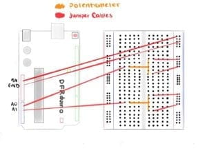
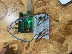
For the first exercise, I was told to recreate an Etch A Sketch through the combination of Processing and Arduino. I first copied and pasted all of the necessary lines of code from the provided Serial Communication folder into separate Arduino and Processing files. I decided that I would first focus on the Arduino side. I deleted the portions that were deemed useless and so, left just sensor1 and sensor2 to coordinate with the two variables I planned to utilize for the sketch: X and Y. I also deleted the Serial print lines that were unnecessary and finished my void loop() function with Serial.println(Sensor2), so that the numbers would come out smoothly as a set of two numbers, as if I was pressing the “return” button for each set. Afterward, I moved onto the Processing page, making sure to not to delete the portions that I needed to complete the exercise. I changed the NUM_OF_VALUES to a value of 2 to correlate with the two variables and equated the integer, PORT_INDEX to 16 so that the  Processing and Arduino would connect and collaborate with one another. Then, I created an ellipse with the attributes (posX, posY, 100, 100) inside the void draw function, making sure to create posX and posY as integers at the beginning of my code.

At this point, I was stuck and confused. Not knowing how to proceed, I asked for help from one of the helping assistants. She graciously explained to me what I needed to complete and guided me on how I could get to that final product. The assistant did not tell me exactly how to achieve the intended results but provided me with ample information and guidance for me to complete it with a full understanding of what I was doing. I positioned posX and posY and correlated them to the potentiometers by equating them to sensorValues 0 and 1, which would translate into sensor1 and sensor2 in Arduino. She also walked me through the basics of using the map function, one I have always been confused about. I used the function to enclose the range in which the ellipse would maneuver across the canvas, changing it from 0, 1023 → 0, 500. This would ensure that the circle, when being manipulated by the potentiometers, would not go past the edges of the canvas.

After testing out the circuit and moving around the potentiometer values to maneuver the ellipse, I decided I would add another portion to the code. I added to Processing, that whenever the SHIFT key was pressed, the page would reset by having its background changed to black. I wanted to add this feature of a reset button that would erase the trail of circles the user had created on the canvas. This feature parallels that of the original Etch a Sketch and its “RESET” button that activates when one shakes the toy. The response is incredibly fast, too fast for my liking, However, due to time, I was unable to work around with the delay mechanisms of the code to correct the timing of the SHIFT key and its output. 

Screen Recording 2019-04-19 at 2.29.06 PM

Exercise 2: 

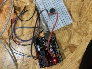
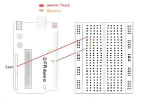
For the second assignment, I was instructed to create a musical instrument with a buzzer and my understanding of Arduino and Processing. Contrary to the first assignment, I needed the Arduino to read serial values from Processing and not the other way around. Once again, I copied and pasted the outlines from the Serial Communication folder and got to work on the processing. I altered the NUM_OF_VALUES to a 2 and selected 16 for my PORT_INDEX int, as I did in the first exercise. Then, with the knowledge and information I learned from the Sketch exercise, I went straight to void draw and typed in values[0] and values[1] and equated them to mouseX and mouseY, letting the Arduino know what information it will be reading to translate into frequency and duration for its tone function. Moving on to Arduino, I went straight to void loop, creating 2 separate integers for int freq and int duration. I mapped the two integers so that I could control the minimum and maximum amount for both the frequency and duration of the buzzer and its output. Following the map functions, I created the tone function and placed 11, freq and duration as the three attributes that created its base. 11 to correspond with the pin I chose when making the circuit, freq to correlate with the mouseX value found in Processing and finally, duration, as it would correspond with the Processing’s mouseY values. With a little tweaking, the second exercise was also a success. 

Preparatory Research and Analysis – Celine Yu

Initial Definition

My understanding of the term ‘interaction’ has seen a lot of change since participating in this interaction lab course. I had always had an idea of what the term conveyed in context but was not aware of the severely ambiguous nature the word carries in association to technology and the human race. In the definition I deduced during the group research project period, I explained that interaction was a form of collaboration coined for the direct involvement between two or more subjects, living or nonliving. I use Chris Crawford’s argument and understanding in the “Art of Interactive Design” to come to the understanding that interaction occurs through the presence of a force, one that stimulates a chain reaction. This leads to a constant cycle between the actors. According to Crawford, the cycle should be a process in which the subjects “alternatively listen, think and speak” (8) with one another to create and introduce an input, processing and output complex. He clarifies that there is a distinct discrepancy between reactions and interaction, explaining that there must be at least two actors who react with one another to create this constant cycle of input and output (13). It is not considered interaction when only a single actor creates and processes data to produce output. Thanks to Crawford, I am able to understand that there are multiple layers as well as multiple variations of interactivity.

Project 1: Difference

The interactive project I have chosen that I believe does not fully align with my definition of interaction is the “Click Canvas, an Interactive Wall.” The goal of the project is for the user to ‘interact’ with the canvas by pressing or clicking a bunch of buttons that light up with different colors via the LEDs found within them. The project is supposed to invigorate curiosity and creativity from the user, as the individual is able to do anything they want with the board: draw, write, color, anything. Although the canvas is very well thought out and designed, I believe that there is a lack of interactivity between the user and the board. The user goes up to the board and clicks a few buttons, therefore the user indeed interacts. However, the board only lights up depending on the user’s input, the only output it provides is the coloring of each LED section. This is not interaction, this is a reaction, as described by Crawford. The user already had in mind what they wanted to produce before going up to the board, so the lighting of the panel did not in any way, affect the user. It did not cause the user to continue processing its output and placing in the input. The user was going to continuously input their information and design no matter what. The board serves as a creative outlet to the user and incorporates larger aspects of reaction rather than interaction.

Link: https://www.hackster.io/natthakit-kim-kang/click-canvas-an-interactive-wall-04332c

Video: https://www.youtube.com/watch?v=_j5Cqc82Gag

Project 2: Similar

A project I believe conforms to my own definition of interactivity is Hannes Koch and  Florian Ortkrass’ “Rain Room.” The art installation allows visitors to walk through a downpour with the illusion of walking through rain without getting soaked. The project’s many motion sensors that are attached to the ceiling detect the user’s movement and location as they walk through the room. Once a movement has been detected, the sensors signal separate water nozzles to stop the flow of water that invades a six-foot radius around the person.  It has achieved worldwide acclaim for its intersection between art, technology, and nature at the heart of interaction. The input the user is implementing is their very own movement, with each step, the project senses and processes information for it to create an output. The output of the rain room, which is to ensure that the correct nozzles are turned off and on directly impact the individual, for it determines whether or not the user gets soaked while inside the room. This output tempts and encourages the user to continue walking or even run throughout the room as a way of interacting with the room. 

Video:https://www.youtube.com/watch?v=EkvazIZx-F0&list=PLUFYSjzJt4pSAkPLRojNrTt6ZOVkDmI2_&index=2

Ambiguous Nature

Within these two projects, I substantiate the reality that interaction is a very ambiguous term and extremely difficult to define in any circumstance. In relation, it is just as difficult to create something that is indeed “interactive.” While I might find something interactive and creative, others might find it a misconception of interactivity. This reality is what pushes many individuals to conduct researches and create art installations and projects as a way of getting closer to the actual definition, if it is at all possible.

New Definition

After an entire semester of interaction-based projects, lectures, and assignments, I can say that my personal definition of the term “interaction” has come a long way compared to the past. Interaction in the form of art, is fairly distinguishable from traditional, generative art, as there is the presence of dialogue and collaboration between artwork and user. I still do believe that interaction, according to Crawford, must have two or more actors that subject to a constant cycle of input, processing and output, a cycle where all actors much work to stimulate input from the other. When creating the intended project, the designer must also keep in mind the difference between a reaction and interaction. As Crawford believes, a reaction cannot be considered interaction. If a branch falls onto the ground and causes the birds in its vicinity to flee the area, it can not be considered interaction. The branch is the only individual placing input into the situation, the birds are only reacting to the branch and not producing any output. Hence, there is no cycle that is being perpetuated. I have also learned that according to the interactive artist, Igoe, an artist should not have to explain their project/artwork to the user. The individual using the project/machine should be able to interpret what form of interaction is being exercised in the situation. This promotes the idea that in interaction, everything, should be user-centered. The interactive design must fulfill its usability goal, and strive to give the user a good experience, encouraging them to continue implementing input, which ultimately, stimulates output from the machine in what we call a cycle. I hope to reflect this definition of interaction in my upcoming final project.

Recitation 7: Processing Animation, Celine Yu

Exercise 1:

For the first part of the recitation exercise, I was asked to add a form of interactive animation in Processing to the image I had already created during the previous recitation. I decided that I would utilize the information I learned in class and implement a few clouds into my design to animate.

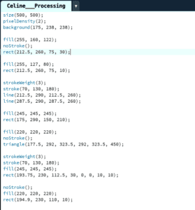
First off, I reorganized my processing code with void setup and void draw, making sure to separate the code into its rightful position. I also took a tip from Young and created separate void functions for each component in the design: void drawCloud, void drawAntenna, void drawBase, and void drawPlatform and then made sure to call it in my void draw function. This cleared up the code by a significant margin and allowed me to create integers that could easily be manipulated in the function. Most specifically, it allowed me to create two clouds from a single code as I added in the translate line of code, another tip taught my Young: translate(x,y);

I then decided that my choice of animation would be to move the clouds based off of the user’s keyboard input. I used integers to set the speed of the clouds to a set amount of 0, meaning that the clouds would be static unless told otherwise. Then, I created a separate void keyPressed function and began to write down conditions with if and else if functions that make use of the special keys on the keyboard. Using the notes from the slides provided by Young, I typed the code in carefully, making sure that there were no red errors. I set the clouds to move at a speed of 3 in the right direction when the right key is pressed and vice versa when the left key is utilized. I also wanted to add another function to the code in order to test my understanding of the function, and so added that whenever the shift button is pressed, the clouds’ speed/velocity would return to the set value of 0, meaning that it would stop in place, regardless where it ends up.

I had also wanted to create a reappearing and disappearing Sun/Moon whenever the user clicked a specific key, however, I did not have enough time during the recitation to complete my desired goal.

Code: https://github.com/cy1323/CelineYu/blob/master/Celine___Processing.pde

Exercise 2:

Step 1: 

The first step, which was to create the circle was very simple as we had already created a lot of shapes during class. I used ellipse (x,y size, size), and then set int size = 150 as well as x and y to 150 at the top.   

Screen Recording 2019-04-17 at 8.02.30 PM

Step 2:

The second step, which was to modify the circle so that it would pulse periodically (expand and contrast) was perhaps the most difficult step. I set an int movespeed = 2, so that I could call for it in a function to change the size of the circle. With if functions, I then set the parameters for when the circles should expand and contract.  

Screen Recording 2019-04-17 at 11.27.00 PM

Step 3:

This step was quite simple considering the hints that the recitation blog provided me. I used colorMode (HSB) to my advantage and learned how to have the color changed on its own. 

Screen Recording 2019-04-17 at 11.30.42 PM

Step  4:

The final step was also fairly easy to complete as I had already finished this translating function or “keyPressed” function in exercise 1. I used void keyPressed function and called on the keyCodes: RIGHT, LEFT, UP, DOWN, as well as SHIFT, so that I can move the circle up, down, left, right and also stop it in position. At first, I kept getting frustrated because whenever I moved the circle around, the outside stroke that changes color would leave behind a trail of color. I tried everything I could but still did not figure out how to fix the code. I then, went online to search for the answers to my problems, this is where I discovered adding a background(255) line to my drawCircle void, and voila, that fixed it.

Screen Recording 2019-04-17 at 11.34.34 PM

Code: https://github.com/cy1323/CelineYu/blob/master/Pulsing%20Circle

Lessons

The most significant features I learned from these exercises include the keyPressed() function as well as the colorMode(HSB) function. They provided me a full glance into what I can manipulate within Processing and was also my first attempt at creating animation within the coding language. 

Recitation 6: Processing Basics, Celine Yu

Date of Recitation: March 29, 2019

Documented On: March 31, 2019

Chosen  Motif:

Reflection: 

Why Did I Choose This Image? 

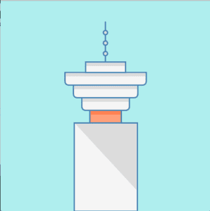
The image is a simplified icon of Harbour Centre, a skyscraper located in Vancouver, BC. I chose this specific image, furthermore, this icon is an allegory for my hometown. I was both born and raised in Vancouver, Canada, in total, I’ve spent 18 years of my life residing in the city. I am aware that Vancouver is a city widely known for its luxurious lifestyle, fresh seafood, and beautiful mountains, however, it does lack the symbolic infrastructure that labels Vancouver as Vancouver.

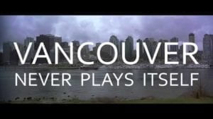
While Shanghai has the Pearl Tower, New York has the Eiffel Tower and Toronto has the CN Tower, Vancouver is left in the dark. This sense of lost identity is also visible in the film industry. Vancouver is known for its vast cinematic scene, making it the third largest film city in North America. It is now ordinary to spot celebrities scattered around the city filming various movies, commercials and tv shows. Although Vancouver is provided various opportunities to appear on the big screen, Vancouver never plays itself in these settings. The city has played as New York, Chicago, Toronto, San Francisco, Seattle, Santa Barbara in hundreds of movies and tv shows, notably: The Interview, Deadpool, Riverdale, White Chicks and many more, but in none of these films, does Vancouver play itself. Filmmaker, Tony Zhou, recently created a video depicting and theorizing the possible causes behind this phenomenon.

Within the video, he quotes Jerry Wasserman, a professor of theatre and film at UBC, “Vancouver doesn’t have any iconic symbols that make it a recognizable city worldwide, It’s very photogenic but what does it have that distinguishes it?.” Only those who truly understand the city will know that the Harbour Centre is a monumental skyscraper located in the central business district of Vancouver.

The 44 tower building stands as one of the city’s tallest skyscrapers, making it a prominent structure in the city’s skyline. Since its opening in 1977, the tower has housed hundreds of companies and continues to house the “Top of Vancouver Revolving Restaurant,” a dining experience that allows customers to indulge in a full-course meal while appreciating the beautiful city on top of a revolving platform. It provides diners with a 360 degree perspective on the city’s extravagant nightlife.

I want to recreate this image through processing in order to inform more people that Vancouver is Vancouver, not Seattle nor New York. I hope to achieve this by providing Vancouver its own “iconic building” that give the city its landmark and its own identity.

Re-creating the Image

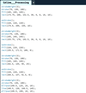
In processing, I was able to recreate the Harbour Centre by combing my knowledge from last week’s lectures with research within the processing reference site. When choosing the image, I kept in mind that I needed to choose a motif that consisted of geometric shapes but was complicated enough to give myself a challenge. I first set the size of the canvas to 500×500 (a mistake: canvas was supposed to be at least 600 x 600) and its background to a sky blue to match my motif. Remembering Young’s tip, I also included the code: pixelDensity(2) to improve the quality of the final product. I then used a variety of functions such as fill, rect, stroke, noStroke, strokeWeight, ellipse, triangle and line to create the image. I searched online for all RGB values in order to find the colors that I wanted in my recreation, which I used in all of my fill() functions. As I wanted my image to be centered and as clean as possible, I had to make a series of calculations. The rectangles and lines were significantly easy to create, but once it got to the rounded edges on top, I was quite stumped. I asked for help and learned that I could round the edges by changing the corners’ radius values within the code. I also learned to use the noStroke function to my advantage as I colored in certain shadows on the Vancouver building. I also discovered the importance of order within processing. When I implement certain code after one another, the results can change significantly, this little tip, confused me a lot, but also made me slow down and reflect upon my progress with care and undivided attention.


Reflection

I made sure to take my time, and I can now say that I am quite satisfied with the final product, given that this was only my second attempt at processing. I believe that my attempt definitely shows resemblance to the motif due to its structural appearance and the preciseness of its measurements. There is, of course, improvements to be made and noticeable differences between the original and my own creation. For starters, mainly due to time, I was unable to add the windows on the main rectangle at the bottom of the image. I was also unable add a skyline to the background, making the image very simple and static. I do believe that creating the image in Processing was a good means of realizing my design, however, it was definitely a difficult and stressful time due to my own amateurism. In the future, once my skills have been improved upon and polished, creating my own designs through processing will definitely have much more efficient and valuable results.