Project 3 Flower Road- Max

Title : 꽃길 (Flower Road)

Project Description

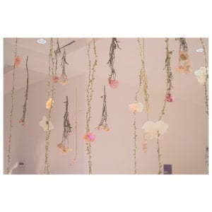
꽃길 is a light installation project. Back at home, we have thousands of Chinese Rose growing in our garden during springtime. When I moved to Shanghai and live in Pudong, studying at a building, I always feel pity for not being able to see many flowers during springtime. Then I thought about bringing in this flower project into the campus, to make people feel the liveliness and beauty of flowers. Therefore, the initial idea is just to bring spring back through the creation of blossom of flowers.

Secondly, there’s a music piece I enjoyed a lot called 봄날에 만나자 (Let’s Meet in Spring).https://www.shazam.com/track/346438630/lets-meet-in-spring

The song is saying people meet their loved ones when spring comes. The loved one makes people feel like a flower is blooming in their heart. I am also trying to make people feel in love when they interact with my project.

Besides, as a senior, we are graduating this semester. There’s a traditional Asia metaphor called 花路 (꽃길 aka Flower Road), saying the bright future is just coming forward. We like to congratulate each other “wish you could walk the flower road. 祝你走花路” Therefore, I think it would be cool to make a flower road. 

Development & Technical Implementation

I first had the idea of just using real flowers. I bought four types of different flowers, not sure which ones are good for hanging. I need to make sure that the flowers would be durable for hanging and become dried flowers. With one week’s test, only one breed survived. 

I first hung all the fake vines and real flowers onto the support frame. I know I need to incorporate light into this project in a nice way, by using the light to enhance the blooming of flowers. I used the EL wires to act as the vines, but it didn’t work quite well. Then I decided to focus on the flower. 

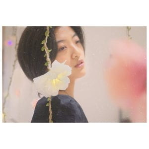
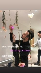
What I did with each flower is to first solder one neon pixel with 3 white wires, and using the glue gun to cover the neon pixel with the petals. And I also wired all three wires together, so it’s neat for later installation. There’re so many times that when I tested the neon pixel’s, it worked fine when I wired up everything, the neon pixel stopped working. I spent a lot of time making sure all the flowers are shining well.

I programmed the flowers with two sets of codes. The white flower with the yellow change code, and the pink flower with the purple change code. This took a huge amount of time in the way of trying to figure out how to make one work, as well as number each of the flowers and make them work together. I also had two codes, because I divide all my flowers (total 4 meters) into 2 meters vs 2 meters.

https://github.com/maxxiongchen/project3/tree/master

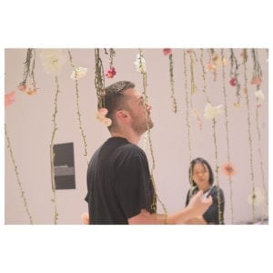
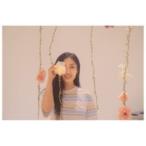
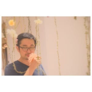
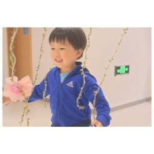
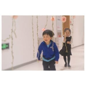
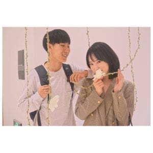
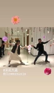
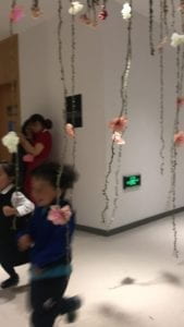
The final implementation didn’t show until hanging it for the IMA show. And people were quite actively walking through and interacting with it.
Presentation

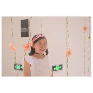
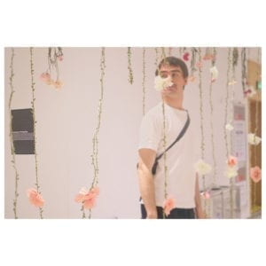
The presentation in the IMA show went quite well. (Better than I expected)I could see people were quite happy with me bringing all these flowers into this working building. None was unexpected except one student said this is just a project good for taking pictures, which is not my intention at all. I did see many people taking pictures, filming with my project, but I do not think that is a bad thing.

Most of the people seem to appreciate the idea of bringing back spring and walking the flower road. I also got feedback from one art history professor saying she enjoyed my project, as an IMA work, the good mention of art aspect (the use of real flowers) is great.
           

Conclusion

I learned about the use of flowers. I also am more aware of the time needed for installations. When I started for this project, I thought it might take around 30 hs maximum to finish, but then it ended taking much more than that. Besides, always check the voltage. I borrowed 5v from ER, but they gave me 12v, I didn’t double check and that ruined half of my lights. Be careful with that. One last thing, the breadboard is not the best choice for installation like this. 

In general, I succeeded in bringing back spring through my project. 
Final Proposal

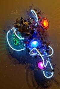
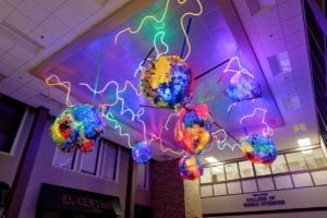
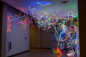
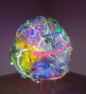
  1. Adela Andea. Adela’s works are to take up space as much as possible. For Adela, her art is trying to deconstruct the clear delimitation line between reality and virtue reality. The two things that I want to learn from Adela’s works are the followings: first of all, I really enjoyed Adela’s use of color. There’s a tendency in her work of using vibrant colors. Besides, Adela’s works are a combination of colorful objects and lights. My project would also be combining hand made objects with the lights. Moreover, in Adela’s works, we could see the composition is quite interesting. The forms she combines lights and objects are fascinating.

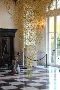
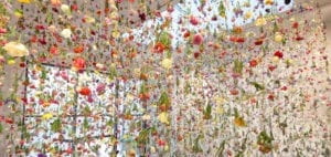
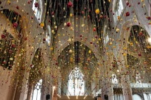
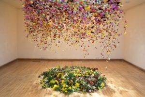
Rebecca Louise Law. Rebecca’s works are about flowers. She made a huge installation with fresh flowers, and let them dry while in the exhibition. These flower installations somehow create a romantic sense. My project is also using bunches of flowers. I could learn from Rebecca on how to arrange all the flowers on a large scale.

My final project is inspired by a Korean song called, 봄날에 만나자, Let’s Meet When Spring Comes. This song is about the ambiguity between young lovers. Therefore, my final project would be an installation made from dry flowers and other objects. The aim of this project is to mimic the atmosphere of people falling in love when spring comes. It would be a series of hangings. My audiences were expected to walk through the hangings to experience the blossoming.  

It will look sort of like this:

It would be made from LED strips/ Neon strips, dry flowers or fresh flowers. Considering the creation of the installation. I would start with on strip. And then a pole of strips, and then add up to a collection of poles of strips.

Midterm Project: The Box (Chen)

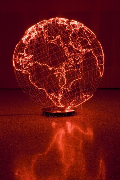
My original idea for this midterm project is inspired by the works of Mona Hatoum and Tracey Emin. When I visited Hatoum’s work Hot Spot III at Tate Britan in July 2016, I was fascinated by how light objects affects the environment.

Image result for mona hatoum

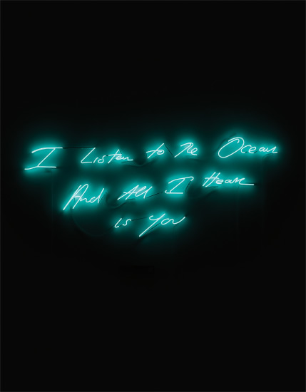
Besides, Tracey Emin’s Neon words installations are also cute to look at. 

Related image

Based on these works, I intended to construct a prism shape light object. Inside the light object, there would be several words hanging mobiles. The obstacle with this idea is hard to hang the mobiles in the prism. And the idea with words indeed requires serious consideration.

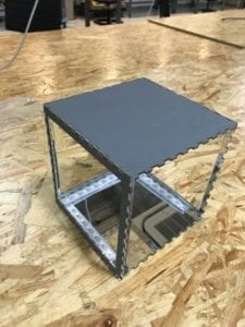
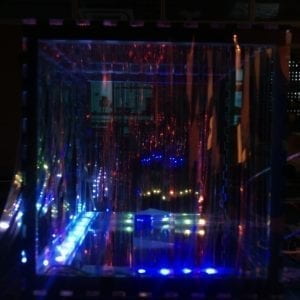
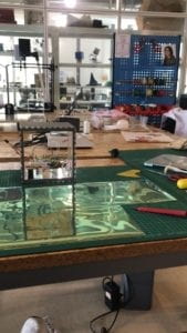
Then my idea totally shifted to another dimension. My capstone is a large glowing box (room). Why don’t I make a small glowing box with more effects? I then laser cut the box first.

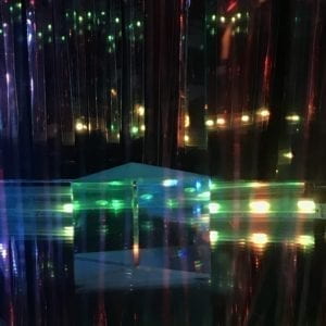
I tried with transparent acrylic first, but it would expose the led strips (which I intended to hide). I then tried with the mirroring acrylic to both hide the led strips and better reflect the light. 

IMG_2243

I then tested with the light. 

sd1554905520_2

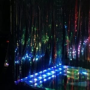
To both considering the requirement of generative and the glowing idea of my box, I used NeonPixel with Fast LED. It actually took me a lot of time to figure out the color, the gradient and the composition of these three led strips.

I also started with knowing I want to maximize the idea of Glowing. This is one material that my cat really likes to play with, shown as follows:

Related image In order to make it glow, I cut them to strips:
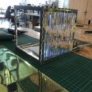
I pasted all the strips onto the box:

c

 IMG_2359

This is when I was testing with the display. I wanted my audience to walk around from the farther area to a closer area. According to my estimate, people would not be able to see the led strips when they are far away, but only seeing the glowing box. Feeling too hollow with just the change of light, when seeing the box. I thought about the scene in 2001: Space Odyssey, when the ape men discovered the stone tablet, and the stone tablet was a metaphor of civilization.

My idea of wanting people to discover the box is aligned with the film. And I decided to put the phone into the box. And here’s the test:

IMG_2359

final show:

1) People’s interaction

2) Documentation:

Professor Eric critiqued this project for the use of the telephone, which was said to have made this project way too complicated than it is best to be. However, I personally enjoy working with symbolism and metaphors. I will leave the question there then.

DMX Light: One Day (Chen)

Project Name: One Day

Group Member: Chen Xiong, Yang Gao, Ying

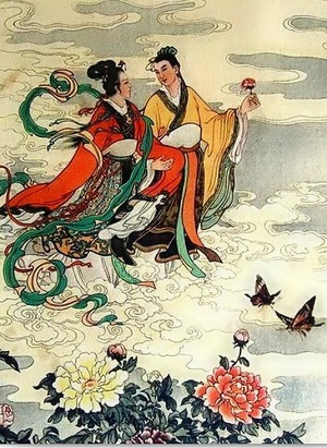
Progress: To begin with, we are quite struggling with the use of DMX light. It is designed for the stage, and therefore it’s hard to imagine a composition with these. Then we thought about music. Since it’s designed for stage, we would just use it for the stage. We decide to choose the theme song from the movie One Day. The idea is that the music has to have a story behind, therefore we could control the light according to the movie. We picked the song, which was used in a scene when the female and male protagonists were running by the sea. It almost immediately came to our mind that each of us would take in charge of one of the DMX lights. Two lights are for the protagonists, and one for the background setting. Then ideas extend a little bit here. There’s a famous Chinese version of Romeo and Juliet called Liang Zhu, where the protagonists Liang Shanbo and Zhu Ying Tai actually transformed into butterflies after they were separated, and they committed suicide.

Related image

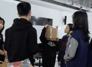
So we decide to use both of the metaphors. It took us some time to figure out how to gather the DMX lights into smaller light spots, and how to change the light spots. We test with different materials and ended up with cardboard. We practiced for a lot of times to make sure we do understand the function of the cardboard hoes, and how that affects the light spots. We used contrast colors for the protagonists (light spots). Ying and I were responsible for the protagonists, and Yang is responsible for the background color. If we had more time, we would compose the background better to fit with the protagonists, cause, for now, the background sometimes is too bright to make the protagonists invisible. Here’s the presentation of our work:

Project 1 (Max)

Title
Picasso’s Painting Mirror

Project Description

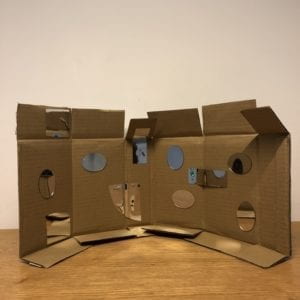
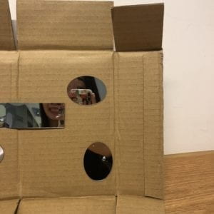
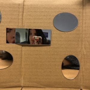
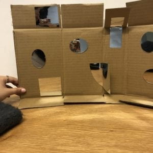
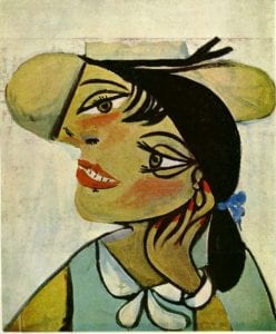
This project is a flexible mirror set. I pasted different material and formats of mirrors onto cardboard.  The cardboard is created such that it could bend. There’re 7 “parts” of the cardboard, and the mirrors were arranged in the way that when the audiences surround their heads with the cardboard, they could gain a whole perspective of their facials. The concept behind this project is that: thinking about how people when fascinated with taking Instagram friendly photos whenever they saw a mirror. However, most of the time, no one would want her face to be imperfect. And the idea is that by combining the normal mirrors with the mirrors that create distortions, people get to see themselves in another way that’s not perfect, but a playful way. My intention is kind of to play with my audiences, that when one faces a mirror, one would expect to see herself, but my project is questioning the pursuing for perfections. Besides, I personally am very much influenced by Cubism artists, the distortions and Yayoi Kusama, who works with those infinity mirror rooms, cubes, and etc. Last semester, I was in Paris studying art history, and when I visited the Picasso Museum, I was always fascinated with the way Picasso perceives the world and how he presents it to us. And therefore, by this project, I am actually dividing the reality with the mirrors and the cardboard, and therefore, the audiences have no choice but to see the world in a very cubist way.  


Perspective and Context

In Merleau’s book, he argues that, from the aspects of science, painting,  and philosophy, people’s perception has changed from classical to modern ones. Nowadays, we are more perceiving the world as a whole rather than separately. In my interpretation, we tend to see everything we perceive as a complete piece. Our brain functions in a way that everything is quite united. And my project, which forced the audiences to see the world separately, gives us another way of perceiving the world. It is a challenge to our traditional perceptions. When facing the mirror installation, people are forced to see themselves in fragments. With all the facial fragmentation, My work is an exploration of the established world. Besides, it is also a questioning to the body shame culture. People all expected to look perfect themselves. Especially for the women, who are also living under social prejudice, this project is to tell them that it is ok to not look good. No one is perfect. 

Development & Technical Implementation

I did not start with this project at all. Initially, I was planning to make a pair of glass, which helps human beings see the world through cats’ eyes. My research is based on the cat eyes’ differences from human beings, which included: 1) color blind on red and green; 2) wider eyesight (220 degrees) 3) less saturated 4) better perceptions at night

And I purchased different types of mirrors, planning to widen the human eye’s perspectives through the additional mirrors. However, the cat eye project did not turn out well. The idea, simply adding another mirror, does not make human beings’ eyesights wider. As a blessing in disguise, the mirrors that I purchased turned out working well. The one particular piece is a type of mirror that you could cut it, bend it, and shape it any way you want it. And the distortions all turned out interesting. I just played with the piece of mirror. And I thought about the art fairs that I visited, where people had an obsession with taking selfies with the mirror artworks. I want people to take pictures when they face my project. I enjoy the idea of creating interactions for my audiences. The artists that most inspired me in this project are Picasso, Yayoi Kusama, and Songdong. When I was taking art classes, the teacher would tell us that Picasso would paint in a way of combination. He would choose fragments of a facial from different angles of the human face and paint them jointly. And my audiences would just achieve that using this magical cardboard. 

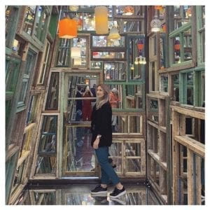
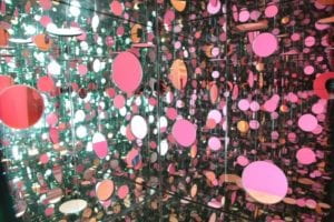
Here’s a display of the works that inspire me:

I’ve sat there, and place the project in front of me, to arrange the displays of the mirrors, to make sure that the piece actually gives a whole perspective of the user.  However, I would say there’re tons of ways to interact with the mirrors. I carefully chose the place of each one of them. And the special mirror is actually flexible that users could play with, and therefore, there’s no fixed way of playing with this. In fact, I would encourage my audiences to play with the arrangements of the mirrors as much as they could. 

Presentation

I liked the presentation in class. The cover of the project is a little bit embarrassing, cause I got it for environmental purposes from cardboard room in IMA. As an artwork, I should’ve treated it with better decorations. I’m very glad that everyone in the class tried my project, interacted with it. It is what I expected, people just love mirrors. It’s mainly nice, the way people interacted with the mirrors; however, I would love it if people would be more daring to try with it. I found my audiences treat it too careful that they did not get to explore it much.  It would be nice if they could just rotate it and bend it, and to be a contemporary Picasso

Conclusion
My final project is not what I planned to make, an actual sharp turn.  To start with, I guess it is the ability to make a project using limited resources. I did not plan to make a mirror installation, to begin with, or else I would definitely buy more mirrors to make a much larger one. With the limited mirrors, I have no choice but to make a more like a prototype thing, one that user could experience, but not able to emerge themselves in. 

I learned that: 1) make full use of what you have when making a project. 2) as an artwork, people love mirrors as a medium.  I discovered a new type of mirror. I did not know that there exists that type of mirror which is quite flexible for almost any use. I would love to explore this type of medium in my future works. 

I failed by making the project a real art piece. I should’ve to pay more attention to the details of the decoration. Besides, the scale is barely satisfactory. I would definitely make better cover next time. In fact, I would love to continue with this work and to make a larger one, with a 360 degrees’ perspective.