Final Project Proposal by Christina Bowllan

Project 1: Set Your Dreams Free

It’s really easy in college to find yourself surrounded by people that doubt your path or unconventional use of your major. It’s so easy in college to succumb to peer pressure and not capitalize on what it is that you want to do. For our final project, I want to create an interactive project that can support and motivate college students to believe in themselves and chase their dreams. During the preliminary research phase, I found a project called The Wishing Wall and this idea really inspired me. In this project, people put their hopes and wishes into the atmosphere and watched how that manifested into beautiful butterflies. For our design, I want to take a similar approach and create an interactive button or spot that will trigger an inspirational animation on the screen. My first idea is to create a judge’s gavel and when the user hits the plate, they can watch certain quotes appear and feel motivated from an animation. I haven’t thoroughly thought through the design, but I want college students to feel a sense of control of their lives when they interact with our piece. 

Project 2: We Are Not So Different After All

Even though NYU Shanghai is a place filled with people from all walks of life, let’s face it, we walk towards our comfort zone at the end of the day. I am not implying that having close friends from your own country is bad, but I think we don’t venture out as much, because we have already decided that only people from our same background can relate with us. For my project, I want to challenge college students to rethink this phenomenon. During the preliminary research, I found a project called Play the World by Zach Lieberman, and this project has inspired me. The essence of his project is if you press different piano keys, it will play out the same note being heard in the world thus bringing people closer together. For our final project, maybe we can have interactive buttons that are disguised like flags and when you press two, it will show you what the two countries have in common. We can conduct interviews with different students, and this recording can play out while the users watch an animation on the screen. Either way, when NYU Shanghai students leave our project, I want them to not only feel inspired to make a friend from another background, but question who they have surrounded themselves with up until that point. 

Project 3: We Are More Than Our Illness 

Whenever someone contracts a major illness in America, they might as well add this to their instagram bio, because it instantly becomes a part of their identity. No matter how energetic or lively the person is, people will still find a way to not see beyond the disease. For this project, I want to create an interactive art piece that addresses this issue. My inspiration to create this project started when I interviewed a family friend about her experience having a heart attack. She said that she would never bring it up at work because her coworkers would start to feel sorry for her and not treat her the same. 

I am not sure yet how this idea would manifest itself, but I was inspired by the interactive science designs in this article. One that particularly stood out to me was the first image where you can zoom in on a bruise by touching the display screen. I think it would be cool if we created an interactive spot that allowed the users to zoom in on different parts of animated sketch in order to see this problem more in depth. Either way, I want the user to walk away realizing how their words and reactions to patients with a chronic illness can leave a lasting impression.
Recitation 7 Blog Post by Christina Bowllan

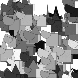
For this week’s recitation assignment, I created black, white and grey colored boats that bounced off the walls. 

Step 1: I set up the variables and arrays that we needed before setup. 

Step 2: In void setup (), I established the range of values regarding speed, width and position. 

Step 3: In void draw (), I used the for loop function in order to randomize the values we set in void setup.

Step 4: In void house (), I created what the image would look like. 

IMG_9751

(This is a link to my moving sketch)

int house= 100; //number of graphics
float[] posX = new float[house]; //array for position of x, this means that there will be a random start x
float[] posY = new float[house];
float[] speedX = new float[house];// array for speed, assigning 0 to 99 one number between 
float[] speedY = new float[house];
float [] w= new float [house]; //width of triangle
float [] h= new float [house]; //height of triangle 
float []c= new float [house]; //color 
float []size= new float [house]; //rect size
float []size2= new float [house]; //arc 
//declare an array of the length 100
//float[] opacity = {random(255), random(255), random(255), random(255), random(255)};

void setup (){ //freezed frame at the first moment it starts 
  size (600,600);
  background (255);
    for (int i= 0; i<house; i++){ // this is direction related to arrays, ++= count by ones 
  posX[i]= random(width); //this really means from 0 to width of screen 
    posY[i]= random(height);
    speedX[i]= random(-10,10); //range 
    speedY[i]= random(-10,10);
    w[i]=random (100);
    h[i]= random (100);
    c[i]= random (255);
    size[i]=random(50,100);
     size2[i]= random(50,100);
    }
  // i is just an integer that represents all of the houses
  //if for loop is here, then it will look stagnant, just draw shape, just goes through once 
}


void draw () { 
  background(255);
  for (int i= 0; i<100; i++){ //we are defining a variable i 
    house (posX[i],posY[i], w[i],h[i], size[i], size2[i], color(c[i])); //calling the function
     posX[i] = posX[i]+ speedX[i]; // adding speed to position, going to be something between -10, 10 
    posY[i]= posY[i] + speedY[i];
  if (posX[i] > width || posX[i]< 0) {  //this is when it bounces off the wall , "||"=or
    speedX[i] = -speedX[i];
  }
 if (posY[i] > height || posY[i]< 0) {
   speedY[i] = -speedY[i];
  }
  }
   
}

void house(float x, float y, float w, float h, float size, float size2, color c) {

    fill (c);
    rect (x,y,size,size);
     triangle(x, y, x+w/2, y-h, x+w, y);
    arc (x, y, size2, size2, 0, PI+QUARTER_PI,CLOSE);
 
}
   //void triangleSimple(float x, float y, float w, float h) {
  // A wrapper for standard triangle() command. 
  // triangleSimple has the lower left corner as x,y.
  // The top is above the base (or below it with a negative parameter for h). 


  //Use these parameters to create your graphics


Question 1:

In your own words, please explain the difference between having your for loop from Step 2 in setup() as opposed to in draw()

If you put “for loop” in setup, it will only run through the code one time, thus be a stagnant image. However, when you put for loop in draw, it will run through the code repeatedly creating the moving image. 

Question 2:

What is the benefit of using arrays?  How might you use arrays in a potential project?

We use arrays if there is a pattern we want to build but don’t want to have a repetition of code which would take up more space. For a potential project, I might use arrays to create multi-colored butterflies flying around the screen. 

Preparatory Research and Analysis by Christina Bowllan

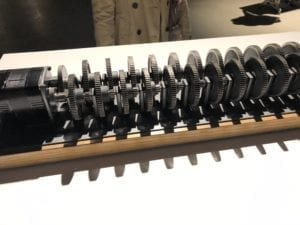
I can’t say that the Chronus exhibition was my favorite art exhibition, but I did like certain aspects of it. It’s interesting because normally when you go to other non-technology based art work exhibits, the artwork is protected by some barrier, but at this exhibit, you could move as closely to the project as you wanted. Since I could see all of the gears moving and have a 3d experience, I felt more connected with the art pieces. The one that left an impression on me and was the most engaging was Beholding the Big Bang because the gear-design was so simple, but it had a great meaning. While I was looking at the gears move, I felt like I was looking into the future because the last gear would not turn for another 13.82 billion years. 

—- 

I have found some great interactive art works that can serve as inspiration for the final project! The first one is a project called The Wishing Wall. The idea behind this project is: people can put their wishes and hopes into the atmosphere and watch an animated version of butterflies move around the wall. People so often are quick to put other peoples’ ideas down and tell them why a dream won’t work, but imagine if you could gain confidence from seeing your dreams turn to butterflies. This is a great interactive experience, because not only is it simple to understand, but each user can leave motivated after interacting with the piece. On a side note, this is the first interactive project I have seen this semester that has changed my perspective on coding and putting art together. It was really interesting to see how the authors took an abstract idea like dreams and used coding to manifest the project. 

Another project/person that has given me inspiration for the final project is Zach Lieberman’s Play the World. I watched his interview before I read about his project and it was cool to see him in my city, New York, walking around to different stores trying to find different materials to use. It first of all showed me how easy it can be to create one of these projects by yourself, but it also reminded me that a successful interactive art piece is not just about coding, but should also be carefully designed. And, the Play the World project is one that invites people to press different keys on the piano and the device can somehow match the note with a real time sound from radio stations around the world—- how cool! So, if you play middle C key, for example, this could play a matching C note from a Nigerian sports radio. I love this project as well because, again, everyone knows what to do when they see a piano so the project is self-explanatory and the project shows people that the fabrics of the world are more interconnected than we think. 

One project that did not have a successful interactive experience was Interactive Mario Mushroom Block. The design of this project is nice because it looks animated and is simple, but I would not know what to do if I saw the box. In addition, while this is an interaction piece, it doesn’t seem like there would be a significant meaning behind lifting a box and seeing a mushroom come out. 

A successful interactive experience is a combination of everything we talked about above: it is simple to understand, is engaging, and somehow leaves the user with something to think about afterwards. This semester, I have referenced Tigoe’s reading a lot, because his idea is what creators should strive for in an interactive art piece: “Set the stage, Then Shut Up and Listen.” The word “listen” is important as well, because a great interactive piece is one that incorporates user’s feedback. Izzy and I in our midterm project tried to incorporate all of the aspects listed. For example, we disguised our button in a flashy price tag because we wanted people to understand that obsession with prices is what fuels this unhealthy consumer culture. In addition, we did our best to design the project in a way that people understood it looked like a human, but also had to think about why we used plastic bags for the lungs and a toy box case for the heart.  

Christina Bowllan Recitation 6 Blog Post

For this week’s assignment, I combined our in-class and homework assignment. As you can see, whenever I moved the keys, the box would move around the screen and, at the same time, it would expand and contract while changing colors. [Sent you a video of it] 

  1. In order to do this, I first had to establish the variables that we would use before void setup. So, you can see that I defined “x,y,c” which related to the size and placement of the rectangle and also told Processing that we would be incorporating speed and an expanding/contracting element with the boolean function.  
  2. The next step was to set the parameters of our sketch: the size of the screen was 600 units by 600 units, “x and y” told us where the rectangle is on the screen and c is the initial size of the rectangle.
  3.  In void draw (), this function allowed us to run the lines of code in a loop. The first thing we established was we wanted the border of the rectangle to change colors randomly, so we used the float function in order to do this. Also, within the draw function, we wanted to tell processing that the rectangle should contract and expand, so we used an “if else” statement and the symbols “–” and “++” to do this. This part also relates with the part of code because void setup(), because the boolean statement is where we established what statement will be true or false; You have to do this because in order for the rectangle to expand and contract, processing needs to know what to do when the statement is true, and if is it not, have a condition for that as well. 
  4. Lastly, in order to make the rectangle move around the screen, we used the keyPressed() code. As you can see, in order to make the box go up, for example, I connected the keyboard upper key with going up, hence keyCode=UP, and then in order to make the box itself go up, I used the syntax “y-speed”.

CODE

int x;
int y;
int c;
int Speed;
boolean rectIsShrinking = false;

void setup (){
size(600,600);
x = width/2;
y= height/2;
c= 100;
Speed = 15;

}
void draw() { // draw() loops forever, until stopped
background(0);
float r= random(255);
float g= random(255);
float b= random(255);
stroke(r,g,b); //random color of border
strokeWeight(5); //width of border
noFill();//no color inside of rect
rect(x,y,c,c); //size of rect and position
if (rectIsShrinking) c–;
else c++ ;

if (c == 0 || c == 150) rectIsShrinking = !rectIsShrinking;

}

void keyPressed() {
if (keyCode==UP) {
y= y-Speed;
}
if (keyCode==DOWN){
y= y+Speed;
}
if(keyCode==LEFT){
x= x+Speed;
}
if(keyCode==RIGHT){
x=x-Speed;
}
}

Recitation 5 Blog Post by Christina Bowllan

Step 1: Choose an image to be your motif

Josef Albers, Concealing, December 1940. Oil on Masonite, 27 7/8 x 23 1/4 inches (70.8 x 59.1 cm)

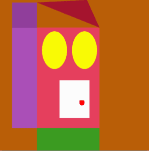
The picture I decided to recreate was Joseph Alber’s Concealing and I chose this one because, on the surface, it looks like a lot of shapes bunched together, but, to me, it looks like a house with a front lawn. Creating this image seemed like a fun challenge to try on Processing. 

Step 2: Draw your image in Processing

My initial goal was to recreate the exact image above, but in practice, things changed. Firstly, I created the purple and pink rectangles which look similar to  the original image. Creating this part of the motif proved to be more challenging than I expected because I had to figure out which numbers to plug into the syntax in order to place all of the shapes side by side. The colors of the motif and the original one also resemble one another, but I wanted to create my own version of Concealing— one that had a twist! On the one hand, the image looks like a house; I used the ellipse function to make windows and a version of the rectangle to make the doorknob. But, on the other hand, all parts of the motif resemble a face! The yellow ellipses are the eyes and the white door is a mouth. 

I think Processing has potential to realize the image well, but I have not figured out yet how to maximize all of the tools. It is interesting to think, though, that anything we see in the world can be broken down into a code for shapes and colors and, in turn, can create any visual in the world.

Code

//little rect
size(600,600);
background (185,94,7);
noStroke();
fill(144,62,155);
rect(50,10,100,100);

//side rect
fill(170,79,183);
rect(50,110,100,400);

//big rect
fill(229,63,93);
rect(150,110,250,400);

//top triangle
fill(165,20,47);
triangle(150,10,400,110,350,0);

fill(255,50,20);
triangle(150,10,400,100,400,100);

//white box on the inside
fill(252,252,252);
rect(240,320,120,150);

//doorknob
fill(255,0,0);
rect(320,400,20,20,3,6,12,18);

fill(249,250,5);
ellipse(220,200,100,150);
ellipse(340,200,100,150);

fill(59,155,33);
rect(150,510,250,400);