Week 14: Final Project Documentation/Reflection – Cara Chang

Project Link: imanas.shanghai.nyu.edu/~hrm305/elevator2/lobby

Description: For our project, Hanna and I drew inspiration from a virtual art museum, having two art mediums for users to experiment and play with. The user is supposed to feel immersed in a world of art, where we created a Piano Studio and a Drawing Studio. The user is directed to an elevator page where they make the decision on which floor they would like to visit, either the piano or drawing studio. Once they make a decision, they can play with the functions that we have coded and create their own artwork through the virtual museum. We wanted to create a visionary experience with the drawing studio and an auditory experience with the piano studio. 

Process: To split up the work evenly, I mainly worked on the drawing studio while my partner worked on the piano studio. Once we got the main components of our code figured out, we then showed our codes to each other and collaboratively added any minor missing components/fixed any bugs that we had with the two codes. 

For the elevator page, we wanted to transport the user into two different HTMLs depending on which studio they chose, so we made the elevator page as the home HTML page, and the piano and drawing studio as two other linked in HTML pages. 

For the drawing page, I used canvas to create the page so that I would have access to a wider range of options to code with, whereas P5 has more limited options. I wanted to create a pen function, a various set of stroke widths, a set of stickers, and an erasing tool to use. Below I have attached a screenshot of the code I created to allow the user to freely choose from either of the two stickers, or the pen tool. 
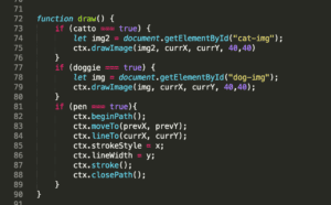
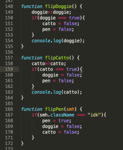
When the user is using the pen function, the cat and dog stickers are disabled, and I did this using a true/false component where when one is true, the other two are false. All the colors are under the same class so that all colors are able to be used when the pen function is chosen, whereas the stickers were coded individually. 
To achieve the stroke width, I added a range slider so the user can drag and choose what width they would like the brush tool to be. There is a cool function with the width tool, where if the user drags the slider value to the maximum, the brush will create a series of choppy rectangles, creating an abstract looking creation. I wanted to create an abstract piece within the drawing studio, so the more the user drags out the slider, the more abstract the pen line becomes. 

The stickers were attached as images, so when the user clicks either the dog or cat sticker, the image is repeated over and over again as if the user were drawing with the dog/cat. 

There is also a save function, so if the user likes what they have created, they can save all their work onto a canvas that will appear next to the original one, displaying their work that they have created thus far. They can keep drawing on the original canvas, and if the user presses the save button again, the work that they have added will transfer to the saved canvas next to the original. 

As for the piano, we assigned each piano note of one octave to a specific key on the keyboard of the laptop. Whenever any note is pressed, a color bursts above the key, signifying the burst of color that users can experience in a visual and auditory manner. We used CSS to arrange the piano keys to mimic the look of an actual piano keyboard. 

Challenges: A main challenge that I had trouble with was trying to get the dog and cat sticker to become independent variables, because originally the dog and cat stickers would interfere with one another and have a pen line stroke alongside the sticker. But after a couple hours of work, I figured out how to make all components independent from one another. 

Postmortem: I feel as though we met our original thoughts of creating a user oriented workspace for people to have the freedom to play with and create their own forms of art within drawing and piano. We wanted to connect two different art forms into one place, and we accomplished that through our virtual art museum. 
Week 11: Web Work Response- Cara Chang

Rachel Greene discusses web art from the very beginning of its age and gives an example of an image of what old net art used to look like. Seeing its raw form in a pixelated manner really shows how far internet art has come since it first made an appearance in December 1995. Net art created a new community of artists to form and  communicate with each other in a manner that combined typical art into a multimedia platform. 

What was most interesting to me was the impact that net art had after the neo-liberal movement, allowing people to artistically express their feelings on a much larger scale, which is on the internet, allowing anyone from around the world to have the chance to see one’s story and art. Internet art is easily shareable and accessible to anyone around the world, and is able to be seen and shared in the blink of an eye. 

The presence of net art is very significant to me because it allows people to create any art form they want on a platform with no boundaries. Having art being created on the internet serves another purpose for the computer or any electronic device that proves that these tools are not just tools used for information or searching databases. It allows people to interact with their art in their own way, creating a personal and fun way for others to interpret others’ creation while making it their own. It is crazy to think that internet art started out with something with such little detail and with just a few pixels. Internet art grows with the ever growing rate of the advancement of the internet, improving and outdoing itself every decade. 

Week 10: Internet Web Art Cara Chang

http://weavesilk.com/

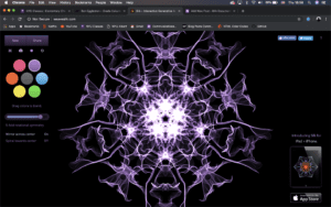
attached is a link to a webpage that I found to be completely mesmerizing. It is interactive and you draw with your mouse and the website generates very mesmerizing art forms based on your mouse movement. attached below is a demonstration on how the user can create any shape with a multitude of colors and dimensions. Having such florescent colors against a black screen adds to the brightness of the colors on the screen. This site reminds me heavily of a very zen aura and stress reliever. 

Week 10: Interactive Video Project (Cara Chang Individual Response)

Project Proposal:

Originally, our group had thought about doing a double perspective on a date between two people, but then settled on a similar scenario of a job interview between two people, after finding out that filming at a restaurant was too noisy. 

Project Description:

Our project has a double perspective on both the boss, as well as the interviewee. The interviewee, played by me, is supposed to represent a normal person applying for a potential job, meeting with a strange boss that is very judgmental. The boss takes first impression as his overall view of the potential candidate, and comes up with different things that the girl is saying, instead of what she is actually saying in real life. On our project, the user can switch between perspectives of what the boss thinks is happening, versus what is actually happening in reality. 

Process:

We split our project in three ways so that we could all work on the code as well as participate in the film process. I mainly did the acting as well as coming up with a theme for the CSS on the webpage so that the site would mimic a real show on television. We all worked together to overlay the videos on top of each other so that both videos could be played simultaneously. We then combined all our coding and film editing together, which resulted in a cool looking interview, mimicking the show, The Office. 

Issues:

The main issues I came up with was trying to stack all the GIF buttons on top of each other without interfering with the TV background. It was also a challenge to get the video to fit within the space of the TV screen, which required a guess and check method until I could find just the right dimensions that could fit. 

Postmartem:

I believe that even though our storyline was quite different than what we had originally planned, all the same concepts were still able to be applied and carried out, which resulted in a project that I personally think came out to be . both funny, and carry out an important message which is: never make assumptions about people and give people the chance to show you who they truly are. 

Week 7: Response to The Danger of a Single Story- Cara Chang

In Chimamanda’s TED talk discussing the dangers of a single sided story was interesting to me because it points true to the society in which we live in. She discusses how due to her British education that she learned about the world from a perspective different from her ethnic descent, which I could personally relate to. I feel like growing up in America in an age with such universality can make me forget to learn my own culture. People do not think about the rest of the world’s perspectives because they are so used to only being exposed to one certain atmosphere. I found it interesting that Chimamanda read books of white characters with blue eyes, and found it normal to her, just as I can personally see the culture of Americans as my own, even though I am fully of Taiwanese descent. Being immersed in a world of such diversity yet with such universal cultures can blur people’s mind from being able to understand other culture’s perspectives. Being in Shanghai offers a firsthand experience to immerse myself in a culture similar to my own. The students who attend NYUSH have the opportunity to expand upon their knowledge of only the culture from which they grew up. Understanding a much more different culture such as China’s can personally allow us as students to be more aware of the many perspectives of the world. Chimamanda warns people to not be caught up in only being able to see from one perspective, because that then causes a lack of consideration and knowledge as well as understanding for many other cultures. A single story then creates stereotypes which can then lead to a direct misunderstanding, as Chimamanda explains. Many people have a misconception about Africa, which Chimamanda got to learn herself, as she learned about her culture and its stereotypes through a single sided story. Take, for example, her taste in music, and when someone was disappointed she had her taste in Mariah Carey, not the “tribal music” she is stereotypically supposed to listen to. This offers a firsthand example of how quick people are to assume certain things based off of stories they hear from only one perspective. People must learn to immerse themselves in all these different cultures so they do not fall for the stories that they hear from a perspective that is not true to reality.