Project: Where do we go in our dreams?
Design:
My project definitely came a long way from my initial idea, but I definitely feel like the decisions that I made throughout the process was essential to its success.
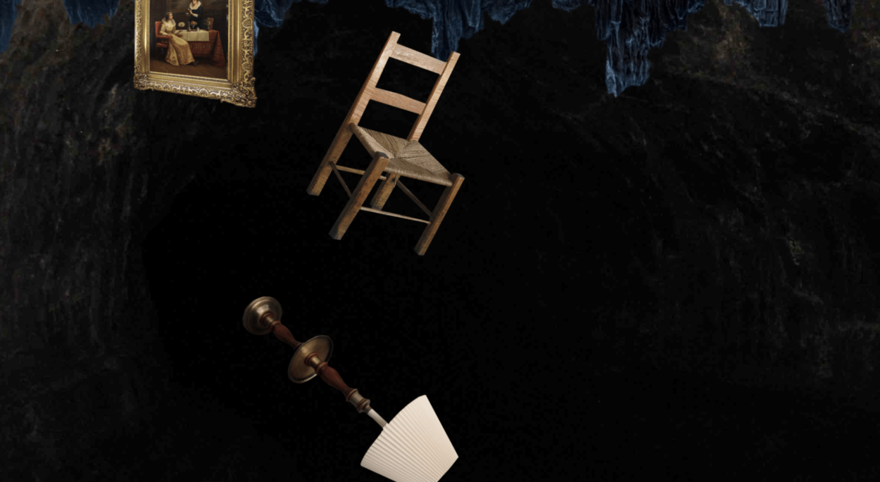
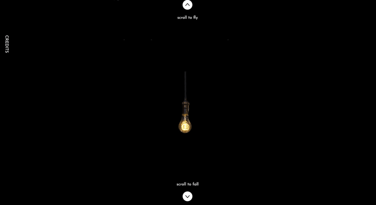
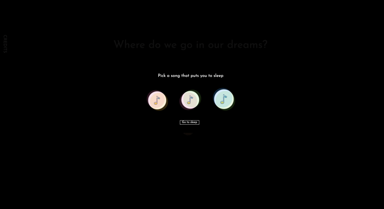
The final project allowed users to explore two different dreams by scrolling up and down. I was hoping to express to the user how I felt that a certain dream would manifest. Each scrolled direction included three subsections where the user would scroll through. Each subsection included it’s own little ‘storyline’ as well as floating elements that moved with the scroll. The video below demonstrates the way that my Net Art Project functioned.

Process:
I began my project by trying to expand the canvas size and to allow the user to start scrolling from the centre of the screen instead of the top left corner. I think that I spent a lot of good time that could’ve been used elsewhere on trying to set up my canvas in the first place. After unsuccessfully trying to use p5 to expand my canvas, and to use javascript to try to land the user in the middle of the page, I turned to my professor for help, and he quickly solved the issue. With this code:

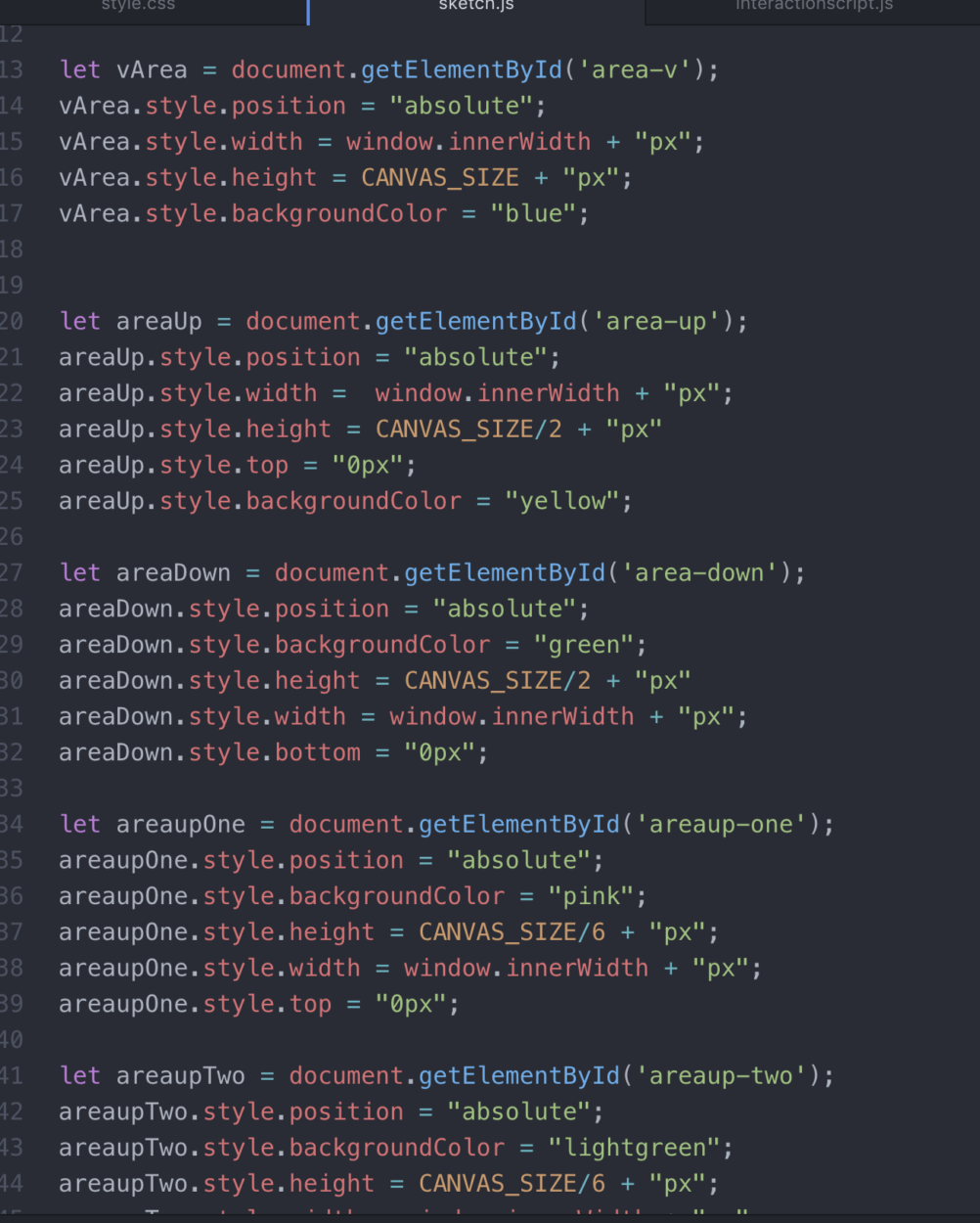
After successfully leading the user into the middle of the page, I had gotten to work trying to split up the canvas in four directions and then splitting up these sections into three sub-sections. I did that in JS:
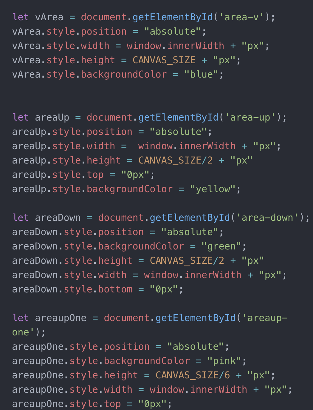
Initially, I had wanted the user to be able to scroll in all four directions in order to explore four different dreams instead of two. However, due to the time crunch, I was unable to execute four different ways of scrolling and try to figure out a way to stop the user from scrolling horizontally when the user was scrolling vertically (and vice versa), and therefore made a decision to cut my project workload in half by only allowing the user to scroll in two directions.
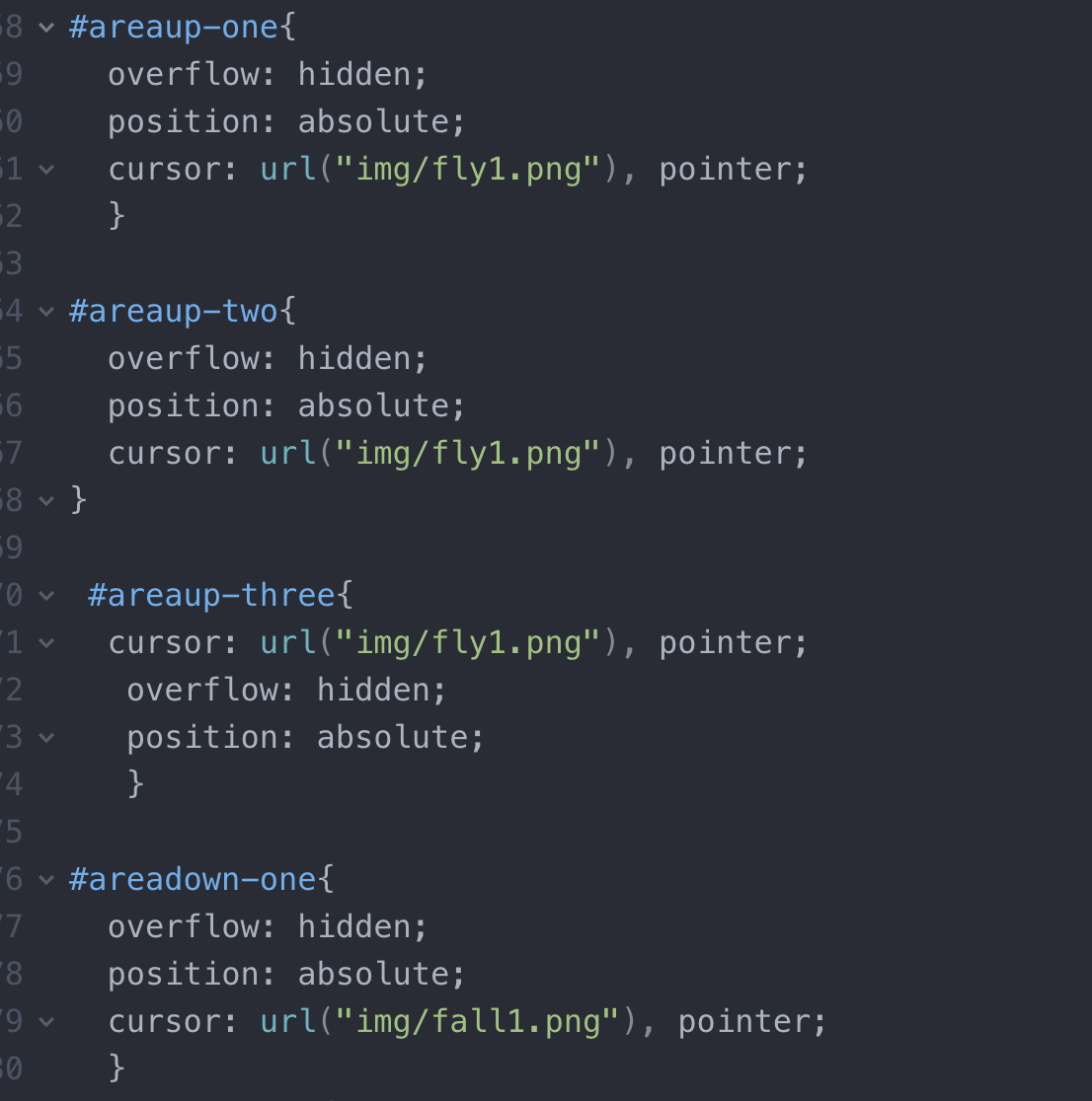
After I implemented these different subsections, I colour-coded them using CSS in order to see the different sub-sections clearly. Then I began to implement the background image for each of the sections which I did in HTML.
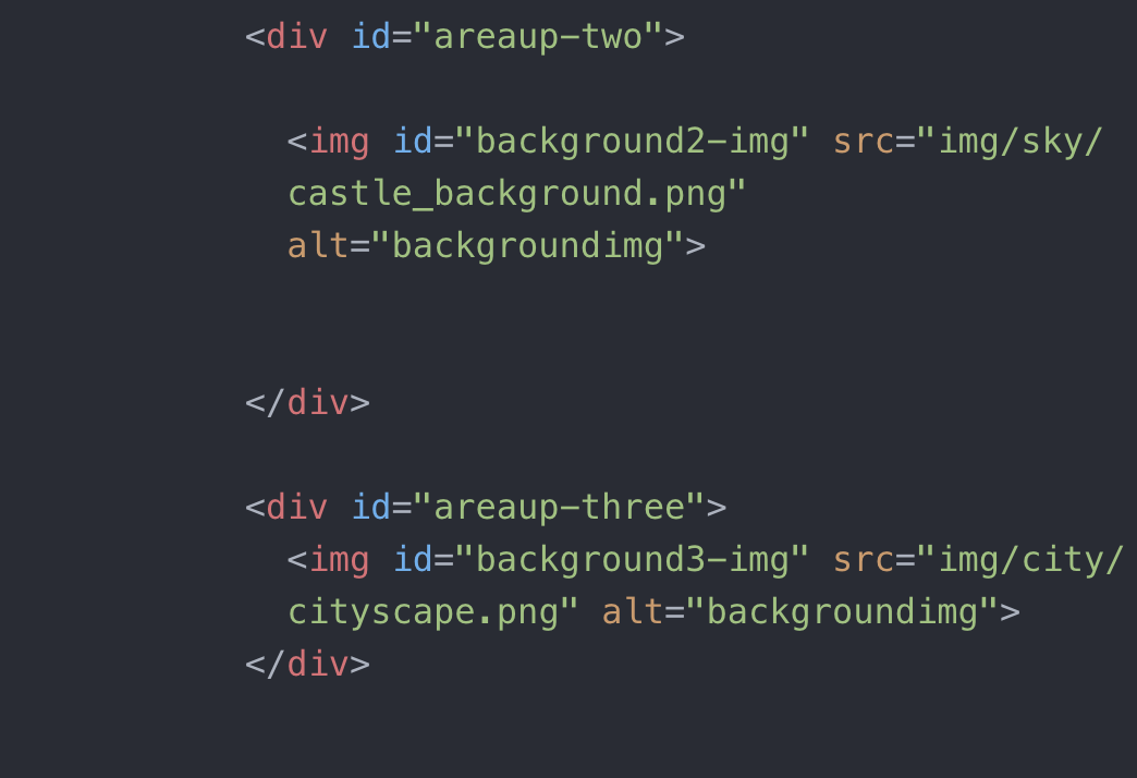 After implementing the background image, based on the trajectory of the dream that I wanted to convey, I got a better idea of how my website was going to unfold, and I began to collect images that would be later on be implemented as floating elements in my NetArt project. After finding all the images, I had to put all of them through photoshop to isolate the image from its background so that I could implement them into my website.
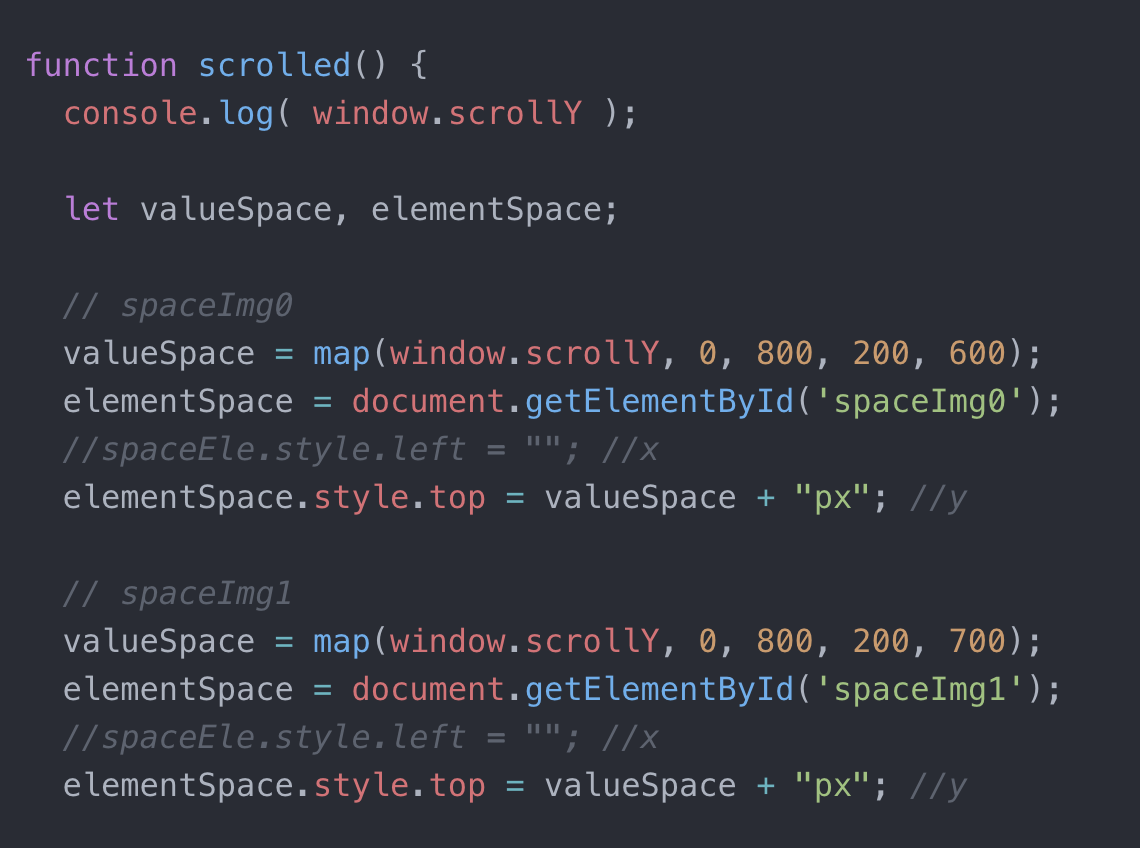
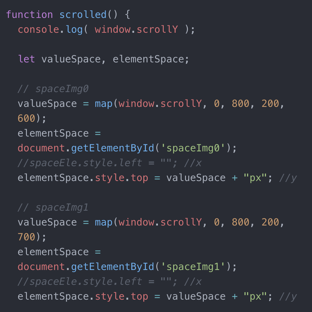
Initially, I had imagined that my elements would load randomly based on how the user refreshed the button, however after achieving that, I just felt that my website looked extremely unfinished and unpolished. I then looked back at my inspiration to think of another way to execute my project. I had originally hoped to achieve the scrolling effect that Joe Hamilton (http://indirect.flights/) was able to achieve in his NetArt Project, however, I thought that this concept would be too complex. After consulting my professor a second time, I learnt that this could be achieved with the mapping function in p5. Afterwards, I was able to map the direction that each element moved depending on the section that the user scrolled past. This eliminated a very messy looking project, and allowed me to hide any flaws that I had with my photoshop!
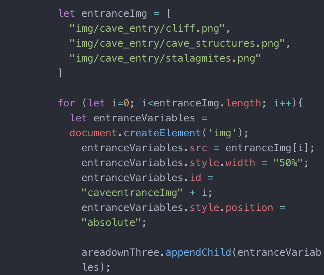
This is how I loaded each image onto the website (JS):
And this is how I achieved the parallax effect (p5):
I think the biggest discovery that I made from my proposal to my execution was that some of my ideas were pretty ambitious for the time frame that we were given, and there were a lot of things that I had hoped to do that I didn’t.
Future:
I think that in the future I would build on some of the feedback that I was given during my presentation first. I would probably rethink my cursor, and try to maximize its representation within my project instead of just using a stick man. I would also try to expand the project in more directions so that the user could explore more dreams. Lastly, I really wanted to add interpretations of dreams by psychological professionals, which I feel like would really add to the project. I would definitely also try to clean up my project even more so that it was much more refined, I would also make the page more responsive and add more elements within each sub-section so that there was a lot more that the user could interact with. I really appreciated Dave’s suggestion to allow the user to return to the home screen by quickly passing through all of the elements instead of transporting, I think that if I were to expand on this project in the future, that would definitely be something that I’d like to implement.

