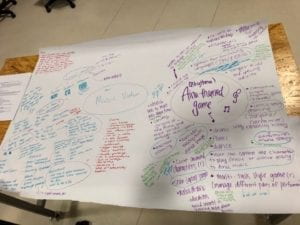
CPD: Geocinema Project – Ashley Zhu (Chen)
Geocinema film: https://drive.google.com/open?id=1gl_gM-Ce3hXT8sMFiRyvZZtt8SseeuoL
Group: Ashley Zhu, Carlo Gabriel and Ashley Friedland
Link to reflection: geocinema blogpost
Works Cited
https://unearthed.greenpeace.org/2018/02/12/shanghai-air-pollution-worse-beijing/
Beijing is no longer the most polluted city in China. Now Shanghai has taken that place.
Google Earth
https://www.youtube.com/watch?v=zhoHfiLGbY4
Lakey Inspired- Monroe
https://www.healthandsafetyinshanghai.com/air-pollution-in-shanghai.html
sources of air pollution in Shanghai
http://aqicn.org/city/shanghai/xujiahui/m/
AQI levels of Xujiahui
http://aqicn.org/products/monitoring-stations/
AQI Monitoring stations
CPD: Digital Map – Ashley Zhu (Chen)
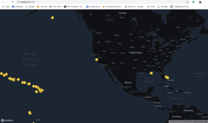
The digital map assignment was particularly difficult for me since it included gathering massive amounts of data and then manipulating it. After figuring out which data to use, I downloaded the JSON files from the MARCOS website, which massive. Going through 20,000 lines of data was extremely difficult. Atom was loading pretty slow, so I went into a text editor and manually selected the data that I wanted to use, which was the gold coral (around 2,000 lines of data) and deleted the rest of the other information. The data is on a local host, like the one Leon demonstrated in class.
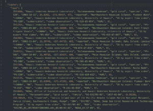
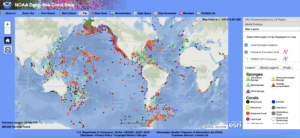
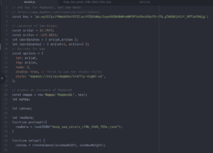
After that, I console.logged the data and created ellipses to show up on my map, to show where the gold corals are scattered around on a world map.
Overall, it was difficult to work with big data and deciphering which one to use which a hassle, but it made the process of coding easier after the data was neatly organized.
Week 2: Map Assignment (Chen)- Ashley Zhu
The map that I created is “A Foodie’s Guide of Shanghai”, along with some of my favorite food places. On the weekends, I love going out to brunch with my friends and really see Shanghai in a different light. Since I am a foodie, I love exploring new places and finding new restaurants and cafes to try out. Luckily, Shanghai is an enormous city full of delicious food and coffee. On my map, I drew the different areas that I have been to and recommend for others to try as well. For example, one of my favorite cafes is Rac Coffee, which is located in Puxi. I did not include a legend on my map since the map is pretty self-explanatory and I included names of recognizable attractions to better understand the exact locations. I also drew out some roads and buildings to provide a clear guide as to where things are. I would like to update my map once in a while, of the new foods that I tried out, and maybe it will become a foodie’s guide to delicious Shanghai food. I drew everything in pen first and then colored it in with my colored pens and highlighter since I wanted to keep the aesthetics minimal and easy on the eye. I also included doodles of food at each location to better ‘explain’ the specialties. For example, I drew an ice cream cone next to Zaku Zaku, since it is a creamery. Overall, my map is a detailed representation of my observations of the good food places in Shanghai.
Week 2: Mapping Readings (Chen) – Ashley Zhu
Jorge Luis Borges’s “On Exactitude in Science” explores the different views of cartography throughout generations. The passage demonstrates the transformation and improvement of cartography, with criticism from the next generation. This reminded me of current maps and how they are always changing and improving. Initially, cartography was purely on paper and as technology advances, the art of cartography digitalized and became more tangible. While reading the passage, I wondered how cartography evolved and how early man collected data about roads with limited knowledge and assets.
I think the podcast about mapping is interesting, as it provides an alternative way of viewing the world through different lens.“Maps have meaning because they filter out all the chaos in the world and focus obsessively on one item.” By paying close attention to one thing, cartographers are able to accurately capture fine details of a map. At first, I was slightly confused about why the producer chose to connect mapping with different senses. But, I figured out that mapping didn’t have to mean cartography only, but rather, the memories associated with an understanding of the world. Overall, I think it was intriguing to see how the producer chose to incorporate the five senses into mapping to tell their stories. One of the stories that stood out to me was the one about the women having uncontrollable urges to check for breast cancer. Her way of mapping the world was focused on touch, and how that sense plays throughout her life while grasping the world.
While reading the essay by Trevor Paglen about maps, I kept thinking about the scale of maps and how it creates a limited view of a certain area. A map is always cut off on some levels, and space unseen might make the picture look completely different when examined. Although Google Earth provides a solid picture of places using satellites, it does not fully capture everything or the newest changes to a certain area. This makes me speculate the accuracy of many maps, and how a lag time in updating might distort my perspective of a place.