Week 6: Podcast Homework (“Pockets: Articles of Interests #3” produced by Avery Trufelman) – Allie Dunnaville

I chose to listen to Pockets: Articles of Interests #3 produced by Avery Trufelman. Before listening to this podcast, I had never thought about why men have bigger pockets than women. Although, an issue that I can relate to which was brought up in the recording is that I often find myself annoyed when I wear a dress or skirt because I have to bring a purse to hold my wallet, keys, phone, etc.

I really enjoyed how the podcast was introduced to the audience. The first line when the college boy says: “I had never worn a dress before” immediately made me intrigued about the following content. Also, I thought the story was really captivating and set up the rest of the content which was talked about in the podcast very nicely. Another story I found interesting was when the interviewer went to a uniform store which supplied police officers with their uniform. The worker discussed how most of the women would rather buy men’s’ uniforms because of the deeper pockets.

Before listening to this recording, I never thought about how important pockets could be in giving someone more confidence when walking around in public or making them feel safer because a purse is easily stolen or lost and is something that is seen by everyone, whereas pockets conceal items. Something that really stood out to me was when the interviewer said “pockets are a perfect metaphor for privilege” because the pocket disparity is a construct that is made up and there is no reason for women’s pockets to be made small.

The last issue I found interesting regarded the history of pockets. I found it fascinating that women used to have pockets which were bigger than men and they were able to hide them under their large dresses. I learned that the idea of pockets disappeared as women’s’ style changed and it was more fashionable to wear tighter fighting clothes and carrying along a bag—this was why pockets disappeared from fashion for a long time.

Overall, I think listening to this article made me think about how essential pockets are. Furthermore, I discussed some of the issues brought up by the podcast with one of my male friends, and he gave me another perspective on the subject. When referring to the point of gender equality and pockets, he added that although men might have pockets, women also have things men don’t have such as being able to use makeup to hide “flaws” or being able to dress “manly” and “feminine.” I thought the points he brought up were super interesting and worth taking into consideration when thinking about this issue.
Week 6: Comic Project- Allie Dunnaville

http://imanas.shanghai.nyu.edu/~cc5581/week04/interactive-comic/

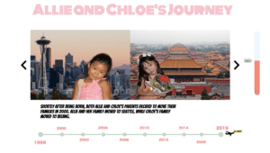
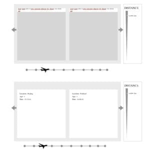
My partner and I began our Comic Project by first brainstorming and outlining our ideas. Once we both agreed we wanted to create a project which described our lives from when we were born (1999) until the moment we first met in class (2019), we started thinking about the layout of our website and how we could implement things such as a timeline, split screen with pictures, and stories about our lives. Once we finished sharing our ideas, my partner drafted an outline of our plans. In the image below, you can see a distance meter on the right side of the screen which tracks how far apart Chloe and I were each year of our lives that we decided to display with pictures. There is also an airplane which follows along a timeline. And lastly, in the center of the layout, you can see how the two images of my partner and I will be laid out.

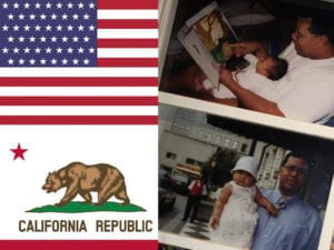
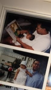
The next steps I took in my project was photoshopping my nine images for the panels. Some of my pictures such as my baby pictures in the first panel were too long for the size my partner and I had agreed on as the set size of the boxes which would hold the space for our images. So, rather than resizing my pictures, I combined them with another couple of images so that the size would not look distorted. I also think that these edits gave an additional positive visual for the audience as it helps them decipher my location just from looking at the images.

Towards the beginning of the project, I was incredibly sick with the flu. I’m thankful that my partner was able to begin the coding process and also seek help from friends who had prior experience coding for the more challenging pieces of code such as formatting and creating the base for the arrow navigation, panels for pictures, and timeline. After my partner and set up the foundations of the code, I was able to step in and add the panels for the timeline, insert images, write and insert the text, as well as work on the design, style, and layout of the page overall. 

The most challenging part of the project for me occurred when I was working on the panels. The result of having 10 different panels was incredibly chaotic and repetitive.  

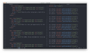
After writing the code for the first 2-3 panels, I decided it would be easier to copy and paste the code rather than retyping everything. But, this resulted in me making little mistakes by forgetting to change one number or one name and then having to take additional time to go back and look through my code until I found my error. Something I also struggled with while coding the website was figuring out why my ninth and tenth page wouldn’t show up. After meeting with Professor Moon and having his fresh eyes look through my code, he found that I had pasted the code for the 9th page after I had consoled out of the code. So it was luckily an easy fix, I think I learned that it is beneficial to have a fresh pair of eyes take a look at your code, especially if you’ve been staring at it for a long time—like me.

I would definingly say we reached most of our goals as a group. The layout of the page looks almost exact to what we had brainstormed a few weeks ago. I think if we had more time, I would have liked to figure out how to rotate the images; so if you clicked on them, they would give the audience a more detailed explanation of what was happening in each photo. Also, it would have been great to have the timeline below the split screens move with the arrows and adjust according to the panel the audience was clicking on/looking at.

Overall, I’m really proud of how this project turned out. My favorite page is definitely the second panel because, in my opinion, the image split screen of my partner and I is super cute and adorable. I also think it’s incredible how similar the pictures of us are. Lastly, while creating this project I feel that we both learned a lot about each other and honestly despite so far away from each other, we moved around about the same amount and also had similar upbringings.

Week 3: Photoshop Exercise – Allie Dunnaville

Photoshop is one of my favorite platforms to use, so I had a lot of fun with this project. I decided I wanted to juxtapose Shanghai’s skyline for this project, so I started thinking of places that look completely different from the city. The first place that popped into my mind was the Grand Canyon. I decided on this image because I thought I would easily be able to add the skyline of Shanghai to it.

I used the image of the Grand Canyon as my first layer, made a copy of the background, then dragged the image of Shanghai’s skyline on top and used it as my third layer. Once I resized the image and placed it into the location where I wanted I went over to the layering tab and dragged the skyline layer underneath the Grand Canyon. Then I used the eraser tool with a low opacity to reveal the image of the skyline.

Finally, I chose my third image of the galaxy and layered it underneath the Grand Canyon and skyline layer. I used the eraser method again to reveal the image of the galaxy. In the end, I didn’t end up adjusting any other settings on the image such as the contrast, brightness, or saturation. I found that the three images all had similar color palates that were in unison for the most part.

Week 3: JavaScript exercise: DOM/BOM – Allie Dunnaville

http://imanas.shanghai.nyu.edu/~asd526/week03/cat/index.html

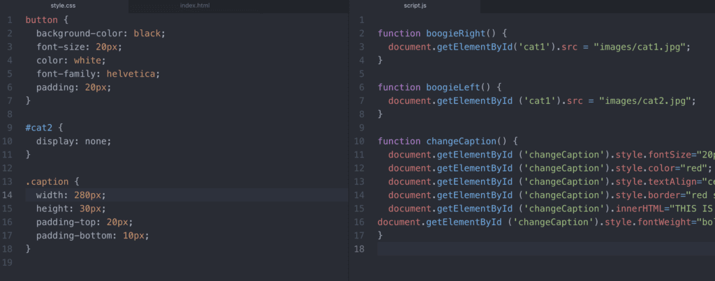
I found this project the most difficult out of all the projects the class has been assigned thus far. I think the most challenging part for me was keeping my code neat and using the proper id tags and class names. At first, I tried to do everything at once by adding both images, making a container for the three buttons, changing text, etc. And rather than starting one task, completing it, then moving onto the next job, I jumped around trying to finish several different codes at the same time. Eventually, I became so overwhelmed with the code that I decided to start from scratch. I found that by laying out my HTML first, then moving on to my js, then css, I had a much easier time completing the assignment.

Something I learned while going through this task was the difference between adding style to js and css. We talked about it a little bit in class, but this project allowed me to solidify my understanding of how I can manipulate and change the style in both css and js.

CSS/JS Style

Week 3: Interactive Comic Plan – Allie Dunnaville

Introduction:

Chloe and I had the idea of creating a comic with a storyline which follows each of our lives up until the point where we first met in NYUSH Communication Lab. We discussed that we want to create a timeline where when the user clicks on a specific period of time they will be directed to a split screen that will show what both Chloe and I were doing at that time. More details regarding what we imagine our project will look like can be found in the text below.

Storyboard:

  • We illustrate a timeline of both our lives leading up to the point where we meet in NYU Shanghai, the extraneous circumstances that lead us to be where we are today.
  • We decided to tell the story by using a split screen that will allow the user to see what the both of us were doing at a specific point in time.
  • Allow the user to click on certain objects in the panel that will pop up allowing the reader to learn more

Illustrations:

  • We aren’t exactly sure how we were going to go about illustrating the comics, but I think that we will use our knowledge of photoshop to put together a comic.
  • We will also draw upon outside resources to find images to support our comic.

Java:

  • We are using Javascript to move the story along, there will be a fixed timeline at the bottom of the comic and the readers will be able to drag an icon along the timeline in order to advance the story.
  • The timeline will illustrate the year
  • The icon that is dragged across the screen will be a small airplane.