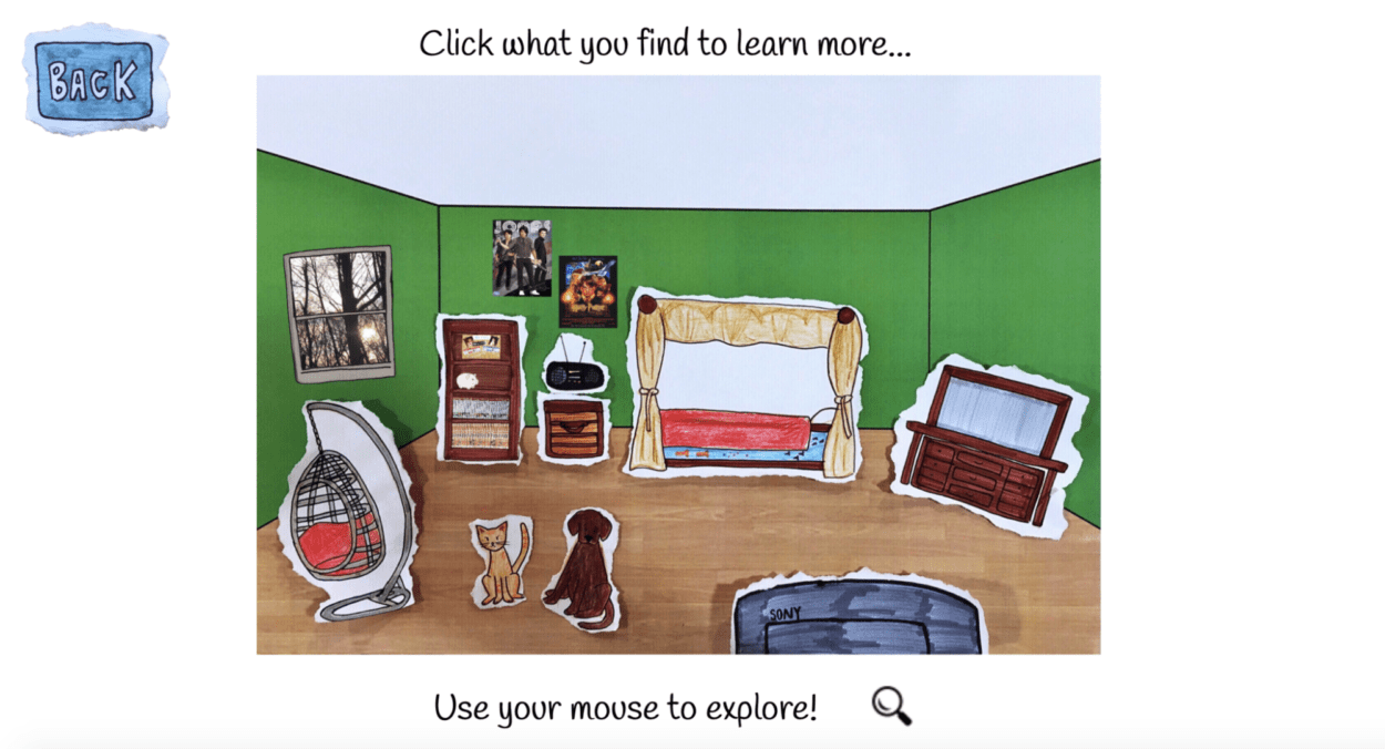
Our project, titled “Dream Room”, is a website which allows users to explore my partner and I’s ideal bedroom when we were in Elementary and Middle school. Concept of the project is rooted from both of our appreciations for collage and Melissa and Doug dress-up board games we played as kids. After school, I would often go home and cut up newspapers and magazines then paste them inside a scrapbook. As I got older, my collages became more sophisticated, and I actually used canvases as material instead of scrapbooks. The idea with the board game is that you are given different props, and you use those props to dress up a figure. With these two ideas combined, we further developed our concept by creating our “dream room.” The user can interact with the room by clicking on each of the different objects within the room such as the television, radio, bed, piggy bank, chest, dog, cat, etc. Once an object is clicked on the User can see a more in-depth explanation for the inspiration and significance of the objects.
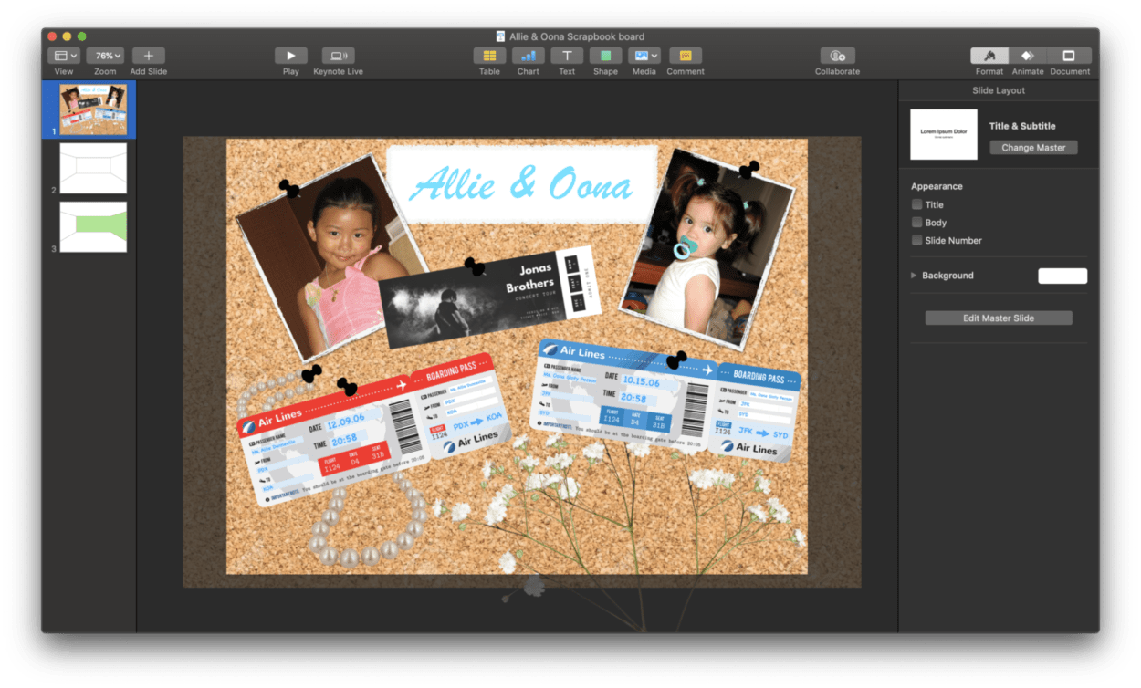
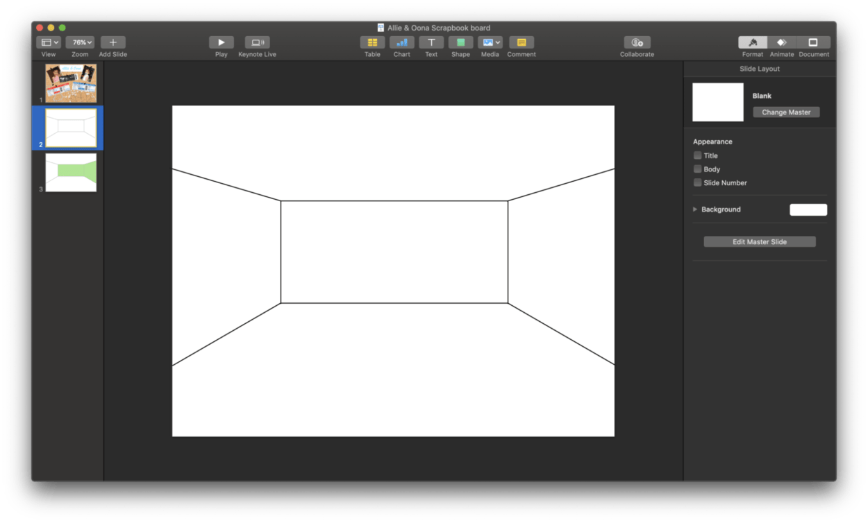
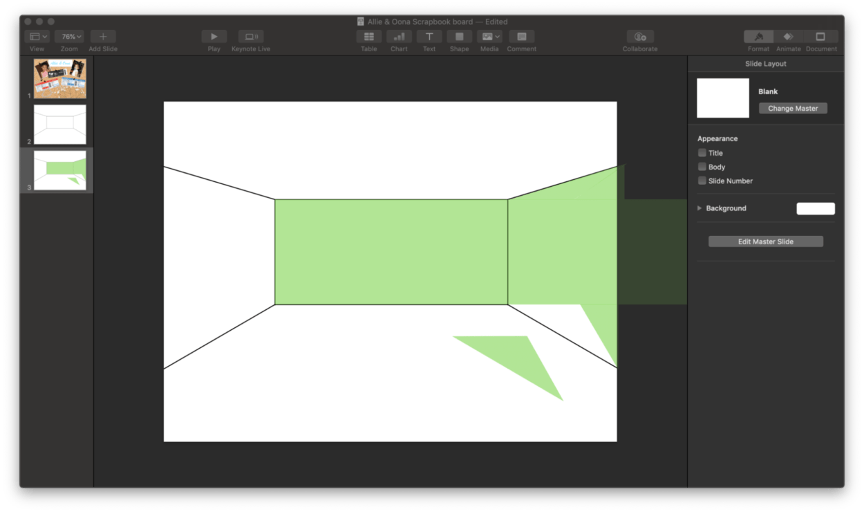
Something that worked really well with this project was the overall aesthetic and concept. Oona and I did our best to make the aesthetic as close to a scrapbook as possible. We drew almost everything by hand ourselves, and if we did not draw it by hand, we used photoshop and other apps on our phones to make the edges around the images look like they were torn. But we decided we wanted to tear everything to give our users the impression that everything was made by us and had a collage feel. Before finalizing our project, we had brief user testing. During this process Oona and I had not finished our website, but we did have all of the pictures drawn out. When we presented our idea, the most helpful piece of feedback we received suggested that we should add in a background behind the actual bedroom that would make it feel like even more of a collage. I thought adding this small element really pulled everything together aesthetically and solidified our collage concept. Lastly, something that did not work well in my opinion during the process of creating this project was when I designed the background of the bedroom. I did not have anything to go off of, and basically, I was just eyeing dimensions I thought were appropriate in order to give the room as much dimension as I could. I realized after talking with a classmate about my struggles I could have just used a 3D software on a computer to easily design the room. But, in the end, I was actually able to create it on my own without the help of additional software. Despite this method taking a longer time, I was happy with the outcome.
Given more time in the future, I would have liked to implement sound effects when you clicked on the object and also animated the objects when you click on them. As an example. I would have liked to have the bed become wavy and make swishing sounds to make the fact that it was a water bed more dramatic. Furthermore, the judges suggested Oona and I should have recorded our thought process in designing the project and allowed the user to listen to this conversation somewhere on the website, maybe the home page. Overall, I plan to continue exploring how I can improve my final project by implementing some of these suggestions and concepts in the future.
