Context and Significance
Tian Tian and I have been close friends since freshman year, so we naturally share a lot with each other: family drama, favorite books, you name it. I recently got a copper IUD and went to Tian Tian for support since she also got one a year ago. We ended up talking about the ridiculous things women do to keep from getting impregnated by men and how men don’t have to worry about these things the way women do. This sparked our interest in creating a project about our experiences as women. Originally we wanted to focus on inequality in the workplace but soon realized that as students who have never had a “real” job, we were better equipped to address a topic we had actual experience with–dating. Whether it’s with someone we met on a night out or a classmate we’re really interested in, we’ve faced similar questions time and time again. These questions, we personally feel, are especially difficult for us as women. We wanted to create an experience that women would resinate with but would also allow anyone else to gain a better understanding of relationship dynamics from our perspective.
Conception and Design
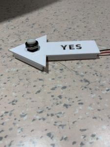
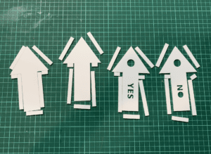
Deciding whether or not to let a guy pay for your meal or whether or not you should “define the relationship” is not an easy task. In the beginning of a relationship, nothing is certain and we often go back and forth between options and outcomes, but never forwards. We designed our project in a way that would force users to move from side to side, a physical movement, which symbolizes how we find ourselves trapped moving between a gray, unknown area. Our project’s interactive component is simply pressing a yes or no button with your foot because we wanted to make it easy for the user. We understand that while our classmates are all very intelligent, listening to instructions and making decisions can be quite challenging–which is exactly the point. We also made it this way because we wanted to juxtapose the simplicity of the design and interactivity with the reality that these questions are actually very complicated. We felt that buttons were the best input options for our project. While we could have maybe used different sensors to get a yes/no answer from the user, we felt that we didn’t need to use fancy sensors just for the sake of using fancy sensors, and again, we didn’t want to overcomplicate it for the user. Maybe in a different variation of this project, we could use a sensor to detect distance if we wanted to create a human barometer activity. We “hid” the buttons in acrylic, laser cut arrows–neutral symbols that did not suggest a right or wrong answer.
Fabrication and Production
Tian Tian and I spent a lot of time working on this project, most of which was spent at the cafe or the podcasting room just talking about the concepts behind the project and ways we could make it better.
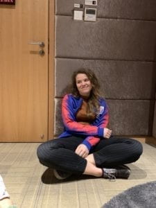
In hindsight, we should have probably spent more time actually building the project or working on the code, but it all worked out in the end. Our project was conceived in a conversation, grew in our code, and was born in a bed of wires and laser cut acrylic. The labor and delivery was not so painful thanks to the terrific help from Tristan, Rudy, and Marcela.
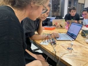
Our project even went through puberty and matured a lot because of the user testing session. A lot of our classmates expressed the need for some kind of user feedback, an “ending” to the story, and headphones. We took all of this into consideration. After the user chooses either yes or no, we added a response like, “okay” or “alright,” so the user knows that their choice was actually received. We used neutral language so the user does not think they chose the right or wrong answer. One classmate said they felt like we were morally judging users with the questions we pose, which deeply disturbed Tian Tian and me. We think that these questions are difficult because there is no right or wrong answer and in many ways, you’re “damned if you do, damned if you don’t.” Unfortunately we can’t provide a happy, or sad, ending to the story because we want users to understand that we face these problems all the time and will continue facing them until we either die or get married–even then maybe once more. We did, however, take this feedback into consideration. We added a final question that creates a loop in the simulation which starts with, “here you go again” to point to how this dilemma is ongoing. We chose to not include headphones because we wanted the user to be hands-free during the experience. Ideally, the user would be given some privacy in a room alone so they wouldn’t let onlookers influence their decision to sensitive questions like, “should I send nudes?”
Conclusion
I was originally worried about how interactive our project was. Buttons? Seemed too simple. But I think I was wrong. After watching my classmates and friends experience “SKIRT,” I feel that Tian Tian and I succeeded. Users were genuinely interacting and engaging with not only the space and physical components of our project, but also their own notions of gender norms, dating culture, and societal pressure. I do not think that a complete understanding of our project or our intentions is necessary for a meaningful experience, but rather having users think about women’s role and worries in these early stages of a relationship is a success in itself.
Watch our friend experience “SKIRT” here.
