For my group project, I researched a variety of artists and projects. I feel that these may have only slightly influenced my midterm project, though I do feel that the majority of the things I create are influenced by my artistic research. For the midterm project, my partner and I ended up creating something which exhibits a very simple interaction. While part of this may have been because we knew that the building and coding process would be tedious, it is also because it is easy to get carried away with the many layers of interaction. In my experience of coding and creating, I have found that trying to have too many layers to your interaction could easily lead to confusion from users. When looking at the artists I researched, Yayoi Kusama and Daniel Rozin, I notice that their works have different layers and levels of interaction. Kusama’s work is very engaging to those who view it. Her repetitive visuals and motifs within her work are very eye-catching, and her infinity-mirrored rooms often elicit a sense of interaction. Recently, I went to her exhibit at the Fosun Foundation in Shanghai, and found a new level of interaction with her work: social media photography. While her work stands alone, it had been manipulated and exploited by many on social media. Also, due to the setup of the exhibit, you were forced to walk through areas laden with her sculptures, especially in one room, where towering tree-like polka dotted objects created a maze-like walkway which you were forced to walk through. In this exhibit, you were also shut into the infinity-mirrored room with five other people. Interestingly enough, the people in the room also became a part of the artwork and they managed to interact with a room consisting of a few lights and four mirrored walls by seeing how their image changed based on their position in their room, and how the room may appear on camera. While these findings did not directly influence my project, I certainly see how they have influenced my understanding of interaction. Before, in my definition, for something to be considered interactive, it had to give a response to another actor. However, I have now come to notice that sometimes this ‘response’ isn’t so easily seen, as is the case with my observations at the art exhibit. However, I still agree with Chris Crawford’s statement in The Art of Interactive Design, wherein there is a spectrum of interactivity (6). I also understand that sometimes an item can have a low degree of interactivity and still be captivating to those who interact with it, much like the example with the refrigerator door.
The interaction with our project isn’t entirely unique or different than something which has already been done, but it is rather simple and entertaining. The project I produced is similar to a fortune teller booth or a Magic 8 Ball, things which are fairly well known in western culture. In these cases, the interaction between a user an the item is that the user presents a question and the fortune teller or Magic 8 Ball would return a random answer. However, unlike the traditionally seen fortune telling objects, our project returns an answer which would definitely not be wanted from the user. All the possible answers we put into our design were very cynical or passive-aggressive, and would hence cause varying results with those who interacted with our project. I feel that our project adds an aspect of humor to the previous fortune-telling mechanisms. With our project, though the answers given could be seen as “negative,” they also were found to be humorous. Along with this, I would go so far as to consider our project as a satire of the aforementioned fortune-telling objects. Therefore, it could be said that our intended audience would be those who would find humor in this development, and those who do not take things too seriously.
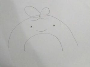
Our original concept was to build a machine with a very cute aesthetic, made to appear harmless.
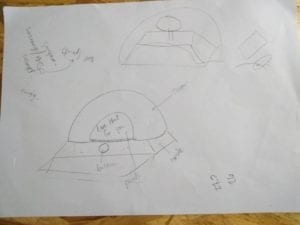
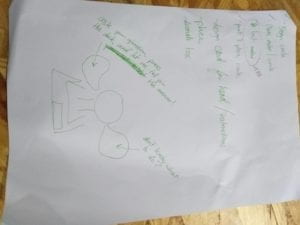
Some sketches from the original prototype:


Along with this, the original interaction mechanism was that users would push a button (I know, real creative), as we found that this would be the most effective way to go about our project. In terms of design, our concept piece was more spherically shaped, with minimal square edges. In terms of user interaction, our idea for interaction did not change much, as we went with our original idea. However, we did change our design to make the reading of the answers more easily visible. The main material we made use of for this project was cardboard. Whereas our concept might have utilized more plastic pieces, cardboard was more accessible to us and easier to shape to fit our needs. While selecting which materials and elements to use, we were mainly influenced by the availability of the material along with the ability for a material to be manipulated. For example, hard plastic is very difficult to manipulate and would add lots of weight to our project, but cardboard is easy to access, easy to manipulate, and would not add too much weight. Many of the decorative factors we used for this project were things which were already on hand. The mannequin head was found on the 8th floor, and the “curtain” was made of an old t-shirt. Though our end design strayed from our concept, I feel that our design was heavily influenced by the availability of materials. In the end, our project’s aesthetic was more mystical, but it ended up working with our original concept.
Updated sketch after laser-cutting:

In the process of the production of the project, we started out by sketching how all the components would work. The project included many electronic components, including a stepper motor, an arduino, a breadboard, a button, and a ton of jumper wires. Therefore, in our production process, we knew we had to make space for the wires and components. In the production process, the stepper motor was the component with the most difficulties. The answers were displayed on a platform atop the motor, meaning that we needed to find a way to stick something to the motor without it being to heavy for the motor to move. Along with this, the motor vibrates when it turns, meaning that we needed something to hold it in place, and our project had to be transported so things could not be too heavy. Therefore, after considering these caveats, we went on to re-sketch our concept, settling on two different boxes, both of the same width, but with different lengths and depths. For fabrication, we laser-cut the box, as we needed custom holes for the button and the viewing window.
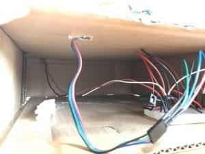
Here’s the stepper motor mount along with the wiring in the back:


After cutting the cardboard with the laser, we decided that we did not want to use any of the harder material as our prototype was holding up well. Along with this, we originally wanted to laser cut two boxes, but decided to reuse one of our original boxes to make things easier. For the motor, I put together a small mount which I made out of small pieces of cardboard, cut to the dimensions of the motor. Once the mount was attached to the box, the motor would never move out of place.
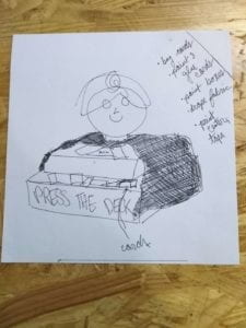
For the sayings which would be placed on a plate atop the stepper motor, we originally made cards and hand-wrote the sayings. However, after user testing, we found that this disrupted our aesthetic and made things look less put together, and they were at first too heavy to be used with the stepper motor. Therefore, we printed our text components onto paper instead of writing. In user testing, we also found that our sayings were too hard to see in the box, so we cut the viewing hole larger and made things easier to see (see video below for improvements made). Aside from this, we added a set of instructions as some users did not know what type of questions would be the best to ask.
Sketch of this addition:

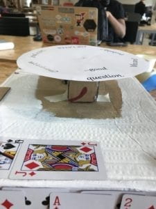
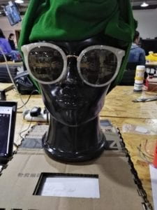
In terms of decorating, we used playing cards, a mannequin head, and paint. The playing cards were also used to hide the button, which also gave a different feel to the interaction. I feel that the mannequin head was the most influential item in our design. It elevated our project from being two rectangular boxes, to actually resembling a fortune teller’s booth. Our project now had a semi-human resemblance, which I feel added another layer to our interaction, as it made it feel as if this uncanny mannequin was judging your life’s worries (pic below is before adding decoration, videos are after).

Before we changed the spinner text and viewing window:
After:
The original goal of this project was to give an unexpected response from an unassuming item based on a user’s interaction. In short, this project did meet this goal, but not in the way I thought it would. Based on my previous definition of interaction, I would consider this project to be interactive, but not to a high degree. One of the ways in which this project does not align with my definition is that the response it gives is not necessarily tailored to the input. I feel that this could be one of the possibilities for improvement in terms of further development of this project. Based on an input (a button push), the machine we made would spin to a random position and give an answer to the actor’s question. I do feel that the question asking could make for a better development in the interaction of this project, whether it be creating an area for user’s to enter a question on a webpage and processing this input, or having a user write their question onto something and insert it into our machine, I feel that this is one of the shortcomings in this project’s interaction. The interaction which was received during user testing was also intriguing as there were a few people that did not know how to interact with this project. Either they did not know where the button was or they did not know which types of questions to ask. While our design did change slightly after this, I do feel that there are still many possibilities for different interactions within the scope of this project. I also feel that there are other possibilities for improvement within the aesthetic values of this project. At times, I felt that the setup of the project could be seen as a little ramshackle, though in the end it worked out. However, I would like to see this project become more aesthetically developed, possibly with a more streamlined look.
Aside from the design aspects, the code for this project was particularly difficult, and there were a lot of issues with the stepper motor. I think that the things I learned while putting this project together will certainly be of use throughout my time studying IMA. In terms of the takeaways of the project, this was the first project I have created which utilizes physical computing. I find that the way in which users interacted with this project is very different to my past projects. My past work goes over two categories: interactive webpages and 3D design. In Commlab, many of the interactive aspects of my work was purely coded within JavaScript. This means that the creative process was very different than the one which I used in Interaction Lab. Along with this, my work with 3D design and Unity was more focused on aesthetics, and how aesthetics influence user experience. Similar to my works from Commlab, the creative process here was relatively similar, as the only physical piece to my project would be the controls (either a computer keyboard or a VR headset). Therefore, I believe that it was useful for me to experiment with this new way of creating and to allow it to let me combine things I am comfortable using (programming), with things I am not very comfortable working with (Arduino, stepper motors, etc.).
 (the original — Josef Albers, Interlocked, 1927, picture from Guggenheim, link to picture)