http://imanas.shanghai.nyu.edu/~cl4690/Commlab%20Project/index.html
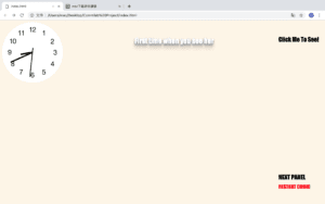
I got the idea of the project from myself. When I was in high school I was once bulled by the other so I come to this idea. To make the whole comic more simple, I create the girl with scar on her face which is a character that often appear in this kind of event.Also, I don’t want the audience to see the pictures at first, so only by clicking the button “click to see”. Because the whole thing happen in school, I want to make the website more similar to the classroom, so I add a clock which can be seen in each classroom. I search how to make a clock on the website. I first made the border of the clock, then I set the position of the minute, second and hour. During this, I learned the z-index. It is a property specifies the stack order of an element. It makes an element with greater stack order is always in front of an element with a lower stack order. Then I learned the @keyframes rule which specifies the animation code. Using this, the animation is created by gradually changing from one set of CSS styles to another. Also, during the animation, I can change it many times. I used this while also the rotate function to make the hand walk. However, I want to make the clock represent the current time, so I learned the date.get(); function which can get the exact time from the computer. I also want to make the text looks more colorful so I searched the 3D effect of text
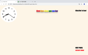
.
I draw all the pictures by hand then I scan them and put them on the website. However, I don’t have much time to do more.
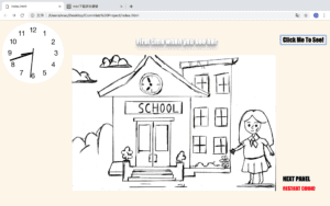
By clicking on the click to see button, the picture will appear. Then you can change the picture to see the next one.
I added another effect on the second sentence. The word will become colorful when you put your mouse on it.
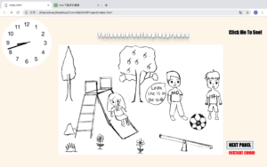
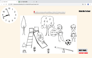
Then I tried another effect on the third sentence. If you put your mouse on the sentence it will have effect like 3D.
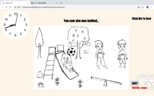
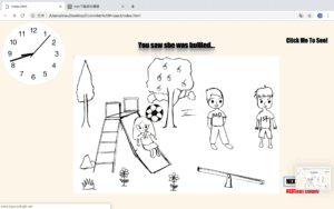
In this slide I created two button that the readers can make choice here. Also, I added a sound effect here, to stress the disappointment of the girl.
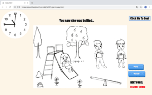
If you choose to help the girl, then a website will appear. I planed to add hand draw picture here however I don’ t have much time so I used some word that have 3-D effect. Then I added a moving background which looks like a meteor show on a Korean TV show to make it looks more romantic.
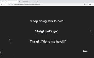
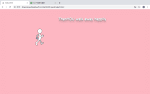
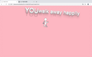
Then it comes to the happy ending of the comic. I want to make it looks more funny and make it represent the happiness and proud of the character so I made an animation here. To stress the happiness, I also made a text effect of the word, so that if you put your mouse on it, it will move.
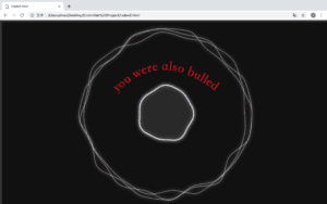
I created another ending for this story, if you just stand-by and watch, you will also be bullied. I chose this background while it’s floating and it looks scary and uncomfortable and it just looks like a ghost is floating. I also made the word in red to make it looks uncomfortable. I made it like this because I hope if students meet this kind of thing they will help their friends but not just stand-by.
I learned some of the code from w3school and Codepen.