http://imanas.shanghai.nyu.edu/~ktb300/comic_project%203/
The Process
Our initial comic idea was a ‘circle-of-life’ scenario where the comic images would begin with the birth of two siblings, the duration of the comic would depict various stages of their lives including conflicts, and the end frame would just have one sibling left. However, after we began drafting image ideas we found that the ‘circle-of-life’ idea was a bit too ambitious for our coding and drawing abilities. Instead, we opted for our current idea that portrays a brother and sister’s path to adulthood. The comic begins at birth and ends when the older brother leaves for college. We felt that this would be the most authentic because this was a stage of our lives that we’d just experienced.
For the animation portion, we first drew the visuals by hand and then traced over the images using Adobe Illustrator. We decided to use a simple color black-and-white color scheme with only sprinkles of color for emphasis. Our inspiration for this idea was the animations from Shel Silverstein’s The Giving Tree.
Challenges
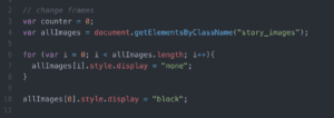
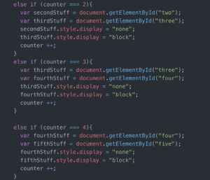
I found the coding aspect of this project to be the most difficult. Aside from the class exercise, I have never done such a large project that includes piecing together numerously connected and dependent elements from HTML, CSS, and Javascript. One aspect that I found unexpectedly difficult was adding all the images together in Javascript. We initially began by individually coding all our images together in Javascript with “else if” however we realized afterward that there is actually a much easier and efficient way. Additionally, one issue we faced was incorporating music in our webpage. We started out with several HTML pages but realized later that we had to put all of our code on one HTML page in order for the music to be coherent throughout the comic.
The photo on the left is our first code which we had to repeat over 15 times and the second photo is after we discovered the more simple code.


At first, we had difficulty deciding what to include for our interactive element. We wanted to add different interactive elements other than buttons and Gifs. Our original idea was to create a drawing pad on one of the images, but we instead opted for what we did in frames four and five where the user can add bubbles and blocks to the respective images.

Conclusion
Although I had many difficulties with the coding portion of this project, I feel like this project taught me a lot. A lot of the coding in this project required similar pieces, so the repetition was a helpful practice. Overall, I am actually very happy with how the project turned out. Despite the change from our original idea and challenges with coding and interaction, I feel like we still managed to follow through with everything we wanted to accomplish in this project while creating a light-hearted and relatable storyline.