http://imanas.shanghai.nyu.edu/~kx421/InteractiveComic/comic1.html
The link above is the completed interactive comic by Kevin and Kai.
Documentation and Reflection: Kevin Xu
Project Proposal:
A linear story about a newly engaged couple visiting the man’s family. The story takes place on a nighttime drive from los angeles to san francisco.
Project Description
When I started this project, I had a clear vision of what the result would be. I wanted to create a linear story experience that was subtle but hopefully will make the reader think about their own life through visuals, audio, and writing. I started the project by trying to complete two main objectives. One was to learn how to create the .gif images which would make up the main visuals of the story. The second was to create a template through javascript, css, and html which would allow me to create multiple pages with the same methods and create a consistent experience. These two objectives took the majority of my time since I was delving into concepts I didn’t previously know about. However, after understanding the tools I used, I was able to quickly create more pages far quicker than the first one or two. I was in charge of most of the images (.gifs) as well as the basic template for the coding, while Kai wrote the script as well as coded the bulk of the websites as well as added in interactive elements.
Process:
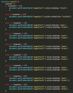
The images were created using a gif technique. I drew each image four separate times and compiled them inside photoshop using the frame animation tool. The template was created by using the counter system, where each click would result in a different result, allowing text to appear below the pictures like a subtitle. The experience was meant to be similar to a still movie.
Issues:
The main issue I came across was during the creation of the template. It was difficult to create an easily understandable and efficient first page since I was fairly new to coding. However, after creating the first page, every sequential page was far easier since I knew what I had to do and I had a working page to compare with when fixing bugs.
Project Reflection:
The final product me and Kai created was similar to my vision at the beginning. I initially thought the project might have been too ambitious due to the large amount of drawing required (each .gif required a single drawing to be drawn 4 times), however managing the push through and complete every panel was rewarding. I am excited to present the final product as I believe it was a successful combined effort and a project I can truly be proud of.
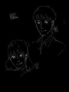
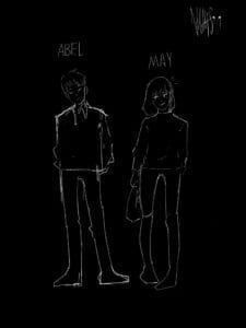
The below screenshots show early concept art, the coding template used for the pages, as well as the Nights logo.


