Title
Picasso’s Painting Mirror
Project Description
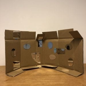
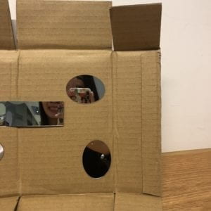
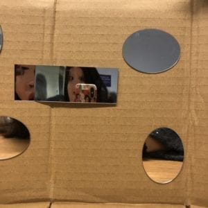
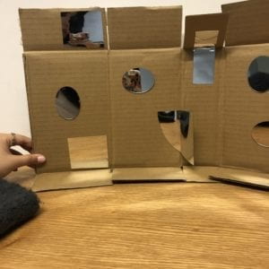
This project is a flexible mirror set. I pasted different material and formats of mirrors onto cardboard. The cardboard is created such that it could bend. There’re 7 “parts” of the cardboard, and the mirrors were arranged in the way that when the audiences surround their heads with the cardboard, they could gain a whole perspective of their facials. The concept behind this project is that: thinking about how people when fascinated with taking Instagram friendly photos whenever they saw a mirror. However, most of the time, no one would want her face to be imperfect. And the idea is that by combining the normal mirrors with the mirrors that create distortions, people get to see themselves in another way that’s not perfect, but a playful way. My intention is kind of to play with my audiences, that when one faces a mirror, one would expect to see herself, but my project is questioning the pursuing for perfections. Besides, I personally am very much influenced by Cubism artists, the distortions and Yayoi Kusama, who works with those infinity mirror rooms, cubes, and etc. Last semester, I was in Paris studying art history, and when I visited the Picasso Museum, I was always fascinated with the way Picasso perceives the world and how he presents it to us. And therefore, by this project, I am actually dividing the reality with the mirrors and the cardboard, and therefore, the audiences have no choice but to see the world in a very cubist way.

Perspective and Context
In Merleau’s book, he argues that, from the aspects of science, painting, and philosophy, people’s perception has changed from classical to modern ones. Nowadays, we are more perceiving the world as a whole rather than separately. In my interpretation, we tend to see everything we perceive as a complete piece. Our brain functions in a way that everything is quite united. And my project, which forced the audiences to see the world separately, gives us another way of perceiving the world. It is a challenge to our traditional perceptions. When facing the mirror installation, people are forced to see themselves in fragments. With all the facial fragmentation, My work is an exploration of the established world. Besides, it is also a questioning to the body shame culture. People all expected to look perfect themselves. Especially for the women, who are also living under social prejudice, this project is to tell them that it is ok to not look good. No one is perfect.
Development & Technical Implementation
I did not start with this project at all. Initially, I was planning to make a pair of glass, which helps human beings see the world through cats’ eyes. My research is based on the cat eyes’ differences from human beings, which included: 1) color blind on red and green; 2) wider eyesight (220 degrees) 3) less saturated 4) better perceptions at night
And I purchased different types of mirrors, planning to widen the human eye’s perspectives through the additional mirrors. However, the cat eye project did not turn out well. The idea, simply adding another mirror, does not make human beings’ eyesights wider. As a blessing in disguise, the mirrors that I purchased turned out working well. The one particular piece is a type of mirror that you could cut it, bend it, and shape it any way you want it. And the distortions all turned out interesting. I just played with the piece of mirror. And I thought about the art fairs that I visited, where people had an obsession with taking selfies with the mirror artworks. I want people to take pictures when they face my project. I enjoy the idea of creating interactions for my audiences. The artists that most inspired me in this project are Picasso, Yayoi Kusama, and Songdong. When I was taking art classes, the teacher would tell us that Picasso would paint in a way of combination. He would choose fragments of a facial from different angles of the human face and paint them jointly. And my audiences would just achieve that using this magical cardboard.
Here’s a display of the works that inspire me:
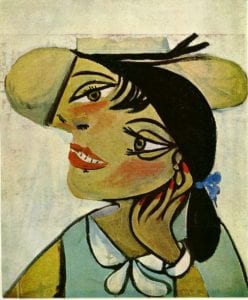
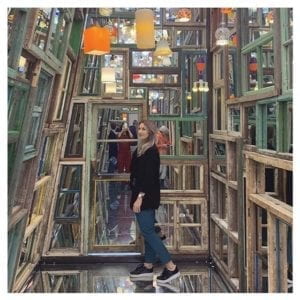
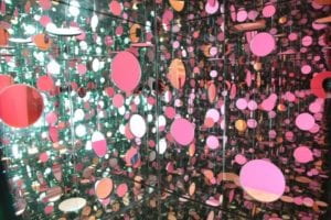
I’ve sat there, and place the project in front of me, to arrange the displays of the mirrors, to make sure that the piece actually gives a whole perspective of the user. However, I would say there’re tons of ways to interact with the mirrors. I carefully chose the place of each one of them. And the special mirror is actually flexible that users could play with, and therefore, there’s no fixed way of playing with this. In fact, I would encourage my audiences to play with the arrangements of the mirrors as much as they could.
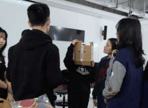
Presentation
I liked the presentation in class. The cover of the project is a little bit embarrassing, cause I got it for environmental purposes from cardboard room in IMA. As an artwork, I should’ve treated it with better decorations. I’m very glad that everyone in the class tried my project, interacted with it. It is what I expected, people just love mirrors. It’s mainly nice, the way people interacted with the mirrors; however, I would love it if people would be more daring to try with it. I found my audiences treat it too careful that they did not get to explore it much. It would be nice if they could just rotate it and bend it, and to be a contemporary Picasso.
Conclusion
My final project is not what I planned to make, an actual sharp turn. To start with, I guess it is the ability to make a project using limited resources. I did not plan to make a mirror installation, to begin with, or else I would definitely buy more mirrors to make a much larger one. With the limited mirrors, I have no choice but to make a more like a prototype thing, one that user could experience, but not able to emerge themselves in.
I learned that: 1) make full use of what you have when making a project. 2) as an artwork, people love mirrors as a medium. I discovered a new type of mirror. I did not know that there exists that type of mirror which is quite flexible for almost any use. I would love to explore this type of medium in my future works.
I failed by making the project a real art piece. I should’ve to pay more attention to the details of the decoration. Besides, the scale is barely satisfactory. I would definitely make better cover next time. In fact, I would love to continue with this work and to make a larger one, with a 360 degrees’ perspective.