Documented by: Candy Bi & Zane Fadul
Team members:Candy Bi & Zane Fadul
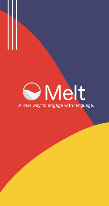
Project name: Melt Dictionary
Professor: Azure Tianran Qian
Problem
As a language learner, building your vocabulary is usually the most difficult part, because while a dictionary is always static, the words that native speakers are always evolving and changing. Not everyone has the luxury to travel abroad and immerse themselves in the language, and so this prevents people from truly mastering a language, and more so deters people from even trying.
Solution
Using Melt Dictionary, you have access to words that are being updated and verified by other users in real time. This ensures that you have the most accurate word choice when making translations or inputting simpler definitions.
Pre-Design
Story
When creating this project, we both equated the target problem with problems we faced head on. As a native English speaker, I understand that many languages function differently than I expect, so I’m constantly being told I “can use a better word” when I’m having daily conversations in Chinese. This cycle of always being able to use a better word is the exact motif we we used when creating our user story,
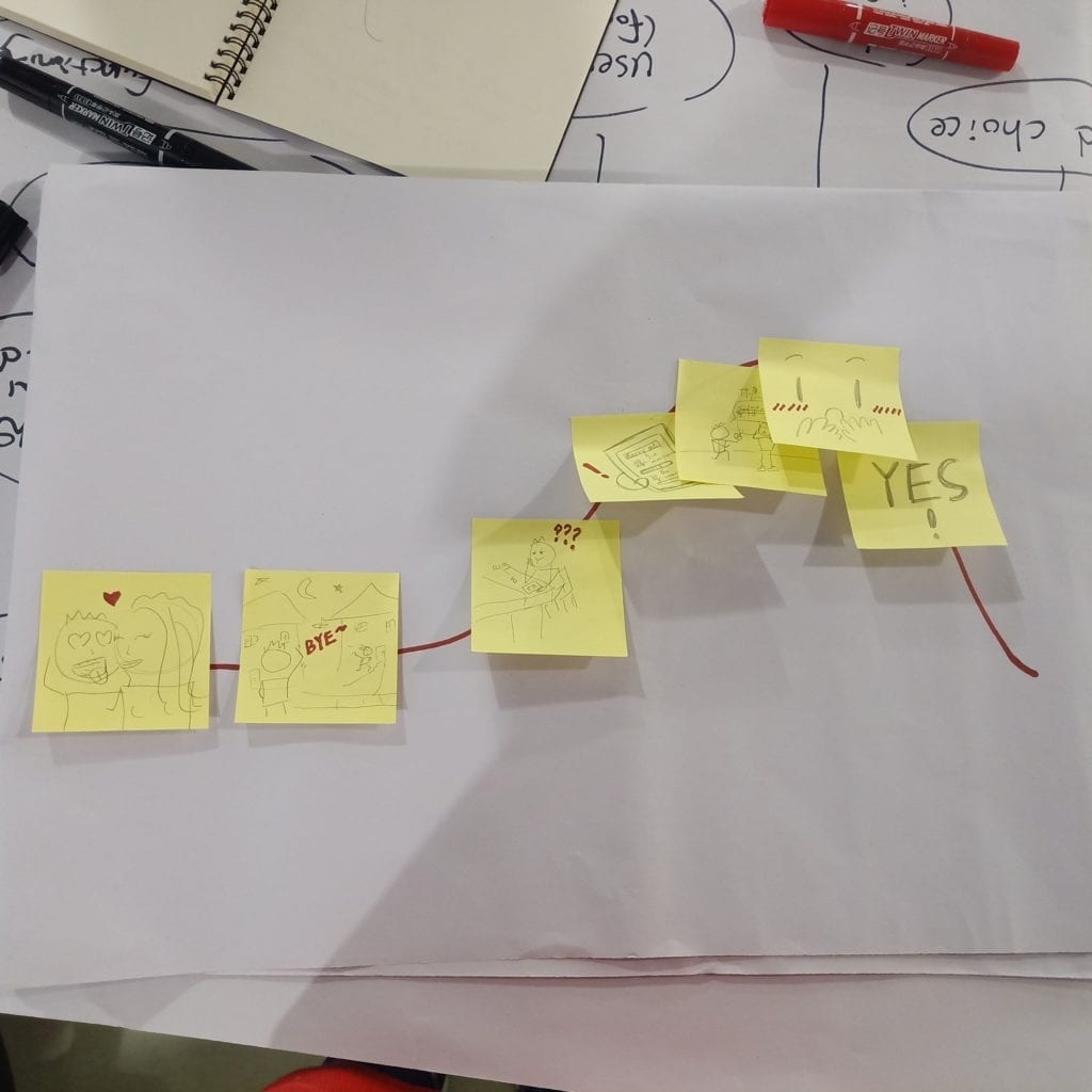
Storyboard
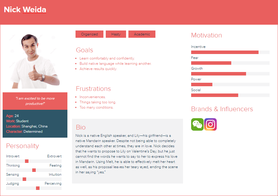
We start our scene with an interracial couple: Nick—a native English speaker—and Lily—a native Mandarin speaker. Despite not being able to completely understand each other at times, they are in love. Nick decides that he wants to propose to Lily on Valentine’s Day, but he just cannot find the words he wants to say to her to express his love in Mandarin. Using Melt, he is able to effectively melt her heart as well, as his proposal leaves her teary eyed, ending the scene in her saying “yes.” Another way we can show that it is the app that helps him to communicate better with her could be to include some smaller tidbits of them having some communication barriers earlier in the scene.
User Research
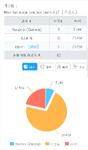
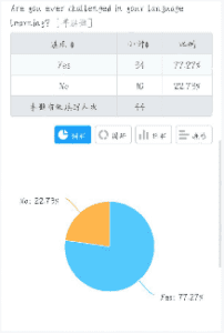
Before we began working on specific features of the application, we surveyed about 60 students in our school using questionnaire platforms like Google Forms and Wenjuan Xing. Since we know that every student at NYU Shanghai is learning a language, this was the perfect population for us to get samples from. With these, we were able to establish a few personas.
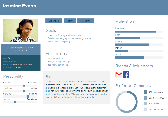
Persona
We were also able to survey students and see what kind of features they expected from Melt Dictionary.
Discovery
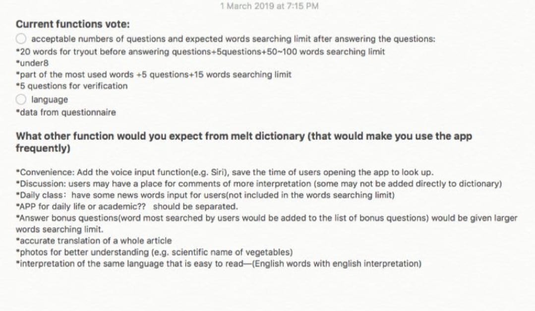
By just explaining the main premise of the application, our surveyees were able to give us some more insight on the features we could implement into our original idea. Keeping this in mind, we obviously didn’t want to clutter our app with unnecessary features. I think that understanding the realms in which your app does not belong is just as important as understanding where it’s primary focus should be.
Design
Based on the data we received from our soon-to-be users, we were able to begin the design process.
User Flow
Sitemap
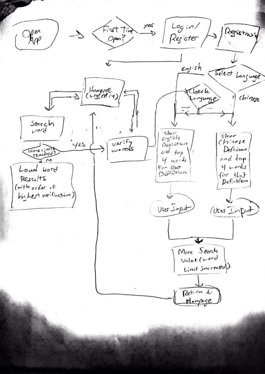
We used this rudimentary sitemap to emulate the typical cycle that a user would take on a dictionary app, while including the verification service needed to update the dictionary’s word database.
Lo-Fidelity Wireframe
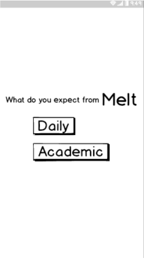
After creating our sitemap, we implemented a basic layout in the form of a lo-fidelity wireframe. This allowed us to make any tweaks to the sitemap if we needed to, and to also account for any tweaks to our layout design.
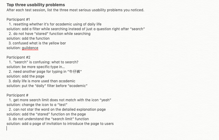
Usability Testing
Branding & Final Details
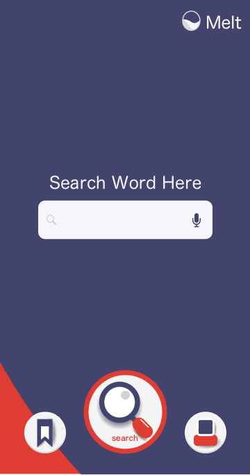
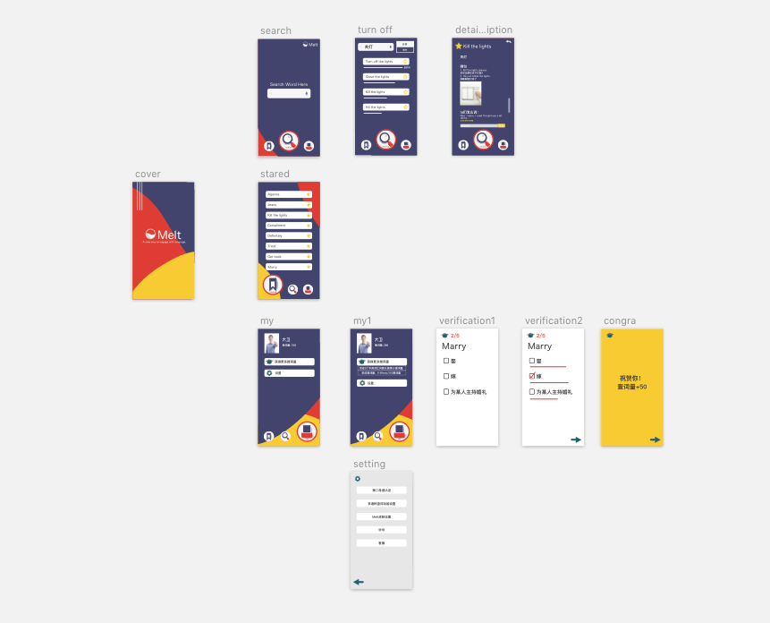
Mockup & Hi-Fidelity Wireframe
When creating our mockup, we wanted to keep in mind what our general audience was. For example, we are pitching to a demographic of younger, relatively tech savvy, language learners. Because of this, we wanted to maintain a brighter color scheme; we felt this embodied the essence of our demographic.

Using tools like Adobe Illustrator and online color resources, we were able to develop a color scheme that was both bright and relatively appealing.
After this, we added color and other visual details to our applications wireframe. While the wireframe still obviously can’t allow the user to search up their own words, the hi-fidelity wireframe gives quite a few examples that the user can interact with to understand how the app works.
Reflection
Through the design process, we were able to truly understand the process that a UX designer goes through. From start to finish, it is honestly a lot more work than I had initially thought, but it’s fascinating to see how important it is to keep in mind that you—the creator—are nothing without your users. It seems like an obvious thing, just like how a play isn’t a play without an audience, but it really does make a difference how aware you are of your product and how well you can implement what your users truly need.
Challenges & Solutions
Through our process, we assumed that the only useful information we needed was from students at our university, when in fact the entire city of Shanghai is growing with people from all over the world. It’s safe to assume that many of them, students or not, would benefit from this app, and definitely would add to our user research.
The user flow can always be made smoother, and I think that if we were to look at this project again, we could create a smoother interface that was easy for users to understand just upon opening.
Referring to the story arc that we would expect our users to follow, we assume that the only thing maintaining user attention is the demand of learning a new word, which we can expect would happen at a regular rate. I think despite this, there are other possible ways that we could attract users. However, this is not something that you can just make happen. Adding extra features would definitely take a lot more user research and and prototyping, which we unfortunately do not have the luxury of time to do. But this is also something to keep in mind.