http://imanas.shanghai.nyu.edu/~emx200/wk2/portfolio.html
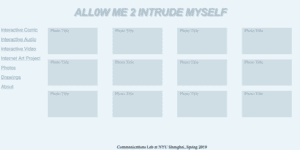
Throughout the process of adding new CSS elements to my flexbox portfolio, I enjoyed the majority of the process itself. I found that adding different colors and font styles were fairly simple after looking back at the powerpoints as well as doing outside research. I originally experimented with different fonts like Arial sans serif and times new roman but found that Helvetica suited the overall style of my portfolio more. I tried to go for a light blue/gray feel that represents something mysterious or unknown so that users would be curious as to what the portfolio includes. As well, I titled my portfolio “Allow Me 2 Intrude Myself” because I often find myself overthinking my own thought process/creativity. Rather than introducing myself, I thought to use the word intrude to make users question the purpose of the portfolio IF they catch the word choice in the first place. The challenging parts of adding CSS to my portfolio came from making sure my code was placed in the right areas such as “.header” or “.content.” Besides this, I found the styling and creative aspects of adding CSS elements very fun and personalized.
