Click here to access the site.
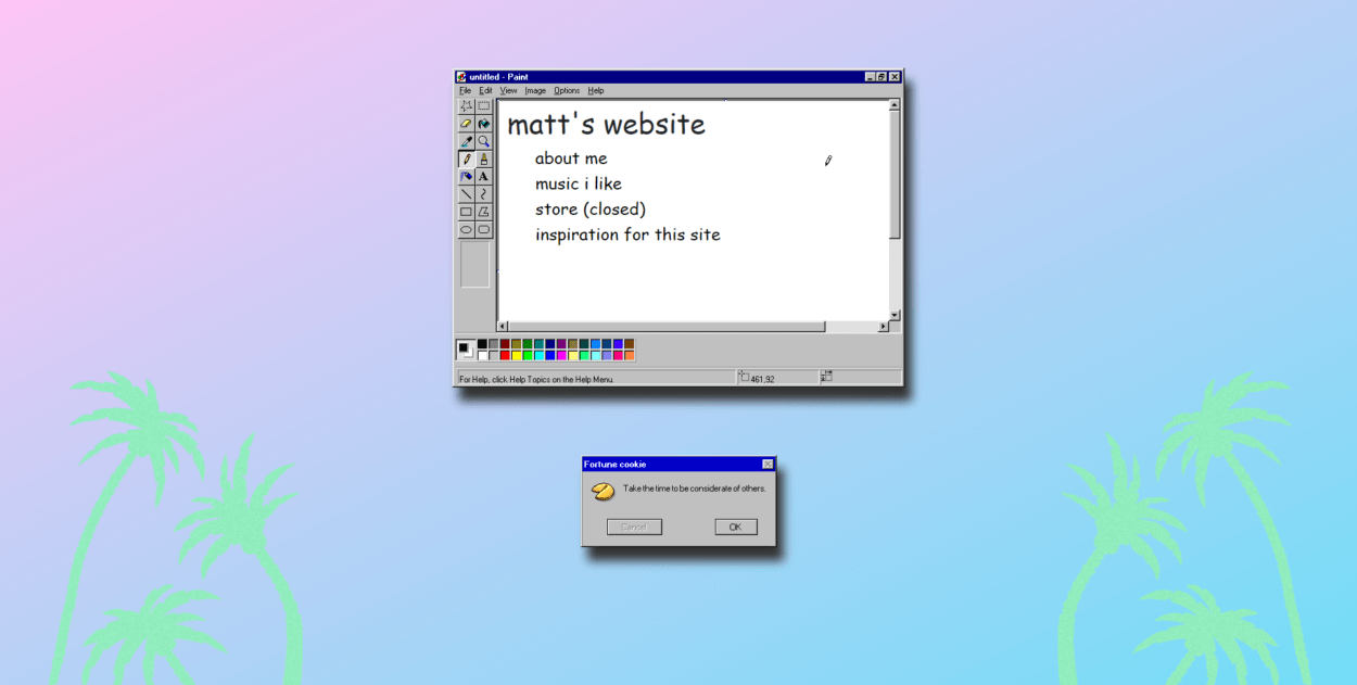
For this project, I decided to go with a vaporwave aesthetic. It is based on a genre of music that is ironic in its use of outdated imagery, familiar sounds, and recognisable products to criticise commodified nostalgia.


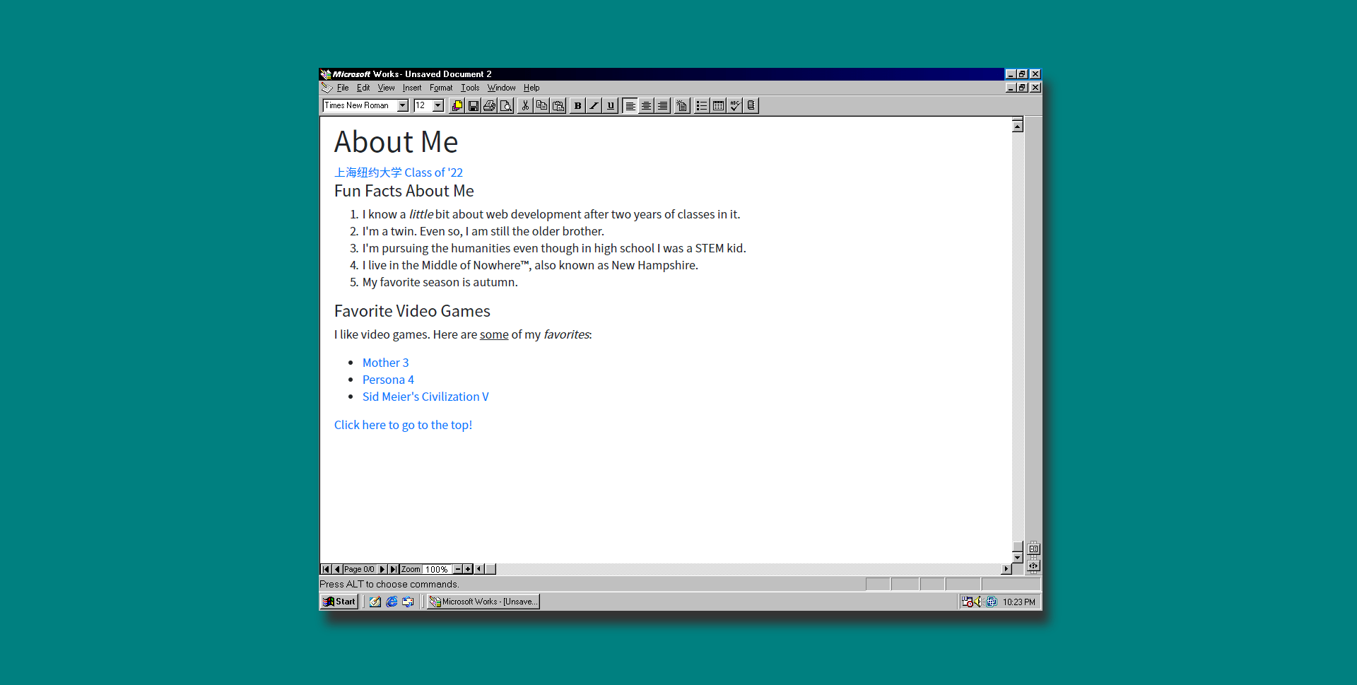
In order to achieve this, I used windows of applications on outdated operating systems as backgrounds for my divs. In order to make them stand out a bit more and seem a bit more “realistic,” I added a drop shadow using CSS.
Furthermore, I used the atrocious font of comic sans to drive home the ironic design of the website (even though it still does look aesthetically pleasing.)
I also added a slow scroll effect to the page. Selecting an item (currently only one other “page” is present) will scroll you down to the next page as opposed to loading a new page. This, in my opinion, is much more pleasing to the eye than going to a new page each time and having the page load with a white flash.
If I had more time to finish this project, I would continue with the other pages (besides the store, it’s just a joke.) I started to work on the third, as you can probably see in both the CSS and the index file.