Assignment 1
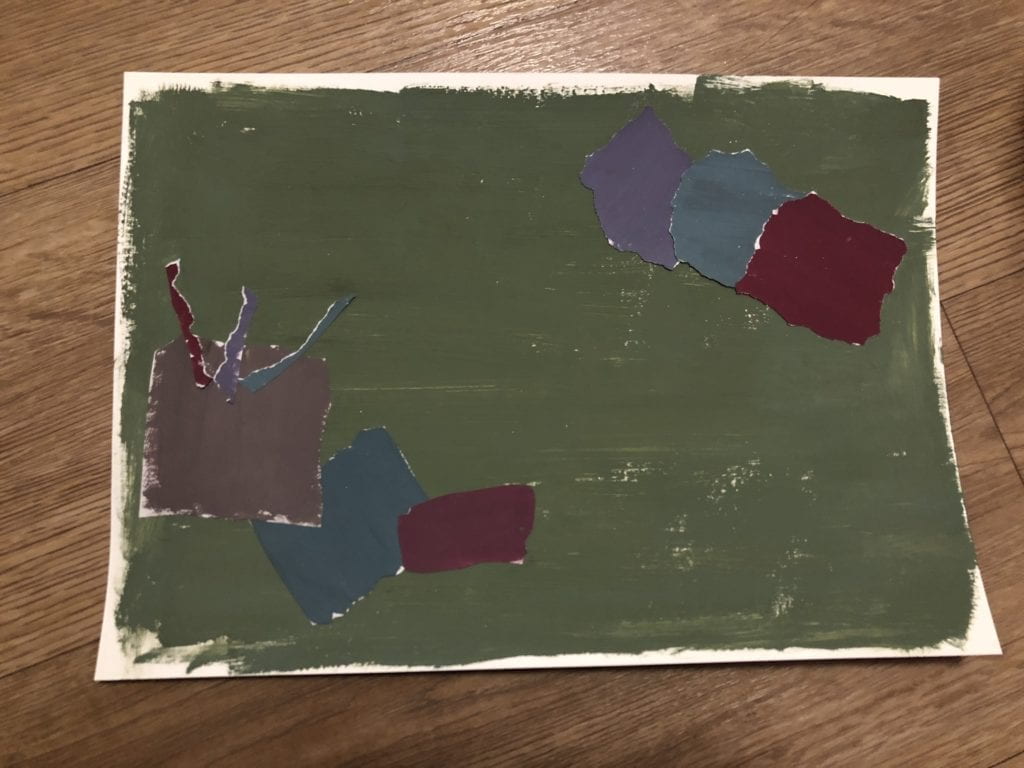
In order to create colors in the chromatic gray saturation range, I mixed different bright(prismatic) colors with gray. There is no specific design to the collage. I mostly just cut random shapes and assembled them together. Because of the color scheme, the collage looks quite dark and depressing.
Assignment 2
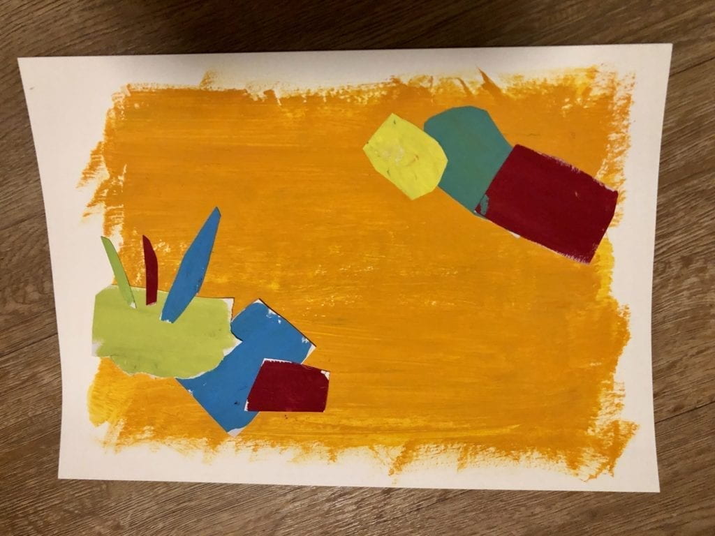
For this assignment, I mostly used the original prismatic colors from the paint bottles. The colors are purer and the college looks brighter. However, all the colors still appear to be more muted than I envisioned. This is because the paint color turned darker when they dried on paper. From this case, we can see the difficulty when working with colors physically as they do not turn out exactly the way we wanted.
Assignment 3
1) Use only grays try to alter the value (brightness) of the the single center color.

This is quite easy to achieve. In order to alter the brightness of the center color, I just changed the brightness of the background color. Light gray makes the central gray appear to be darker and vise versa.
2) In color, alter the hue of the single center color.

It was a bit difficult to figure out how to only change the hue in the morning. As I looked the hue progression more, I came with up the idea of choosing a center color that is already in between two hues (or a mixed of two colors). In thie case, I selected the center color to be somewhat in between yellow and green so it can go either directions. On the left side, I used blue as background. Because yellow and blue are contrasting colors, the center color appears more yellow. On the right side, I put a more pure yellow to contrast the center color so it appears more green.
3) Try to alter only the saturation of the single center.

To alter the saturation of the center color, I thought about changing the saturation of the background colors. A more saturated background will make the center color to appear less saturated. After experimenting with some different shades of purple and gray, I settled on this color combination.
4) Try to alter the hue, saturation, and brightness.
I basically combined what I summarized and used for the previous three parts to alter the hue, saturation and brightness. The hue of the background colors are different as well as the saturation and brightness. I fine tuned the parameters until the results appear to be the most prominent.
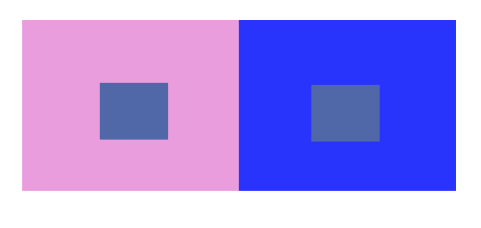
5) Make two different colored center squares look like the same color by modifying the surround squares.
 After some failed attempts, I realized the key to make this work is to the center colors very similar. I used the same hue but slightly alter the saturation. In order to make the colors appear the same, I made the backgrounds to be in blue hue but one is less saturated and one is more.
Assignment 4
Create two separate sequences of color:

Change in Brightness and Saturation
Brightness: light green to very dark green (almost black)
Saturation: more saturated to less saturated

Hue and Saturation
Hue: pink to yellow
Saturation: more saturated to less saturated
Two sequences interspersed:
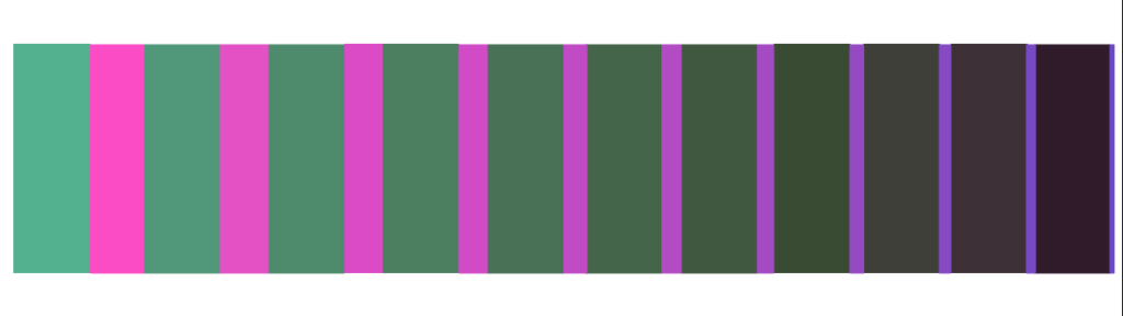
Instead of just combining the two sequences, I tried to add more dynmics to the final product by decreasing the size of one of the sequences. As a result, it is not only changing in color properties, but it also contains some movement.
Assignment 5
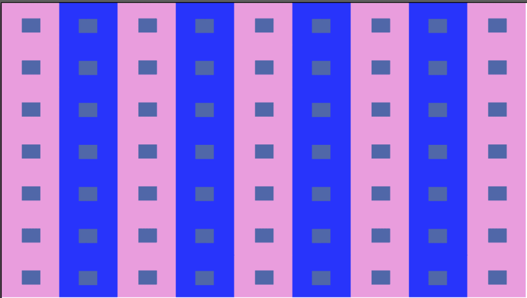
Before putting together new shapes and color combinations for this assignement, I first considered the possibilies of recreating and combining existing ones I created in the earlier parts. I used the color blocks from assignment 3.4 and dupliacted them to fill the entire frame. There is a very strong after image effect. Especially on the blue strips, positive afterimage of the purple color is very prominent. I also feel dizzy when staring at it for a period of time.
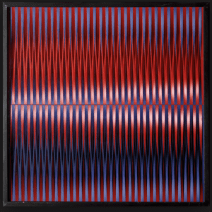
I got really interested in creating kinetic artworks so I decided to do more. The next one is inspired by Walter LeBlanc’s work Mobile-Static M 0 2.
It reminds of the color sequences I just did. I built upon the interspersed sequence and created this:
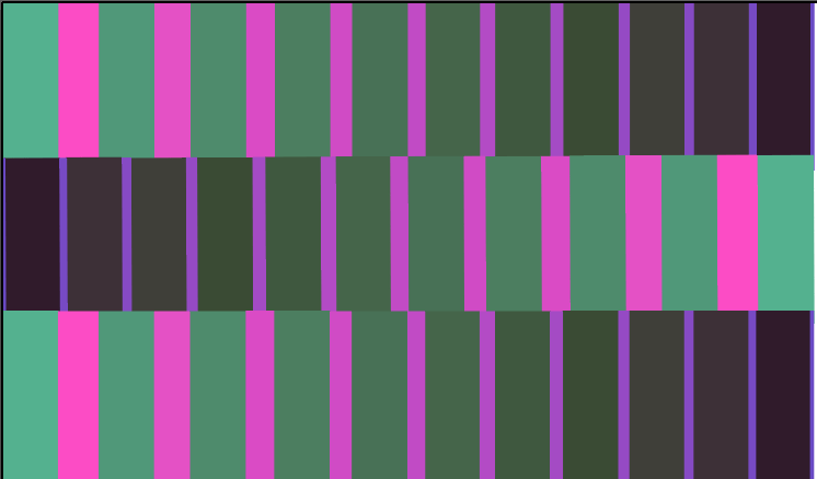
I made three copies of sequence and placed them from top to bottom. Then I inverted the middle stripe to create some contrast in motion. The resulting image is quite interesting. The middle strip seems to be sitting above the plane bottom, creating a sense of depth even though they are technically all in the same dimension. The contrast in motion is very obvious with the changing size of the pink-purple rectangles.
After these assignments, I experience significant differences between physical and digital color studies. Physical studies are more hands-on but are restricted the colors available to us. Colors also change when they encounter various medium just as what I discussed in assignment two. In terms of digital colors, there are more flexibilities playing with them. It is easy to see the subtlety of color changes and see the effects immediately. However, this also suffers similar problem in that colors might appear differently on different screens.