Kinetic Light: Color Studies
Intro:
For our color studies, we explore the three aspects that color is made of: hue, saturation, and value, and combined these to explore how color can be similar and different based on how the human eye observes them. We created 5 different creations that each explored different ways that colors can be seen or changed using the three aspects of color. I hope to learn how the human eye observes color can be changed and altered by changing the values of the aspects of color, and by aligning colors next to other colors. The projects that inspired me are 82937519024i3jt314y0t984urhn32uy
Process:
The following are the 5 different creations:
- Creation 1 and 2
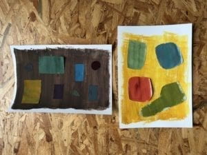
- Creation 1: I mixed different paints to create multiple to create different chromatic colors, which I then used one for the background and several others for different shapes. For the background, I used a chromatic brown, and for the different shapes, I used a chromatic yellow, blue-green, light blue, violet, burgundy, sea blue, green, and tan.
- Creation 2: This one was a bit more difficult than Creation 1 not in terms of mixing the colors (as we only needed to make prismatic colors), but in terms of painting the colors. Some of the leftover gray-ish paint on the brushes and in the water would sometimes mix with the prismatic colors, causing them to become a bit muted. For the background, I used a bright mustard yellow, whereas for the shapes I used red-orange, swamp green, blue-green, and ocean blue. The swamp green and blue-green became somewhat muted due to the issue I previously stated.
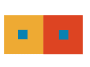
- Creation 3
- Creation 3.1

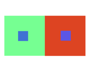
- For this creation, I could only adjust the brightness of the gray in the middle square. Doing this, I was able to see how the gray square on one side looks brighter than the other even though they are the exact same brightness.
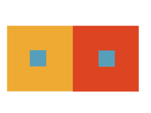
- Creation 3.2
- For this, I had to use the exact same color for both middle squares by adjusting the hue, and while adjusting the hue I noticed that the middle squares look like different colors because of the outer squares’ colors. The middle square on the right looks a bit brighter than the one on the left because of the outer squares’ difference in color
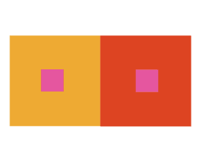
- Creation 3.3
- For this one, I had to use the same colors from 3.2 but adjust the saturation of the color, and this gave me a slightly grayer middle square, still with the same difference in observed color even though they are the exact same color. This phenomenon will continue to be observed in the following creations.
- Creation 3.4
- In 3.4, I was allowed to alter the hue, saturation, and brightness of the middle squares, and I created a pink middle square that once again looks different from each other. The pink on the left looks a little bit darker than the one on the right even though they have the exact same color values.
- Creation 3.5
- For the final creation, I had to make two different middle squares appear to be the same color by adjusting the color of the outer squares. For the two middle squares, I chose two different blues, each with their own hue, saturation, and brightness and I altered the left outer square as much as I can to make the two middle squares seem identical. With a creamy lime blue and the original creations’ red, I was able to make the two different blue middle squares appear to be the same color through the power of color interaction.
- Creation 3.1
- Creation 4

- For creation 4 I had to make two sequences of 11 different rectangles with varying hue, color, and saturation. For the sequence in the back, I used 11 equal-sized rectangles with the color changing from a prismatic blue, to a prismatic light blue, to a prismatic green. In the front sequence, I created 11 rectangles of different widths and changed the saturation slightly from the first rectangle – a muted red – to the last until the final rectangle was a wider, prismatic red. I used this pattern as a way to implement some variety and create a feeling of movement from one side of the creation to the other.
- Creation 5
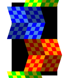
- For my final creation I was inspired by a twice folded paper I saw sitting on my roommate’s desk and also by Victor Vasarely and his work with checkered patterns. I adopted his checkered style to make a grid of diagonal rectangles, with shadings that make it seem like there are folds along the lines where the shaded/unshaded areas meet. I would like to make this a more complex piece in the future by adding cube-like structures amongst the squares.
Reflection:
Although most of my creations went the way that I had hoped, I did have difficulty mixing the paints to create prismatic colors for my second creation. I hope to be able to understand color mixtures better in the future so this process goes more smoothly. I also believe that my creation 5 could have been more complex had I had more experience with using Illustrator, as I hadn’t used it in several years. As the semester progresses I will certainly be able to create more complex creations.