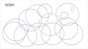
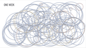
I realized that I did not read the assignment carefully and created a digitally drawn map rather than a hand drawn map but I guess it still works. This week I tracked my time spent with people. I tracked this data based on three variables: personal (time alone), private (time with family/friends), and public (time with greater Shanghai). I visualized this data through bubbles – not sure why, I just felt that the size and color of the bubbles would be a visually appealing and engaging way to understand with whom I spend my time. I used yellow for personal time because I am quite happy when I spend time alone. I used blue for private time because I feel at ease spending time with friends and family in Shanghai. I used red for public time because I am often aggravated when I spend time out and about on the metro and in public places in Shanghai. Below are screenshots of a daily map of my time spent as well as a weekly visual of overlapping circles detailing my time spent with whom this entire week.
Link to slides:
https://docs.google.com/presentation/d/1tc3TucSw2jKgHdzTEGzPqrsV9Z1ezYwosgXMQSvFYsg/edit?usp=sharing