Link: http://imanas.shanghai.nyu.edu/~qc532/week03/index.html
Process:


I firstly fixed my last assignment about the basic css exercise. Since I used “margin to left” in the content part the whole content didn’t appear in the right place.

Based on the assignment of week 1, my portfolio website includes three pages – intro (index.html), project and about. I spent most of the time on the intro page. To present in a simplism style, I only put my Chinese name and the English name on it. Instead of linking to “contact me”, I put the icons on the left with links to my social media accounts. To achieve this effect, I learned to use the FontAwesome which is a useful font providing different icons and I can edit them the same way as editing the font. I also tried the hover attributes so that the color will change when I put the mouse over the icons.
For the navigation box, I used a simple animation effect learned from online tutorial which pops up a line when the mouse hovers on the content. Attributes included are the transition and transform. It also took some time to refine it by trying different opacity and time.
I put my Chinese and English name on the right of the page. Since I tried to make an overlap effect of these two, I set them in different classes and add different styles concerning font-size and opacity.
The background image bothers me the most. At first I set “height:100%” for the gradient in the background but when it’s not full screen there will be a black row under the page. The reason is that the flexbox used to display the content will change position according to the size of the window while the background won’t. So if I use just background color it will be fine (because it will repeat and the edge of the image is not as obvious as that of gradient) but can’t make it using background-image. Now I know why most of the websites just use white or other colors as the background instead of gradient 🙁
For now, I just used color as the background to avoid the weird blank block on the bottom in other two pages. I also changed the color of the link when hovered according to the different background color. The similar effect is also applied to the box on the project page.


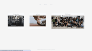
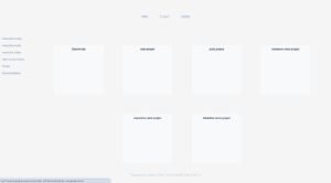
The about page and project page follow a similar style as the intro page as well as the one we’ve done on the previous assignment. I changed the text-decoration, the font type and add some photos to these pages. I left the project photos blank for now. (Hopefully I can fill that page after this semester.) Finally, I add the footer and deal with the problem to make it stay on the bottom by set the height as auto.
