Introduction:

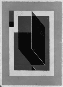
The image I chose is titled Bent Dark Gray and I chose it simply because this piece stuck out to me when browsing pictures in the links provided. What specifically grabbed my attention was the way in which the simple geometry created a three dimensional shape that could be interpreted in differently depending on the viewer. Some may view the black shape in the middle to be a “wall” casting a shadow to its left while others may interpret the shape to be a thin cube shooting out at you.
Link:
Code:
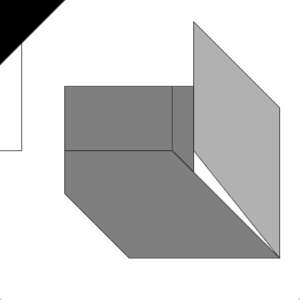
size(600,600);

background(255);

fill(0);
triangle(0, 0, 129, 0, 0, 129);

line(43, 86, 43, 301);

line(0, 301, 43, 301);

fill(127);
rect(129, 172, 215, 129);

beginShape();
vertex(387,172);
vertex(344,172);
vertex(344,301);
vertex(387,344);
endShape(CLOSE);

fill(127);

beginShape();
vertex(129,301);
vertex(129,387);
vertex(258,516);
vertex(559, 516);
vertex(344, 301);
endShape(CLOSE);

fill(177);

quad(387, 43, 387, 301, 559, 516, 559, 215);
My Picture:

I am not an artist, so trying to create something similar was rather challenging. In order to help create this sketch, I used the graph paper provided to plot the coordinates for my shape. Though difficult at first, this proved instrumental in the long run. In order to keep the motif of “multiple interpretations” I tried to create a gray shape that the viewer could either see as pushing further into or popping out of the sketch. I tried to maintain the color scheme of the original photo, however I tried to take concept of the original (multiple perspectives) and blow it out of proportion. Though not perfect, I am satisfied with my first attempt at using processing. I’m almost certain that more practice with drawing on processing will aid me in realizing future designs.