Project Name: Who’s ordering your food?
Partner: Xueping
Final Creation:
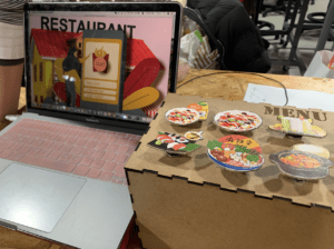
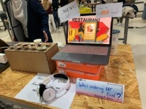
Codes: Arduino + Processing
Conception and Design:
The interaction of our project consists of two parts: processing ( with a series of scenarios ) + Arduino ( a Menu made of buttons )
In this project, the users are allowed to explore by themselves. The final feedback/report they get is also based on what they choose. When we made the proposal ideas we wanted to make it an educational device informing people to have a healthy diet by keeping the balance among all the nutritions intakes. But thanks to Prof. Marcela, we do think that idea will only be accepted by a small range of audiences —— people who care about nutritional balance to gain a healthy diet. People have their own standard to choose a healthy diet. Otherwise, our concept was too narrow to make our device an inspiring one.
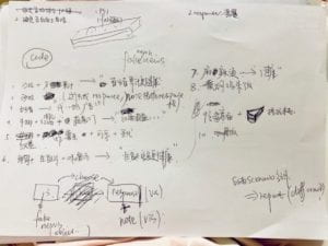
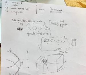
The three scenarios are created to make a comparison. In the first one, there’s no limit. The users can choose whatever they want in the menu. ( People want to try curry rice simply because it’s been a while not having it ). In the second one, there are three clips of weekly vlog filmed by a famous Youtuber ( I will put the link down below ). It indicates that people nowadays can be easily influenced by social media. Psychologically speaking, most people tend to follow what others do. When those famous Youtubers are promoting their healthy styles, the audience will follow suit, not considering whether the recipes suit them or not. Or the recipes themselves are not healthy at all. In our project, people need to press “v” to watch several clips. In the last one, there’re news/scientific reports popping up on the screen with the corresponding voice. It’s like we are surrounded in a world filled up with either real or fake information. We tend to believe the so-called “scientific facts” when they are actually not. The most important lesson we learned from the midterm project is to create an all-dimensional experience for the user, in which the audio is inevitable most time. So here, from both visual and audio sides, we want to make it more a reality. The experience is like reading newspaper or checking daily news. When you look through that news, you can choose to read thoroughly or just skip it. But you can’t resist the information pouring onto you. That’s how we develop the third scenario. Finally, based on whether they’ve chosen a different dish or not during the process, we will give a feedback to the user.
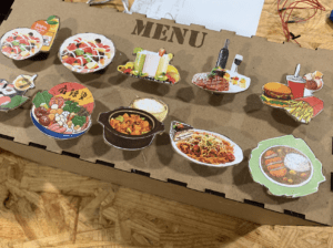
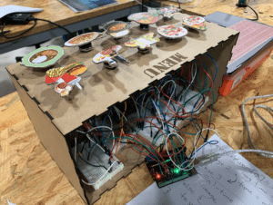
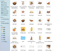
For the visual design, we made a menu with buttons on top so that it feels like a restaurant. We specially chose a similar cartoon style. We made some visuals (pictures and texts), but due to time constraints, we didn’t draw all the dishes. We definitely want to try next time to make it more aesthetic.
We could have used more words but we think that there might be too much load or more like a lecture instead of an interactive experience where people are put into the “conversations” all the way.
Fabrication and Production:
The most significant and challenging part of our production is to put all the scenarios in a single processing page. We use if statement to count the scenario number, delay() to make transitions and refresh the background in between. Also, it’s important to decide when to display the image or to play the sound. For example, it happens that the new image covers the old one but the sound continues to play. It’s important to put them under the correct conditions.
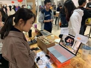
During the user text, we only finished the third scenario then. And we received lots of helpful feedback from classmates and professors :
(1) Better to have clearer instructions. ( This is actually a tricky one. We do want to make it clear, but not too obvious. Or the experience will be responsive rather than interactive. So later we added some hints or notes.)
(2) The information given may be overwhelming? ( We thought of this problem. But that’s why we also added the voice. It also makes the scenario more realistic. Later people also told us that now it’s better because more visuals, more elements(sound, video, image), and more interactions are involved.)
(3) The menu can be better designed. ( We also think so. If we still have time, I want to make it more like a sheet or book or make more decorations on the box we have)
(4) Make it a little game. ( That’s also a very good starting point.)
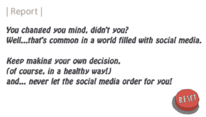
(5) Create a replay/reset button so that the user can play it again. ( Yes! later we added that on the report page).
All the feedback is very helpful for our following production decisions. We made some improvements:
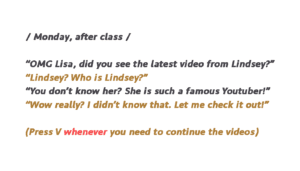
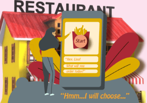
We try to put the user into a conversation, where he or she is making choices not only for himself/herself but also for the girl, Lisa, in the story. When the user is making decisions for that girl, it also indicates that it’s not you but the social media that influences your food decision. Besides, the conversation like this can be part of daily life so the users may quickly familiarize themselves with what’s going on. We want the conversation to make the scenarios more of storytelling, rather than just a “lecture”.
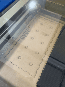
For the fabrication part, we used the layer cutter to make the box. The dishes are made of cardboard with pictures atop.
Conclusions:
The goal of our project is to convey the information that we can be easily affected by social media in terms of food choice to get a healthy lifestyle. You are the receiver of all kinds of information, and you thought you were making your own decision. But think about it: Are you ordering your food? Or is there anyone else ordering for you? Are you really making independent decisions? This project is never to tell people the best nutritional balance to reach in order to keep healthy. Instead, all the people can get their personalized experience in this device. Based on our report at the end of the project, if you are someone who holds the original choice you’ve made, it’s a good thing, except that you choose the junk food three times. The latter will be reminded to have a healthier alternative. As we observed, most people easily changed their mind after they got that information. We hope this project will make them realize the invisible power of social media.
Our project generally aligns with my definition of interaction that it is a process in which an actor receives and processes the information from another through a certain medium and then gives the results accordingly. It’s sufficient to describe a basic interaction. But to be a successful one, in my opinion, the experience should (1) self-explanatory, clear, and obvious (2) put the user in a continuous loop to make responses (3) be multi-dimensional with visuals, audio and other factors involved so that the user will be more engaged. I think we still need to make our project more self-explanatory. It can be achieved through various forms of interaction like recognizing the users’ gestures, which may be more close to daily life. Or we can provide more hints rather than just texts. I think we did well in (2) and (3), but there’s still space for improvements.
Since the users need to stay focused on the scenario, I’m glad to see they are more than willing to navigate throughout. Although sometimes they got confused about what’s the next key to press, and that we didn’t have a very detailed, personalized report in the end ( we expected that the feedback is given based on every food combination. But due to technical constraints, we found it difficult to realize). some of our friends said that they really saw the difference and improvements we made after the user test.
The values we learned from our setbacks and failures are that we need to thoroughly think about the ideas we want to show rather than the particular techniques for interactions. But when we begin to think about the interactions, we easily neglect some details. For example, we made the video wrong size/format, or we forgot to put the bracket, etc. Therefore, we also need to spare time for these possible mistakes besides the main parts.
Another thing we need to reflect on setbacks is how to convey the information more explicitly and quickly. So we designed a plan B for the 3rd scenario: we let the user chooses whether to go through every piece of news or simply get the abstract by skimming. The latter is meant to create a feeling of the explosion of information, mimicking a realistic environment filled up with all kinds of information. It has all the news and big titles moving while the voiceover will be a combined soundtrack with varied voices telling different news or slogans. In this case, even if they are not patient to see the news one by one, they get the main ideas rather quickly.
To conclude, we want to let people realize the influence of social media on their decision making. Studies show that when we order our food, we are affected or misled by many external factors. Social media is the major one in today’s world. If we just blindly follow whatever others eat or the so-called scientific report says, we are going to face some food safety issues. The prevailing pop culture including live streams and articles gains profits mostly by driving the traffic and catching people’s eyes. Some may be true facts, and some are really not. But consumers tend to believe whatever they see or hear. Following the social media blindly may lead to some disorders or obesity or heart-diseases. In our project, by asking people “who’s ordering your food”, we want to let people think twice about their food choice or decision making in general.