Truth about Truth – Chloe(Yuqing) Wang – Rudi
My idea of how this installation would look like changed a lot during my development process. At first I wanted to be a complicated series of questions and answers with data collected from user interactions. But after talking to various people about my project, I gathered different opinions and came up with the final version.
Artist Statement
Contemporary media has the power to shape the way we think. We are all blind when it comes to truth. In this environment, how do we determine right from wrong, black from white? In what ways do we interpret something as a fact and how likely is it for us to view something/someone without prejudice?Truth about Truth is an installation that is intended to remind individual observers the importance of not categorize and define others from only one perspective, not to have our decisions influenced by what the media portrayals or merely considering what’s on the surface. However, this work is also open to all interpretations.
Conception and Design
As written in my final essay, I based my project on two medi theories: “Selective Exposure” and “Third-Person Effect”. Selective Exposure means that people have the tendency to read and accept those news that are in accordance with their beliefs. Third person effect is the concept that individuals believe others are easily influenced by the media but they themselves are not. With this project, I wished users can slowly explore by themselves and come to their own understanding of what this project is about.
The Three photos
Changing the images to any group photo would make sense, but in this case, I choose three images with opposing groups of people in them. If we look at these images without cropping out the individual faces, we can automatically give each of them a definition, a job title, and we decide whether they are good or bad people.
1.Hong Kong Protest: I got the idea of my project because of the Hong Kong protests. For me, the protest did not happen only on the news, but they have impacted some of my closest friends who were studying in Hong Kong. As someone sandwiched in between the two sides of this conflict, I wish to maintain a neutral perspective. Each person holds their own perspective when looking at this image. By cropping out the individual faces, I wish to put the emphasize individuals’ roles in this whole situation. Interestingly, although the image I use doesn’t explicitly say that it is Hong Kong, many people automatically relate the image to the Hong Kong protests. This shows that a pre-set image of what the protesters and the polices are like.

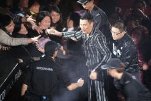
2.Andy Lau: I think this image can successfully reflect my main idea of media portrayals and the star-making process. Andy Lau is one of the most well-known and commercially successful Chinese singers. His fame was built by mass media in China in the 1990s. Being the focus of this image, Andy Lay is still a well-known figure even when cropped out. The media has made us(at least the Chinese users) connect Andy Lau’s face with fame. People get crazy when they see him. So in this image, Andy Lau is separated from everyone else. He is a commercial phenomenon, while the others are consumers of this fame.
3.Occupy Wall Street in 2011:There are not so many protester-police opposition images that are available. I chose an image of the 2011 Occupy Wall Street protest. This protest was about economic inequalities in the U.S. Many were arrested while the police and protestors conflicts were intense. With this image, it does not limit the topic of this project to just China. Who’s side are you on when the protest is happening in New York? How are people’s perspectives changed when the context of the image is not so obvious and recent?

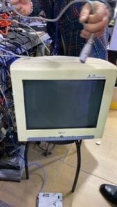
The Vintage Monitor: For this project, I didn’t want to have my project shown directly on my computer screen. My initial idea was to laser-cut a box that can cover my computer so it would look like a TV screen. Then I wanted to have an old TV set that is smaller, with buttons on the sides, to create a more intuitive user experience. I have also considered getting a newer monitor, but it still does not fit the aesthetics and goals I want to achieve with this project. However, what I found in the second hand market was a huge monitor with a rather high resolution. With the monitor, I wanted to make the users feel as if they are controlling a surveillance camera to observe individuals, as the set-up of this machine only allows you to look at one face at a time unless you press the button. There is another layer of meanings. Nowadays with our smartphones and laptops, we feel like er control the world, we know everything that is happening, we can easily reach out to those we want to talk to or comment on things we want to comment on. However, at the time when this monitor was used, information is only starting to be transferred faster. At the same time, with this machine, it also shows that the social media today only gives us fragments of information. You still cannot fully understand someone just by looking at a small fragment of their face.
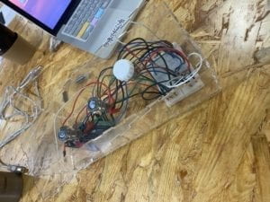
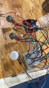
The Case: The clear case for the Arduino is also a hint to the title of my project. I remember in class we talked about putting an input to a black box and receiving an output, but we don’t know what happens in between. This transparent case is to show that there are lots going on underneath the deceptive surface. I think it was necessary in this project, to have a see-through wire case.
Sound Effects: The sound effects as the user is turning the knob signifies surveillance camera focused on individual faces. Although this interpretation might be adding another layer to the project, it has made the project more engaging for the users. Although I received recommendations to add some background music to my project, I realize that if the project was in an environment like the IMA show, adding a background noise would not improve the whole experience.
Fabrication and Production
I started my project based on what I have done in one of the recitations where users can control two potentiometers to reveal parts of an image. At first, I wanted to make a similar interaction device with other sensors. But I realized that my ideas can be better expressed if it only reveals faces. So I chose the first police and protestors image and cropped out those people’s faces with Gravit, labeled them image1 to image13. The last image is the original photo. I also used two push buttons and one potentiometer for the actions of revealing the whole image, changing the image, and changing individual faces. One problem I encountered was that the images all had different sizes. Rather than changing the canvas size every time, I fitted all the images to the same size so the image change was smoother.

User Testing
The user testing process helped me to foresee many problems that could occur once the project is done. Many people also gave me critical suggestions for my project. During user testing, I only had one image and two buttons. They wanted more images and more ways to interact with the machine. I also realized that people tend to push the buttons first and only focus on the screen. The light-up button did not signify “press me” for the users. Everyone interpreted the project as: focusing on individuals as parts of a whole. Some people thought that one image was enough to explore and it gives a strong statement. While others wishes to see more images so the project has a more diverse or complete storyline. Furthermore, most liked to have the image only revealed when the knob was turned to the end. Because of this suggestion, I changed this part for the final version. However, I did not realize adding more images is already making the installation more complicated. I should have the image revealed more often as the user is turning the knob.
Video: User-testing version
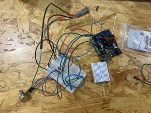
To organize the wires but still showing them for the aesthetics, I laser-cutted a clear box that can fit the breadboard, Arduino, and can fit in front of the monitor while not blocking the screen. I also made sure to have three holes with the size of the two buttons and the potentiometer. Then I 3D printed a knob for the potentiometer. However, when I assembled the case to the buttons, the potentiometer was not so stable. So I soldered it and put a tape underneath to support the potentiometer.
Here are some photos of the building process:
In one of the images, there are 13 faces. While the other two have 7 faces. To make sure the potentiometer can evenly spread out the degree it turns to the number of images, I used the map function in Processing.
  prevknobValueMapped= int(map(sensorValues[0], 0, 1023, 13, 1 ));
  prevknobValueMapped2= int(map(sensorValues[0], 0, 1023, 6, 1 ));
  prevknobValueMapped3= int(map(sensorValues[0], 0, 1023, 5, 1 ));
Because there are three different images each with different faces cropped out, I had to separate them as three groups of images with three individual folders: pic1, pic2, pic3 in the data folder. To retrieve those images from those folders, I used
  for (int i=0; i<14; i++) {
    photos[i]=loadImage("pic1/image"+i+".jpg");
  }
and
    if ((sensorValues[1] == 1) &&(knobValueMapped == 13) ) { //sv1 = big picture, sv0=knob
      image(loadImage("pic1/image14.jpg"), 0, 0);
    }
The two push buttons correspond to two digital values and the potentiometer corresponds to the analog value. They only have 1 and 0 two values of whether they are being pressed or not.
This is the code for the second group of images:
    if ((sensorValues[1] == 1 ) && (knobValueMapped == 6)) {
      image(loadImage("pic2/image7.jpg"), 0, 0);
    }
    if (prevknobValueMapped2 != knobValueMapped) {
      sound.play();
    }
Conclusion
I wanted to show that contemporaty media has the power to shape the way we think, and that individuals matter. During my mid-term project, I defined games as the most interactive forms of art. However, they are only interactive because they are immersive. The process of developing my ideas for this project and finally getting it done has been quite a journey for me. There were many times when I got lost in my own ideas. However, the end result of my project was successful for me. All the users I interviewed came to the conclusion that individuals are more important in the big picture. Most people I saw were able to figure out how this installation was operated if they focused on it for longer periods of time. However, I still needed to improve the intuitiveness of the machine. Many people got lost when using it, and even if I put a note explaining how to use it, people still would not read it. Although the machine’s “complication” can make people want to explore it more, some people do not have enough patience to explore, or they simply did not see the button lighting up and did not interprete it as time to press them. If I had more time, I would add more images and try to make the operation of my project simpler. From this project, I realized that everyone thinks differently. It is quite difficult to arrange three input values that fits everyone’s habits. I used some images that can be considered controversial in this project, but there were no words accompanying the images so there is not a forced understanding to my project. Also, because I used three “irrevalent” images, this project covers quite a diverse topic and can be applied to more areas, which traces back to my initial struggle of being neutral and not taking sides.
Here are all the version of my codes for the final project: https://gist.github.com/Chloeolhc/2662115e00a0ab9844e73ec224b66792
Here is a video of the final presentation of my project:
Sources:
https://www.mpweekly.com/entertainment/focus/local/20170120-33977