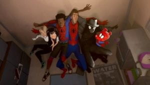
This is the original picture that I put into photoshop. It is a scene from Spider-Man: Into the Spiderverse that shows all of the different Spider people from the different dimensions.
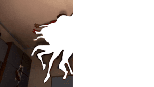
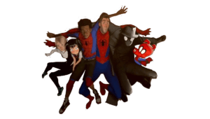
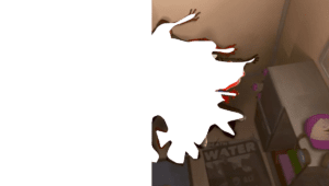
I split the picture into three parts, left, right and center. The center part is the most accurately cut out as if I didn’t cut the left and right perfectly then there would be parts of transparency on the image. As a result, I made sure to leave a bit on the outside so that the center image didn’t need to fit perfectly when I put it as a layer on top of the other two sides.
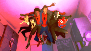
This is the final result. I just changed the colors of the three segments (more red on the left, greener in the middle, more blue on the right). I decided to go with something like this because the movie is styled very much like a comic book. I was hoping to achieve a more colorful comic book look where the scene looks less realistic and flooded with color. I think the red and blue were ideal as those are primary colors of his suit. I could’ve trimmed the different segments a bit more as you can see a bit of red where the scene is meant to be bluer.