Assignment 1 :
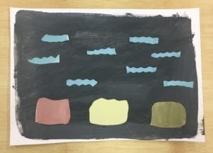
For assignment 1, I mixed gray with many bright colors like red, yellow, green, and blue to make them more in the rage of chromatic gray.
Assignment 2 :
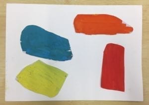
For assignment 2, I chose several bring colors like red, yellow, green, and blue to make different shapes that fall in the prismatic color saturation range.
Assignment 3 :
Original:
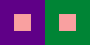
For the original one, I choose the same pink color inside and make the surrounding color purple and green. One center color looks more orange than the other one.
1)
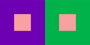
For exercise 1, I changed the value(brightness) of the surrounding color and it makes the center color more different than the original one. One looks brighter, and the other one looks darker.
2)
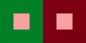
For exercise 2, I changed the hue of the surrounding color and maintain the saturation and brightness of them. The color in the center still looks different. The left one seems darker.
3)

For exercise 3, I changed only the saturation of the surrounding color. The left one still looks more orange than the right one and compared to the original one, the center color looks more gray as well.
4)
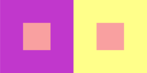
For exercise 4, I changed the hue, saturation and brightness of the surrounding color, which makes the center color more different from each other than the original one.
5)


In the original one, the left one is more orange than the right one, so I made the right one more orange than the left one and the center color looks the same with different color surroundings.
Assignment 4 :

For the first sequence of colors, I changed the hue, value and saturation.

For the second sequence of colors, I changed the saturation and brightness.

The combination of two sequences of colors looks kinetic and creates an afterimage effect.
Assignment 5 :
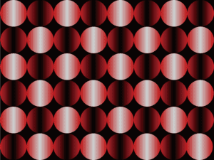
For Assignment 5, I made a page of circles that filled with two separate range of colors using illustrator. For the red-bright one, only the saturation is changed, and for the red-dark one, only the brightness is changed. I get the inspiration from Victor Vasarely’s painting ‘Hold-K’.