For this week’s assignment, I decided to train the style transfer model with one of Jackson Pollock’s paintings:
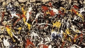
The reason I chose to use this painting, besides the fact that I like Jackson Pollock, is that when I was considering using style transfer for my midterm project, Professor Aven mentioned that images that have bright colors and very defined shapes would work the best. While this piece doesn’t really have very defined shapes, the colors are still pretty different from each other.
After the model was trained, I put it into the styletransfer style.js code from Professor Aven’s github to test the output through the webcam. This was the result:
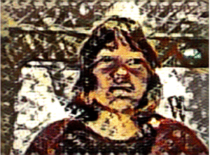
The shapes generated were interesting, kind of like a honeycomb. The colors somewhat matched the source image, but it also seems like some new slightly different colors were generated. If I saw this image without knowing how it was made, I wouldn’t think that it had anything to do with Jackson Pollock, though.
Now…what to do with this? I was really inspired by Roman Lipski’s Artificial Muse in how he incorporates his own paintings and combines them with his algorithm so that the role of artist is split equally between human and machine. This whole style transfer process also reminded me a lot of when I was first learning how to draw and paint: my art teacher would always give us some references that we would just straight up copy to try and improve our own skills. Combining these two ideas, what would it look like if I tried to paint my own Jackson Pollock painting, and then show that painting to the Pollock-trained style transfer? What would the combination of a human replicated Pollock painting and a machine replicated Pollock painting style look like?
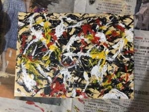
I first attempted (key word: attempted) to paint the Pollock painting on a small canvas:
I then held the painting up to the webcam with the trained model, which created this output:
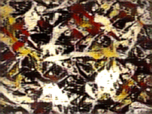
The colors are a bit duller, and the strokes are smoother. However, the whole thing is kind of blurry and there is this faint bumpy grid pattern over the whole image. I kind of like these effects because they would be difficult to achieve with paint on canvas – they very much digitize the style.
Overall, this was an interesting experiment and I think this concept is something I would potentially want to further explore for the final project.