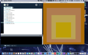
I chose this image because of its tone. The theme color for this image is yellow. It goes from brownish yellow to dimmed pink, then goes to dimmed yellow, finally to bright yellow. I see a transformational stage from this image. It looks like a depiction of a psychological changes that someone can have.
I wanted to draw an image that looks exactly like the original image. I made attempts to add the same textures onto my drawing. However, processing does not offer that function. So I had to stick to the plain texture. At first, I had to upload the image to a color depiction website. That website could figure out the color codes for me. Even though the codes that website gave to me did not match the original color codes exactly, but those codes were pretty close to the original ones. After getting the color codes down, I started drawing the squares from outside to inside. I set the size for the biggest square. Then add color codes into the background. After that step, I added rectMode. And set that to center. I repeated this step for the other two squares with slight changes in the color codes. For the innermost square, I added strokeWeight in order to depict that bright yellow stroke the original image contained.
I think my final creation is more or less similar to the original image. The colors in my image were not exactly same as the original image. But they are pretty close to the original ones. I think one noticeable difference is that my image does not have a texture feeling that original image had. If I could add the texture, then the final creation would look more similar.
I think drawing in processing was a good means of my design. It helps me to practice my coding skills.