When I was trying to choose the motif, I browsed through the Bauhaus School of Arts.

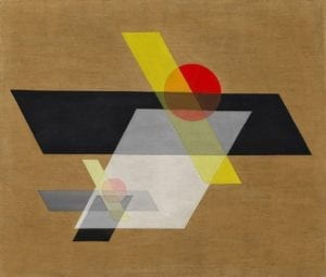
This is the image that I select as the motif of mine. The first time I saw this image, I felt that this image could be associated with ancient Chinese paintings which makes me describe them as quaint. The light brown background looks like the color of the rice paper used for those ancient Chinese paintings. The color with the transparency feature reminds me of the hazy view that is peaceful. The red circles look like sun to me and the black parallelograms seem like shadows while the yellow ones resemble sunlight.


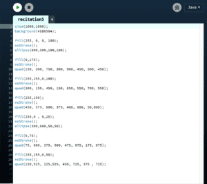
The similarity between my work and the motif is that the same shapes are used in them. Yet there are distinct differences between them as well. To begin with, I modified the angle of the parallelograms in the motif in order to make coding the coordinations of them easier. For another, the background color in my work was not the same as that of the motif for the reason that I don’t know how to apply the transparency effect to the background color in Processing. In addition, there is difference between the proportion of the shapes.
For me, I think processing could be a very good means of realizing my design since it could draw any shape and curves with the right code and even make animation. Yet it requires precision when we are designing the coordinations of each shape, which is very complicated and time-consuming based on my experience. Therefore, it requires very precise and careful plan before start to write any code. The reason why I regard Processing as complicated is probably that I was not very used to using this software.
Bibliography