http://imanas.shanghai.nyu.edu/~zc1151/commLab/week1/profile.html
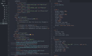
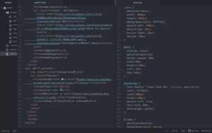
This is the link of my profile page with CSS, and the following pictures are how the page looks like before and after I added CSS to it.
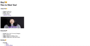
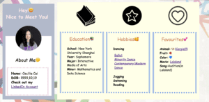
Inspired by the in-class CSS exercise, I started with dividing my profile page into different blocks and use <div>’s to create different classes in the html file. I separated the content into four sections, respectively basic information, education experiences, hobbies and my favorite stuffs. I then went on to browse others’ profile web-page for inspirations for designing the layout, and the following picture is one of the examples I found.
In fact, the above picture is quite typical, as professional profile pages all have similar style. I figured that the classic components are: a side bar with a profile picture and navigation links, and grids containing image or text. Applying this idea to my own profile page, I decided to create a side bar to put my basic information, with the rest of the contents fitting into different frames, taking up the main part of the page.
To implement such design, I used the knowledge we learned in class about CSS positioning and creating flex objects. I found this tutorial about positioning especially useful:https://medium.freecodecamp.org/how-to-use-the-position-property-in-css-to-align-elements-d8f49c403a26 . I firstly created different containers for each part of the web page, which are rectangles of different colors, and use them to enclose their respective contents. By setting the sidebar’s as well as its contents’ position to be absolute, and the remaining parts’ to be static, I was able to reorganize the layout. With the position absolute, the position of each sub-component in the sidebar, such as the greeting line “Hey! Nice to meet you!”, is only relative to its parent, which is the grey block container I created in the first place, and they all, together with the grey rectangle, are removed from the page flow. I also explored the CSS functions for image, and learned from google the way to cut it into a circle.
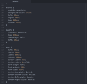
For the remaining parts, I learned from google the way to set styled frames and added a frame to each part. However, I went into trouble in formatting them. I figured that the three parts: education, hobbies, and favorites should be parallel and similar, and thus set them to be flex. But such setting messed up the layout of the whole page, including the side bar, and I was only able to reformat them by resetting the values of the parameters. I originally wanted to use the same class for the style of the three blocks, but I realized that since I set the values of the margins and the distances to top and left to be some concrete numbers, I need different values for the three frames so that they don’t overlap each other. Therefore I created three similar classes for them, but I’m still wondering if there is any way to combine the three classes. I’m actually curious about the way it works when using percentages to set the values of the widths and heights, and I’m not sure what value are the percentages referring to. The following parts are the CSS code for them.
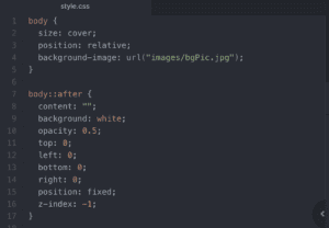
In addition to the above features, I also explored to set a background for the web page. The trouble I ran into is to adjust the opacity of the background image. I originally inserted the background-picture in the CSS code in body part, but once I set its opacity, all the contents on the web, including the texts and other pictures, become more transparent along with the background. I googled for the solution and learned that I can set features for the same div with a separate “body::after” block. By setting the opacity in the “body::after” section, I was able to adjust the transparency of the background without affecting other contents.
Finally, I added three icons, which are picture I found on google, to enrich the page content. And I also adjusted the margins of each parts to make the page looks more proportionate.