Design:
Our project is meant to dispel the notion that there is a perfect human. We made this project not only as an imitation of Jørgen Leth’s “The Perfect Human” and “The Five Obstructions”, but as a response to it.

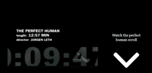
We have a video of “The Perfect Human” to give our users an idea of what we were trying to emulate. In addition, we referred to the user as the perfect human so that they would be more interested in seeing what the videos (and what we) considered to be perfect.

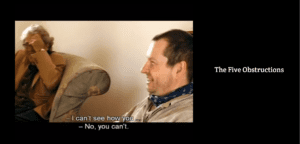
We also added “The Five Obstructions” since we thought that it was vital to our thought process when we were considering how we should edit our own videos. I wanted the website design to be quite minimal both in terms of what was on the page and even the color scheme as I felt like it would fit “The Perfect Human” better.

These are our three actors for our videos. We had an athlete, a professional and an environmentalist. We picked these attributes as felt like they represented traits that would be considered admirable in students. Users could click on these pictures to show individual videos shot in the same way as “The Five Obstructions”.

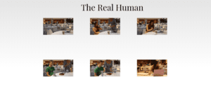
At the end of our website, we had “The Real Human” to show that people do make mistakes and that’s what makes us human. We used blooper footage to represent this as we felt like they were lighthearted mistakes that show that we aren’t perfect and in fact, these imperfections are something to be celebrated or enjoyed rather than disliked. One might also see that the background color has changed since the first part of the website. I added that to a) signal to the user when we were switching from Jørgen Leth’s films to our own and b) claim that our interpretation of what a person should be is more “pure” or “innocent”.
We used Chinese instruments in our audio to reflect the setting of our videos (NYU Shanghai) rather than pulling directly from the soundtrack of the films.
Process:
Based on the feedback I think our message was received well and clearly enough for us to get our point across. While we didn’t originally intend for it to be funny, I don’t see our audience’s unexpected reception of the videos as a sign of failure. I think the look of the website was somewhat successful. Some people mentioned they liked the color scheme, but at the same time, the website was too minimalistic or unclear. I would probably just add more indicators next time, similar to the downward arrow I had in the beginning. In addition, I wanted to add some text over the individual photos when users hovered over them (like “The Athlete”, “The Professional”, “The Environmentalist”, etc.) but I didn’t have time. Some things I discovered was how difficult it could be to coordinate artistic styles even in a pair. When Winny and I were filming, I feel like the way I recorded was different than how Winny did, and she had to edit my footage to make it fit the established theme better. I also discovered how important it was to stick to either using “px” or “%” for my arrangements as I think it led to buttons being in the wrong place compared to the pictures.
Future:
I think in the future I would obviously fix all of the stuff I know we did wrong already. In terms of new additions, I would have liked to try out different music tracks because we had the same music track for every video and it became a bit repetitive. Furthermore, I would have liked to try out different editing styles, like rapid cuts featured in “The Five Obstructions” Cuba video. Originally, before teaming up with Winny, I wanted to recreate the Leth’s films using films like some of the Avengers movies or Alien. While I am not too sure whether this would have as much of an impact on the user, it is something that I thought would be fun just as a little project that showed how movies often display their protagonists as perfect, or at the very least, extremely admirable people. More specifically for the Alien one, I think it might have been interesting to use footage that showed the Xenomorph as they are meant to be quite literally the perfect organism.