Final Project Documentation
Jannie Z & Justin C
Link:
https://github.com/320834/Poemsite
Description:
Our project is a website that allows users to create poems based on the templates that users have already created and a deck of words that randomly generated. Also they can create their own templates and upload them for everyone to use. After creating their own poems, they could save and publish them so that everyone can view them.
Process:
Inspiration:
Our idea originally came from our understanding of music, and other art form. We wanted to create something related to music at first, but we were stuck in a situation where we found there weren’t much room for new ideas when it comes to music. While we were discussing, we both thought that art should be open to interpretation with no definite answer, so our project should be open to interpretation as well. Then I thought of poems. Personally, I am very passionate about poems and lyrics. Poems are short, but reveal much more and leave a bigger room for readers to reflect on their own aesthetics, experiences and feelings. So we decided to use poem as the carrier. And then we thought of MadLibs, a phrasal template word game where one player prompts others for a list of words to substitute for blanks in a story.
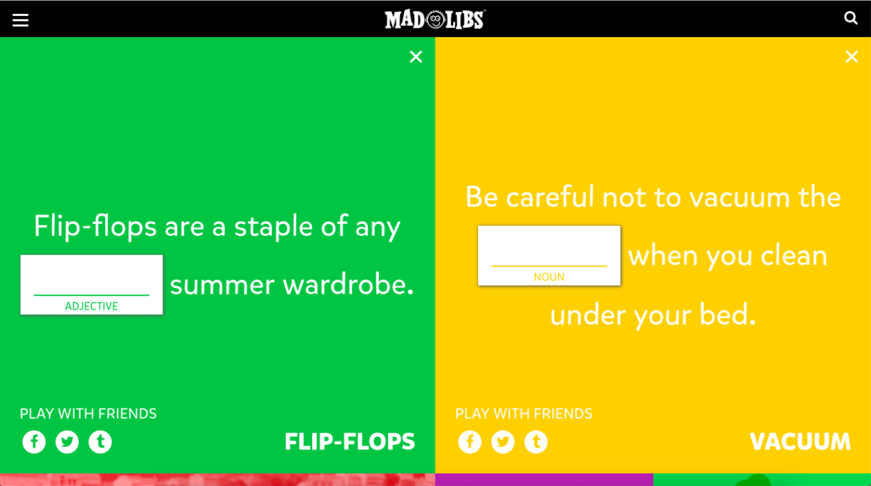
(MadLibs)
So we decided to do something similar, but with more sense than pure entertainment. We want to create a welcoming platform that allows people to release their inner art.
Web Design / User Interface:
I designed the user interface. I took inspiration from moon phases. I decided to name our project “phase”. Because moon phase changes everyday, just like us. We keep on changing, in different stages of our life. And the angle we see things is different, too. The different phases reflect different aesthetics and perspectives of ours. Maybe one day you create something, and a few years/months later you go back to look at it you will fell something totally different. I think this fits our theme so named our project “phase”.
Since we named our project phase, the whole theme of the website is defined. Main color set is black/white. I used some pictures from the Internet and edited them using photoshop.
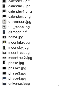
(I created a gif picture using photoshop for a star twinkling effect.)
I was inspired by a website called blacknegative. So I want to design something as cool as theirs.

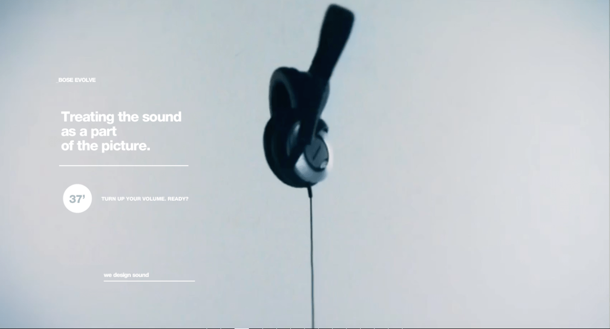
(Blacknegative: http://blacknegative.com/#!/loader/)
Their website contains a lot of cool animations on the website, and a lot of transitions between pages and events. So I did something similar to this.
-
Hover and zoom in effect.
When hovering on the buttons, it will zoom it slowly. I did this by using css transform and transition property.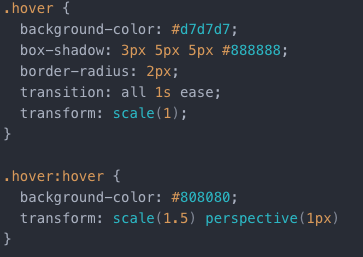
-
Fade in and out effect.
On the intro page, the introduction will slowly appears.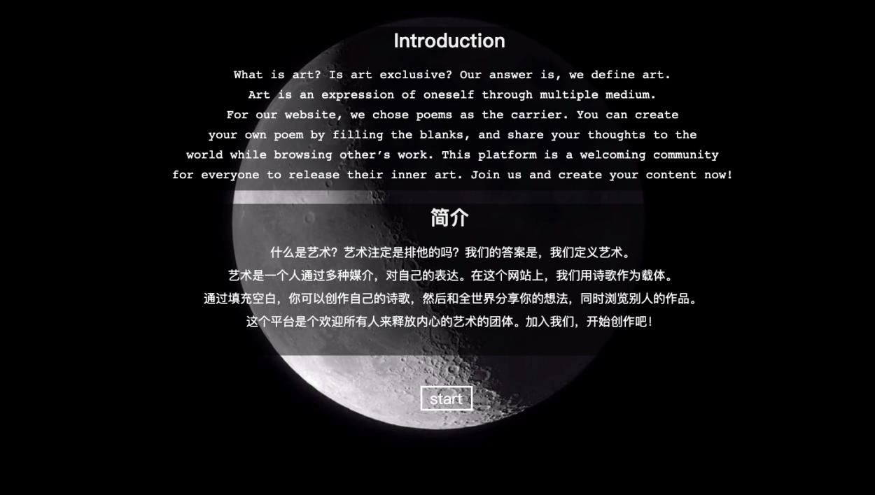
-
Phase video as the background.
I created a video of moon phase and used it as the background. (Seen above)
-
Handwritten title and animation.
I wrote the title “phase” on an animation generator and embedded it into our html page.
For the display page of templates, I used a phase calendar to be the background. And each icon represents a template. It will have the name of the template displayed on top of the icon. As more templates been created, more icons will appear.
I also used two bar images, which will always stay on top of the website, keep fixed.

Programming/Coding:
My partner Justin did the most part of programming. He set up a database where stores all the templates and poems that have been created and display them on the webpage. He also created a words generator function which randomly pulls some words out of dictionary at a time.
But we received feedback from user testing that the words may be too difficult for non English speakers. So we toned down the difficulty of words a little bit. Instead directly pulling them out from a whole dictionary, we now have a set of words (eliminated the difficult ones) to choose from.
Music:
I chose some meditation music as the background music, to avoid people being distracted by it. I chose some famous work by Dan Gibson, a famous sound-collector who spent his whole life on collecting different nature sounds.
Post-Moterm:
There’s still room for development. As the feedbacks we received said, the randomly generated words do not really represent our ideas of “release your inner art”. And there could be a function that allows people to like a template, so that there could be a rank of the templates. Also, in the creating template page, we have problems with the blanks. People have to type in exactly four underlines to make it a blank.
Future Development if Possible:
- Have a like function for the templates and poems.
- Adjust the randomly generator of words to something makes more sense. (e.g. categorize words by theme.)
- Fix the position problem on different screens.
- Fix the problem of blanks occurred in the creating template page.
In summary, I think our final project fulfilled what we hoped to achieve. The style is consistent throughout the whole process and the interaction worked well. But more future developments could be done.