For the group project, Ashley, Sabrina, Theresa and I worked on building a website for the Sapporo Upopo Hozonkai (Preservation Society). Before we start to actually design the project, we all first did some primary research on the history and culture of the Ainu and later on asked them for their specific needs and requirements on the website during the meeting.
After the video meeting, we divided the work into website design and video editing. Theresa and I mainly worked on designing the website while Ashley and Sabrina worked on editing the videos. Theresa and I decided that despite the basic pages a website usually includes, we want to specially add three pages- the sounds of the Ainu where we showcase their traditional instruments, the textiles of the Ainu where we set a gallery for the pictures of the details of the embroideries, identity where we interview the Ainu people who came to Shanghai and ask them about their life experiences growing up as an Ainu. Below are the basic layouts we came up with initially.
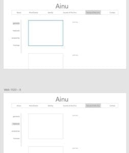
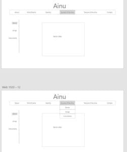
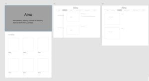
On the day the show was held, we interviewed each member of the team. Before the interview, we presented the basic layouts we planned for the website and showed them some templates, they gave us really useful feedbacks on things we need to pay attention to. They said they want the website to be simple and easy to change. Therefore, we decided to choose WIX to build our website. Besides, we decided to add a member page where they can put the pictures and names of each member. Also, they wanted all the blogs to be shown on our website, so we also transported the blogs on the original website to the new one. In terms of the colours, they said they want it to be the colours used in their clothes, so we picked blue as the main colour for our website. After understanding their needs, Theresa and I started to work on the layouts and design of the website. We each worked on a different template, just to give them more choices to choose from.
Below is what we had for the first in-class feedback session.
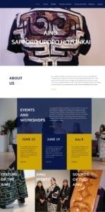
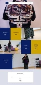
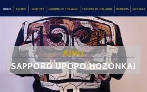
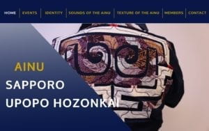
During the first in-class feedback session, someone pointed out that the colour yellow and blue might be a little too much for the website, so we sent Roslyn the colour schemes to ask for their preferences and they picked green, blue and white as the main colours.
During the second in-class feedback session, someone suggested that the “sounds of the Ainu” and “textiles of the Ainu” does not correspond to the other tabs. Thus, Theresa and I decided to add a culture tab and put the sounds, textiles and performances under this tab. Also, we improved the hovering on the home page and added fade effect to make it clearer. After getting feedback from the class and people from the society, we decided to continue our work on Theresa’s design.
Th last few weeks we basically worked on improving the design and adding the information and videos into different tabs. Under the “sounds of the ainu” tab, we used the anchor function and put pictures and videos under each instrument. For the “textiles of the ainu” tab, we created a small gallery with pictures and a short description of each embroidery. For the performances tab, we first put the edited video on top and listed videos for each performance with a short description.
Below if the live demo of our website.
In all, I am really happy to see what we are able to achieve in a short period of time and I also want to say special thanks to my teammates and everyone who helped us throughout the way. You guys rock!!