Title: Harry and the Girls
Link: http://imanas.shanghai.nyu.edu/~bc2328/commlab/video_project/lyricson.html
Our project is a video project that incorporates physical and digital interactive elements within the website and film. Our website is mainly an interactive platform that plays three different music videos, which footage is all entirely shot by our group. Our user interacts with the website while the video is playing by tapping on the video change between three different music videos. Since the songs that we picked also included korean music, we decided to also add a subtitle/caption function to allow users to understand the lyrics. Our website is mainly focused on combining physical and digital interactions for users as they watch the videos on the site. We were inspired by Namie Amurino’s Golden Touch video and thought it would be fun to do our own version of this as something that differs from the typical story picking project idea.
Screenshots:
*Landing page of the website that also recommends using touch screen*
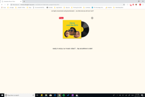
*Includes a gif of our album and allows the user turn on captions*
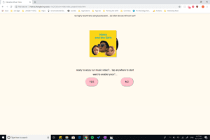
*Instruction page that tells users how to interact with the video and site*
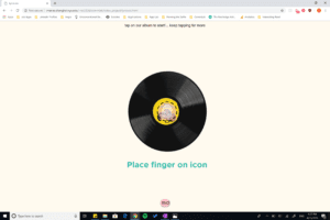
*First music video (Better Feeling – CL)*
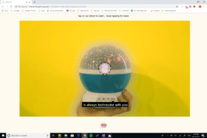
*Second Music Video (Palette – IU)*
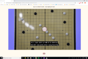
*Third Music Video (Home – Phillips Phillips)
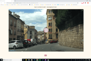
*Thank you page at the end that allows users to stop playing the videos*
Process & Struggles:
For Film/Assets: Since we were showcasing three different videos, obtaining footage for our videos was the most difficult. We filmed most of the indoor footages Each of our songs had such different concepts, it required a lot of props and different location filming such as the footage from the museum and the street lights. Another difficult part of filming was trying to film the props in first person view without our bodies in it. Since the footage had to also seem like it was interacting with the camera by zooming/popping in, it was difficult without a green screen. Thats why a lot of the footage also went through post production. We mainly used Premiere Pro to color balance the footage to create the different background colors, masking in order to have a cleaner cut between the different footages, input captions into the video, and other effects such as speed, scale, and opacity in order to make the illusion of interactivity in our footage. Our album and gifs were created through Photoshop and we thought it would be fun and cute to add our photos into the album as well.
For Coding: The coding for our website was relatively easy to figure out, and we really wanted to focus on the footage rather than the website. We used Javascript for the buttons and video playback and HTML and CSS to make our simple and easy to understand website. We did have a little trouble trying to figure out how to get the video to pause and play at the part of the video that the user left off, but we got it to work in the end. We also had originally coded the css positioning for the website using pixels, so we had to troubleshoot and change the units of the positioning css code in order to have the website fit well for all device sizes.
Post Mortem:
I am quite proud of our website and think that the footage that we had was filmed quite well as well as the website was created in a user-friendly and aesthetic style. I have been inspired by Namie Amuro’s music video for a few years and was very happy that I was able to recreate my own version of that and create three different music videos as well. I think that the visual aspect of it was fun and I wish we had the time to also make a mobile or touch screen version of the site as well. The critique reviewers mentioned that the interactivity component of the video was hard to understand or not done very well but I thought that many users will still find the directions pretty intuitive especially since we had presented the website through a large projector and the website and function of it is a much more private user experience instead. I think that the visual aesthetics and the user functions were also done well.