Link to the webpage: http://www.paperrad.org/newindex.html
I found this website when I was browsing through Rhizome Net Art Anthology. What struck me about this webpage is the vibrant color. Then I clicked in to explore more.
PaperRad was established by DIY artists in the 2000s. Those artists found a common thread in their interests as they want to explore unique medias such as comics, videos, and DVDs. PaperRad was extremely active during 2000s-2008s, composing of various internet works, while some are archives and some are artworks. The shared theme and idea between all the artists is the “riot of brightly colored compositions featuring graphics and mazelike complications of characters from otherwise overlooked aspects of ’70s and ’80s pop culture.” (anthology.rhizome.org)
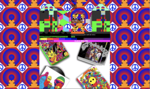
This is how the main Paperrad page looks.

However, I cannot screenshot the blinking of the screen. I feel like the blinking of the different colors, texts, and images really catch my attention. Those blinking aspects of the webpage really give movement to a static web. It lures our eyes around the page from one text to the other.
I could see that images are placed one over the other. Instead of seeing them as mistakes, it gives me the feeling that artworks don’t have to be all perfect without imperfections. It can be messy and it is still a wonderful art.
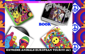
As I played around, I found out that there are many instructions on the page to “click below”, “click the animal”, “get the info”, and etc to get more connected to what Paperrad has to offer. When I hover over some images, texts also come up. For instance in the image below.

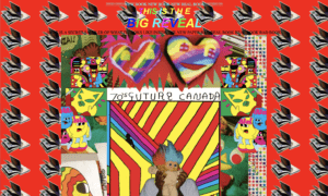
Here I hovered over the book image and the word “book” appears. When I clicked on the image of the book, a new webpage opens and reveals the sample of PaperRad book. Again, on this page, they are also using vibrant colors and the blinking of different things. Below is how the web looks like. Similarly to before, I cannot capture all the artistic aspects. For instance the animation behind in the backgrounds of all the books turning pages.

Since it is an archive page, it embeds a lot of broken links. It is interesting to see those broken lists and how it posts challenges to net art.
Within the website, there are many things to explore. And those things also leads to other parts as well. I really like the page in the artistic aesthetics and the uses of vibrant colors to capture the audience’s attention. What I like most is how it portrays the feelings that art could be anything we want, and it doesn’t have to be perfect.