A.
My initial definition of interaction is simple and looks like the definition found in a dictionary. I think an interactive process requires three key elements in order to qualify as interaction, which are 1) two or more actors, 2) cognitive systems, and 3) “listening, thinking and speaking”. As I walked through my midterm project, some more specific ideas about interaction came to my mind.
For example, I started to pay much more attention to the feedback given from my device. My device Duet Beat uses a heart rate sensor to measure the user’s mood and it takes a while to get a heart rate reading. While the sensor is working, the user has to know what’s going on with the device otherwise he/she would be clueless what’s happening and would think the device is broken. Therefore, I added an indicator to the device – an white LED which blinks while the sensor is working. The outcome is satisfying . During the demonstration, most users got the idea of the indicator and no one thought the device went wrong. In spite of that, I also noticed the idea of accessibility. Our device was designed for everyone, which means people with disabilities could also use our device well enough. I decided that accessibility had become one of my most important parts to evaluate interactive designs.
B. 1
Apple Inc. is one of my favorite tech company whose chief designer Jony Ive I admire the most. Every design that comes from Apple is my role model of interactive designs for its simplicity, accessibility, and availability. Take one simple function on the newest iPhone for example.

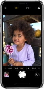
People tend to mute their phones all the time for whatever reason it may be, and thus the your cellphone loses its main tool to give feedback. However, on the newest iPhone uses another tool for feedback. Every time you click on the white button to take a photo, the phone would vibrate a little bit using its TapticEngine to notify you that you just successfully took a photo, instead of merely click sound. The TapticEngine can even simulate the kind of feedback that you actually get from a physical push button. This vibration function is nowhere to be seen on other phones I’ve used, and it perfectly fits my definition of interaction, especially the feedback part. That process involves two cognitive actors: iPhone and user; the iPhone receives a touch input from the user, and process it, and gives the proper feedback to notify the user.
B. 2
Another thing I like about Apple is that the company’s design has the best user-friendliness in the industry for people with disabilities.
I was touched every time I watch this commercial because Apple has truly made newest technologies available to everyone. Every function in every Apple product has been carefully considered and tested for its accessibility. I know that not only because that commercial, but also because I read some blog posts about why most blind people choose iPhone instead of other cellphones. On those posts, almost every person with eyesight problems says iPhone has the best screen reader called Voice Over so that they can use their iPhone just as well as others even without looking at the screen. Those interactive designs from Apple for people with disabilities cover both on the feedback part of my definition, but also the accessibility part.
B. 3
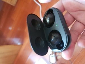
To find an interactive project that differs from my definition of interaction is kind of tricky. How can I tell why a project is not interactive enough in my sense if I already treat it as an interactive project? Therefore, I choose to research on a project that other people might think interactive while I don’t, which is a pair of Bluetooth headphones I just bought.


People may think it is a interactive design: it receives your input from you cellphone, processes the audio, and then plays it for you. But I do not think it is interactive enough. For example, it took me ten minutes to figure out how to plug it to my ears because there is neither instructions nor signs to tell you what’s top and what’s the bottom. In addition, I did not know anything about how you can tap it to pause music until I downloaded an app with instructions to my phone.
That being said, although it is an expensive headphone with many high-tech features, indeed interactive from it’s designer’s perspective, it is not user-friendly at all. It lacks proper instructions or signs or feedback and the physical design is not intuitive enough. It runs basic interactive functions but users would take pains to figure out how to interact with it.
C.
Now it’s time to establish an advanced version of my definition of interaction. With what I said above, the new definition seems clear: an interactive design means 1) two or more actors, 2) cognitive systems, 3) the process of input, processing, and output, 4) proper feedback so as not to confuse the user, and 5) available to everyone. In general, what I added to my previous definition is that, an interactive design should show its humanitarian care and user friendliness. As my favorite designer Jony Ive says, :”What we make testifies who we are. People can sense care and can sense carelessness. This relates to respect for each other and carelessness is personally offensive” and “The inside of the phone we spent so much time on & it’s something that 99% of you will never see-because it’s the right thing.” It is always worthwhile to spend much time on your project to make something that may seem invisible to anyone but actually make your device easier to use for everyone.