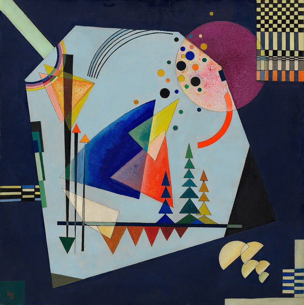
I chose Vasily Kandinsky’s Three Sounds as the motif because it first caught my eyes among so many sample images. It gave me a sense of Cyberpunk and mystery, attracting me with its beauty. When I decided to choose it, I knew it would be a complicated work with so many components in it, but I still made my decision without much hesitation because I thought there was nothing in the picture could not be achieved as if I took longer energy and sought for help when necessary.

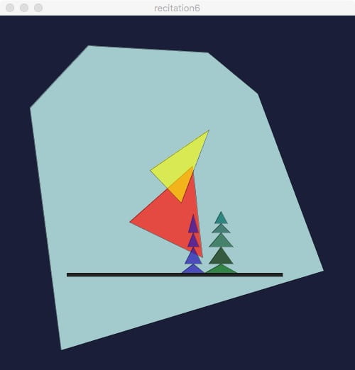
As you can see, what I wanted to create in Processing is a replication of Vasily Kandinsky’s painting (due to the time limit and the complexity of the picture, I only completed 30% in class). The first challenge to me was that there were too many components with so many different vertexes. In the beginning, I only estimated the coordinates by my feeling. So at many times the position or shape of the components was not accurate, differing much from the original motif I chose. Luckily, when Leon saw me doing this work, he came to me and told me that he also did this before. And he taught me a little trick: upload the picture with the pixel size you plan to create to Illustrator, then open the information window, there will be small window recording every pixel coordinates where your mouse arrow points at. With this method, I got the coordinates I needed much faster and more accurate; each component I replicated in my work was almost exactly the same position and size with the original image. The second challenge was the color choice. I felt that I could not set the exact colors which were used in the original work no matter how I tried; there was always little difference. And even if I set the transparency in my work, I could not imitate somewhere in the original work having a sense of dizzy dye and very natural color transition. I think it is because of the pigment artist used in the real world has more uncontrollable imperceptible disequilibrium and sometimes the artist can also create a sense of color transition freely by himself, which would be hard to achieve by the digital drawing method like Processing.
I think Processing might not be able to replicate full spiritual works of art as artists created by their hands – even we could replicate the shapes, the spirit in the existing artwork would be hard to express in our digital work. But I think it can certainly help us to explore the artwork and understand it. We can realize why the artist chose each position or size of each patterning – understand more about the patternings’ relative positions by coding their coordinates; we can also understand more about the artful color choices made by the artist during our search for similar colors in Processing – sometimes the wrong tries would destroy the concordance of image even if they were similar to the original colors.
Code of my work:
size(500, 500);
background(26, 30, 57);
fill(171,213,214,240); //big blue
stroke(0, 0, 0);
strokeWeight(0.3);
beginShape(); //blue hexagon
vertex(124, 42);
vertex(42, 130);
vertex(86, 472);
vertex(456, 360);
vertex(363, 110);
vertex(293, 52);
endShape(CLOSE);
fill(31,31,31,250); //black line
rect(94, 363, 304,5);
fill(255,20,8,180); // red triangle
triangle(271,212,182,291,285,341);
fill(38,25,180,180); //blue tree
triangle(272,350,255,363,288,363);
triangle(272,326,260,350,284,350);
triangle(272,306,264,326,280,326);
triangle(272,280,265,306,279,306);
fill(254,255,0,150); //yellow triangle
triangle(294,161,211,218,255,264);
fill(33,121,50,220); //green tree
triangle(311,350,288,363,334,363);
fill(54,90,61,255);
triangle(311,326,294,350,328,350);
fill(70,129,107,255);
triangle(311,306,294,326,328,326);
fill(69,126,116,255);
triangle(311,293,298,306,324,306);
fill(45,134,129,255);
triangle(311,276,302,293,320,293);