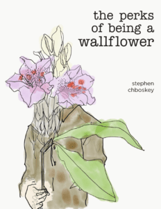
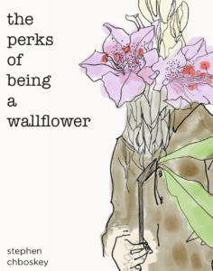
For the assignment of “Good Design”, I made a book cover for a classic coming of age book “The Perks of Being a Wallflower”. The book was firstly published in 1999. It speaks from a high school freshman’s perspective and tells stories around him. The original book cover has a classic vibe, shows the green background plus a washed-out picture on the right-top corner. The cover has a sans-serif font to show the modern feeling. However, the original book cover was a little bit outdated nowadays. My goal for the redesign is to make it attractive to younger readers.

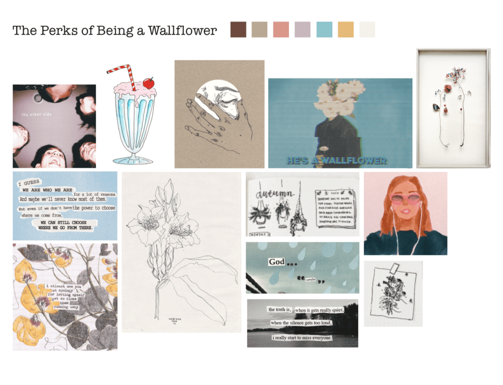
My graphic design process always starts with creating a mood board to establish my designing style. I wanted the book cover to look more trendy, therefore I decided to go with illustrations and hand-written style. I collected pictures from the Internet and then put it together as a collage. The pictures that I found all conveyed a similar coming-of-age vibe. It showed youth and high school love.
For me, good design requires iterations. I don’t think good design only has one shot. It needs to be updated based on people’s feedback. In the beginning, I drew the illustration that I thought could represent the image of the book and provided different layouts for my friends and others. Then they said the flower part was a little bit emptier. Thus, for the final version, I redesigned the illustration as well as added the hand-written title. I chose a sans-serif font for the author to balance out the hand-written and illustration.