This design challenge offered more than technical obstacles; it forced me to develop a shared vocabulary with new people on the spot while speaking of abstract ideas. The quick and dirty design process allowed me to think beyond the limitations and simply build.
Review Interview
To begin we discussed the interview with Tristan. It was very helpful that some of use knew who he was and have previously interacted with him. This gave us a better idea as to what his personality and surface values were. We each other asked questions about his daily routine and shared what we thought of his attitude towards his mobile phones.
Outline Subject
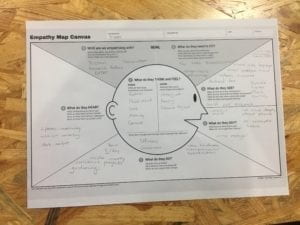
As we filled out the Empathy Map if was hard not to target your answers towards the challenge prompt. The questions’ vague nature challenged us to distance ourselves from the goal and instead look deeper into the subject.
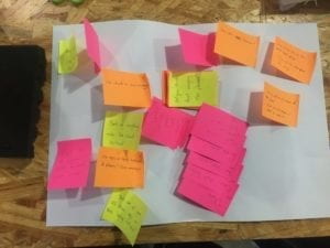
Brainstorm & Idea Vomit
This was by-far my favorite part of the design process. Writing ideas down without any hesitation or filter had a cathartic feel. It didn’t matter if the idea was near impossible. The lack of limitations gave me a freedom that allowed me to think of ideas well beyond my natural scope.
Filter & Consolidate Ideas
As we regrouped to sift through all of our ideas, I found it interesting to see how many fell within the same realm or simply the same. This process gave us the chance to see an overarching trend that would not have be as accessible to us if we had not branched out for the brainstorming portion. Here we decided that a problem we could tackle was Trisan’s issues with his phone case. Button orientation in relation to specific tasks such as watching videos offered an interesting angle for us to attack.
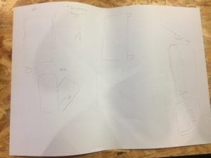
Design According to requirements
Using the categories created through the filtering and consolidation of ideas in the previous stage, we outlined a list of requirements that we’d like to see our solution have. Using these as loose requirements we were able to develop 3 different designs. Each hoping to solve our issue in similar but different ways.
Prototype
Prototyping turned out to be the most labor intense step. Our biggest issue was the suitability of materials.
How can we accurately convey our solution?
What material achieves this task?
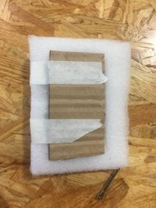
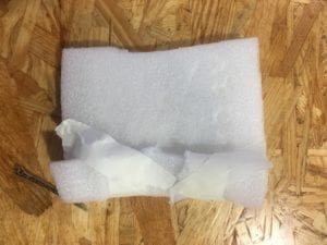
We first tried using the small piece of an absorption panel to create the firm, jelly like feel of the phone case. However, this proved to be fruitless as the material was unable to hold a different form and also unable to fit our “phone” (cardboard rectangle).
Next, we chose to use the boxing foam. Using the structure of the foam to create smaller malleable layers, we were able to mimic the idea of a gelatinous substance within a pouch shaping into a phone stand.
Conclusion
Overall, this design cycle was very informative into the process and effort required of design development. It has given me further insight into the timeline required to make a successful design. In terms of overall production, the design process definitely employs the 90-90 rule where 90% of tasks will take 90% of the time but the remaining 10% of tasks will require an additional 90% of time.
